
Typography plays a crucial role in shaping a professional and modern brand identity. This article explores the font used by YMCA, examining how it contributes to the organization's visual appeal and consistency. We'll look into the specific font choice and its impact on YMCA's branding.
The YMCA logo features the Cachet font, a geometric sans serif typeface that enhances the organization's modern and professional image.
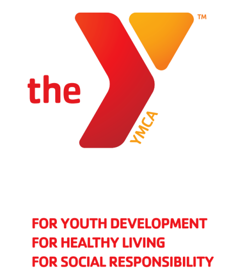
Cachet is available in various styles and weights, making it versatile for different design needs. Its geometric shapes and clean lines create a contemporary and approachable look. This font's unique characteristics include its simplicity and clarity, which help convey a sense of trust and reliability. The use of Cachet in the YMCA logo reinforces the organization's commitment to youth development, healthy living, and social responsibility.

Cachet, a geometric sans serif font, was created by British type designer Dave Farey in 1997. Since its inception, Cachet has maintained its original design, characterized by clean lines and geometric shapes, without significant updates or changes. This consistency has helped it remain a reliable choice for modern and professional branding.
Today, Cachet is prominently used in logos and taglines, most notably by the YMCA of the USA. Its clarity and simplicity make it suitable for various design needs, from corporate branding to marketing materials. The font's versatility ensures it remains a popular choice for organizations aiming to convey trust and reliability.
To use Cachet in your projects, follow these steps:
With Subframe, create page templates, UI snippets, and design components and export them directly to React or Tailwind. You can also take advantage of the large font library, including Cachet and other typographies.
Build and create pixel-perfect UIs in no time. Start for free or explore templates.


