
In the competitive world of digital design, the Key Benefit Section of a website can make or break user engagement. This crucial segment highlights the core advantages of a product or service, capturing the audience's attention and driving them to take action.
Effective Key Benefit Sections not only inform but also enhance the overall user experience by providing clear, concise, and compelling reasons to stay on the page. In this article, we will explore 25 exemplary designs that masterfully showcase the power of well-crafted benefit sections.
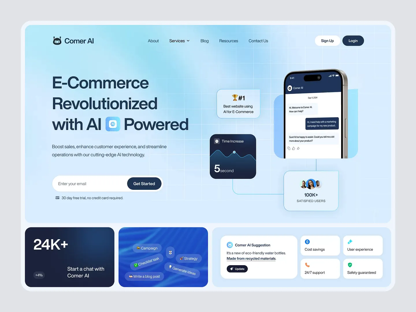
Comer AI's Key Benefit Section showcases the transformative advantages of AI in e-commerce with a clean layout and engaging visuals. It highlights user satisfaction, time efficiency, and cost savings, enhancing customer experience and streamlining operations.
Check out this example on Dribbble.
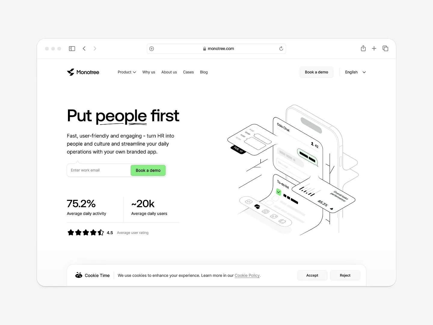
Monotree's Key Benefit Section features a clean, modern layout with bold typography and minimalistic icons, emphasizing user engagement. The design focuses on streamlining HR processes, and the color palette enhances readability and user experience.
Check out this example on Dribbble.

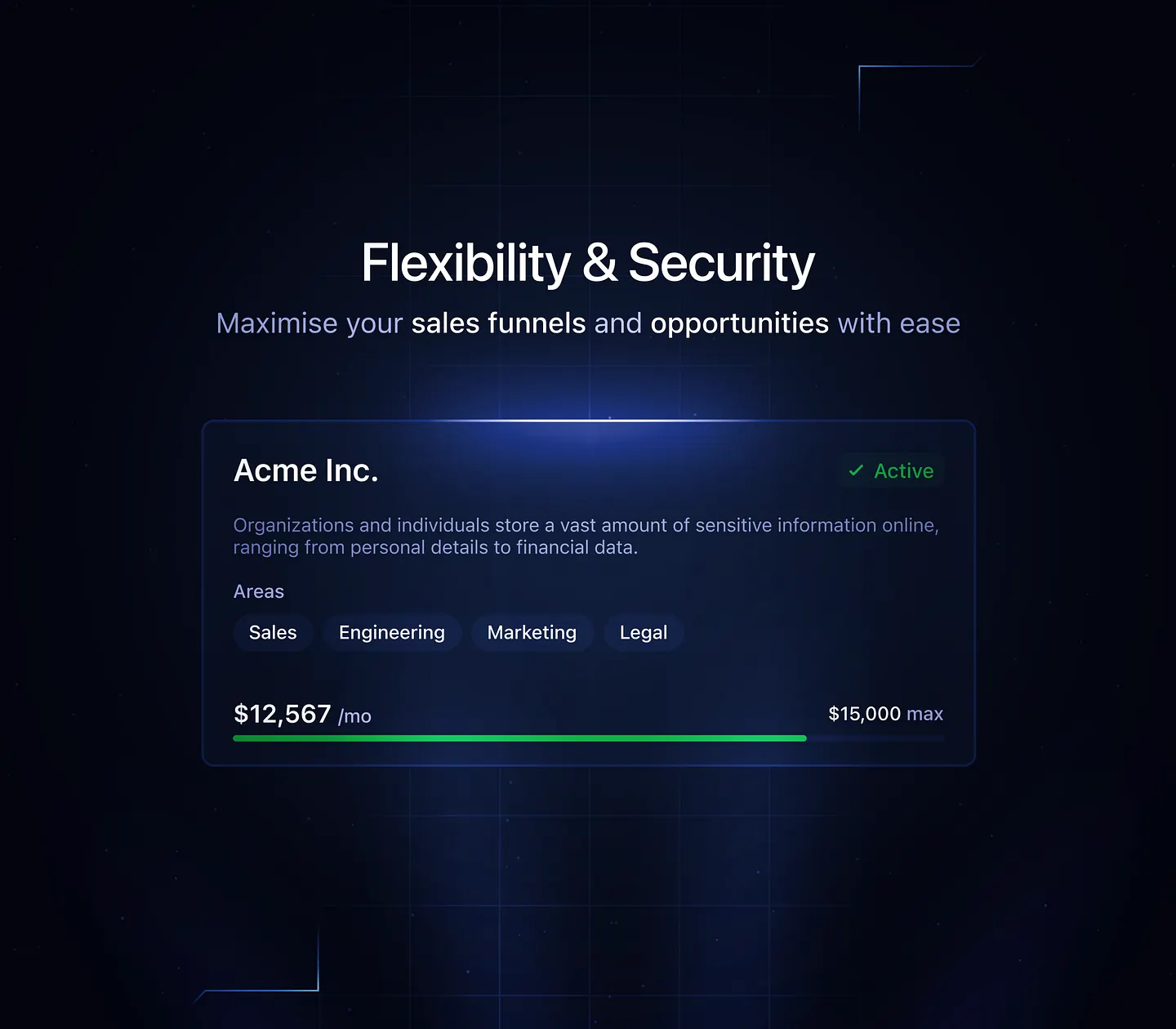
The Key Benefit Section for the Pipelined CRM platform features dynamic widgets in the header and session tracking by country. It uses vibrant color contrasts and clear typography to highlight smooth workflows, smarter insights, and meaningful connections.
Check out this example on Dribbble.
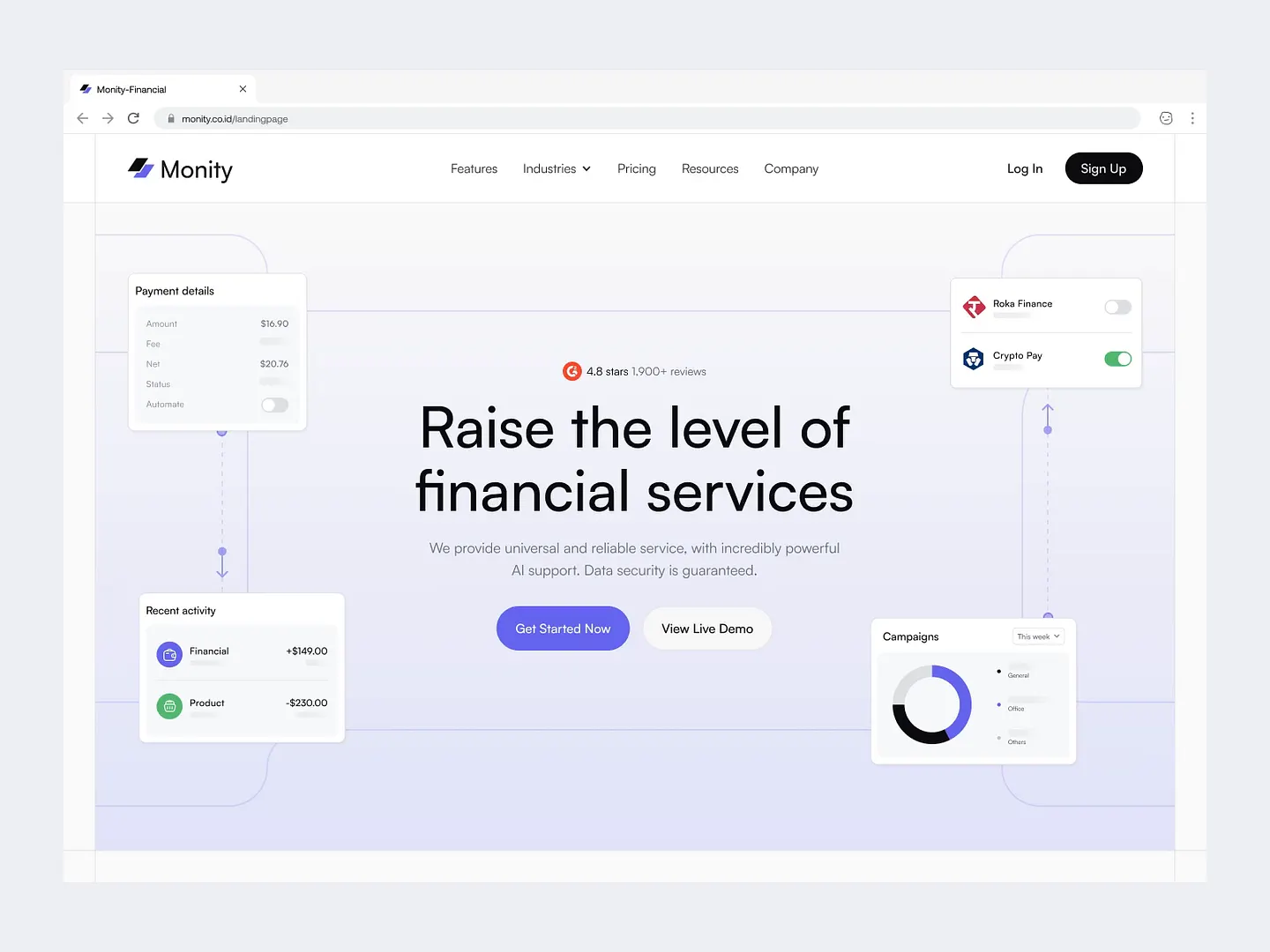
Monity's financial services landing page features a clean layout, soft color palette, and intuitive icons, effectively communicating reliability and security. Unique elements include custom financial services and an integration with Figma for design trials.
Check out this example on Dribbble.
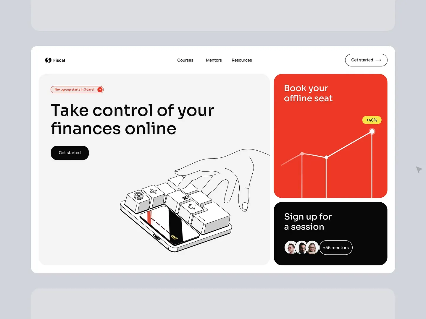
This Key Benefit Section emphasizes taking control of finances online with a clean layout and a prominent call-to-action button. An illustrative keyboard graphic symbolizes interactivity and user engagement, effectively communicating the value of financial education through a modern, user-friendly interface.
Check out this example on Dribbble.

Designers and developers, elevate your projects with Subframe's drag-and-drop interface and intuitive, responsive canvas. Create pixel-perfect UI effortlessly, every time.
Loved by professionals across the industry, Subframe makes designing Key Benefit Sections a breeze. Start for free today!
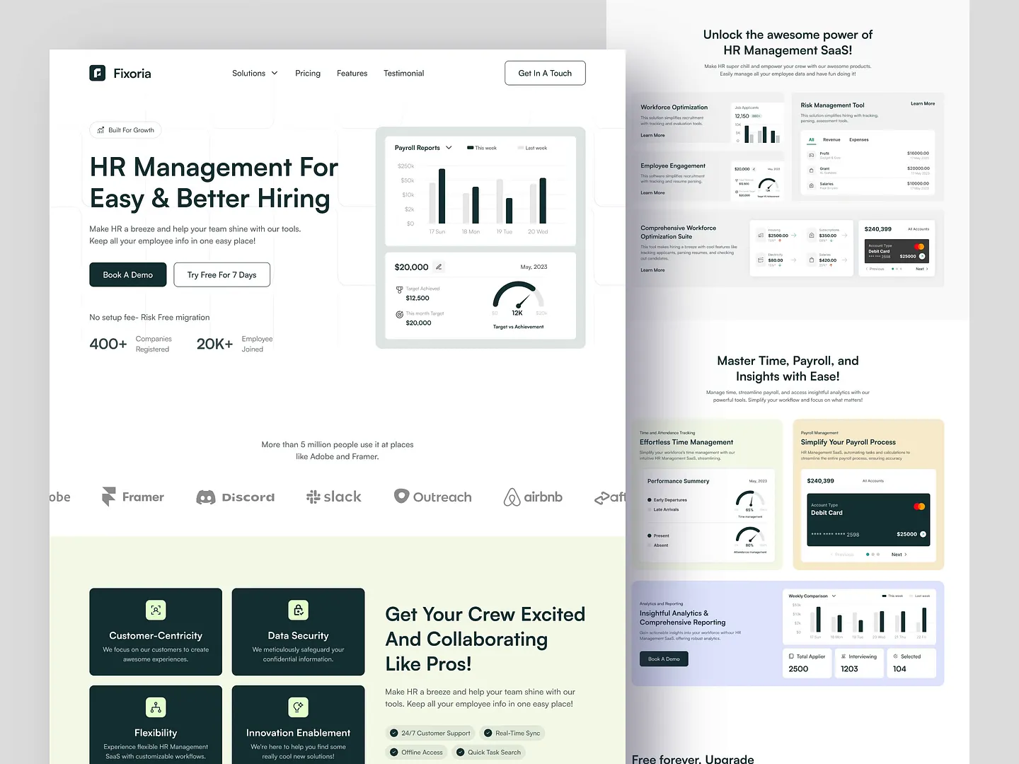
This Key Benefit Section for an HR Management SaaS highlights user-friendly tools that streamline hiring and payroll processes. With a clean layout and engaging visuals, it emphasizes customer-centricity, data security, and flexibility, ensuring businesses can optimize their HR functions effectively.
Check out this example on Dribbble.

TrustLine's Key Benefit Section highlights its ability to automate third-party support requests with a clean, modern design. Contrasting colors and intuitive icons emphasize efficiency and security, making the service's advantages clear and accessible.
Check out this example on Dribbble.
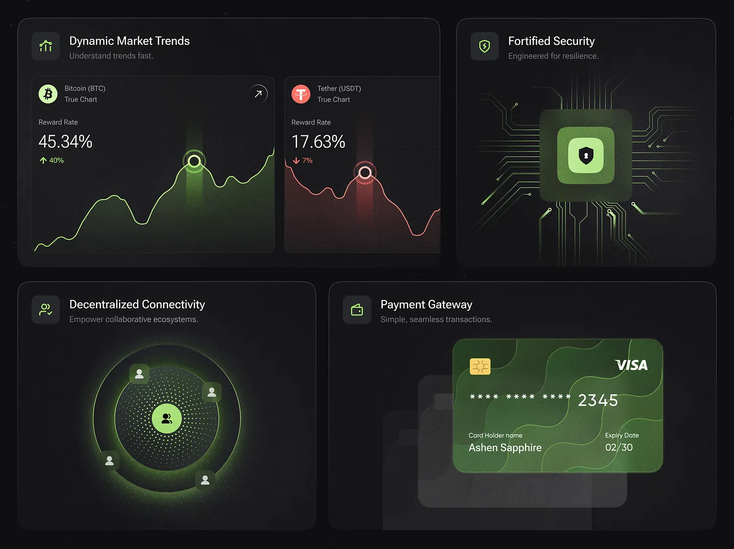
Cryptic's Key Benefit Section uses a modern color palette and intuitive layouts to highlight dynamic market trends, fortified security, decentralized connectivity, and a seamless payment gateway. Unique design elements include visually engaging feature cards that enhance user understanding.
Check out this example on Dribbble.
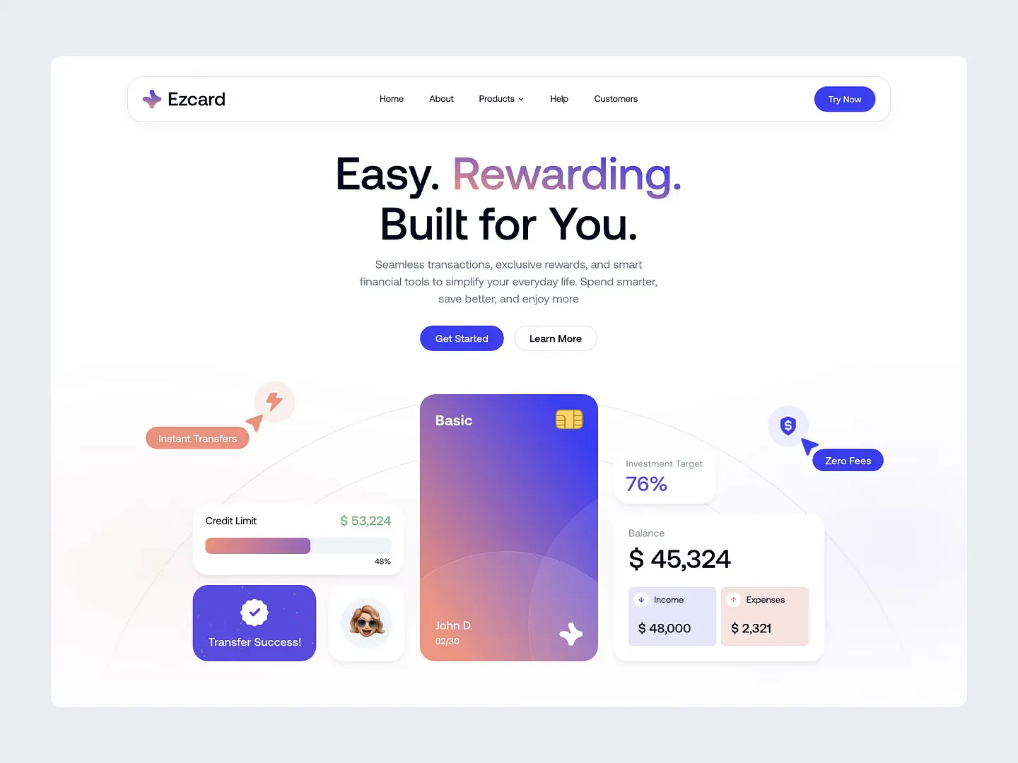
ezCard's Key Benefit Section simplifies financial transactions with instant transfers, zero fees, and a clear overview of credit limits and balances. The user-friendly interface empowers users to manage their finances effortlessly, making it a standout design.
Check out this example on Dribbble.
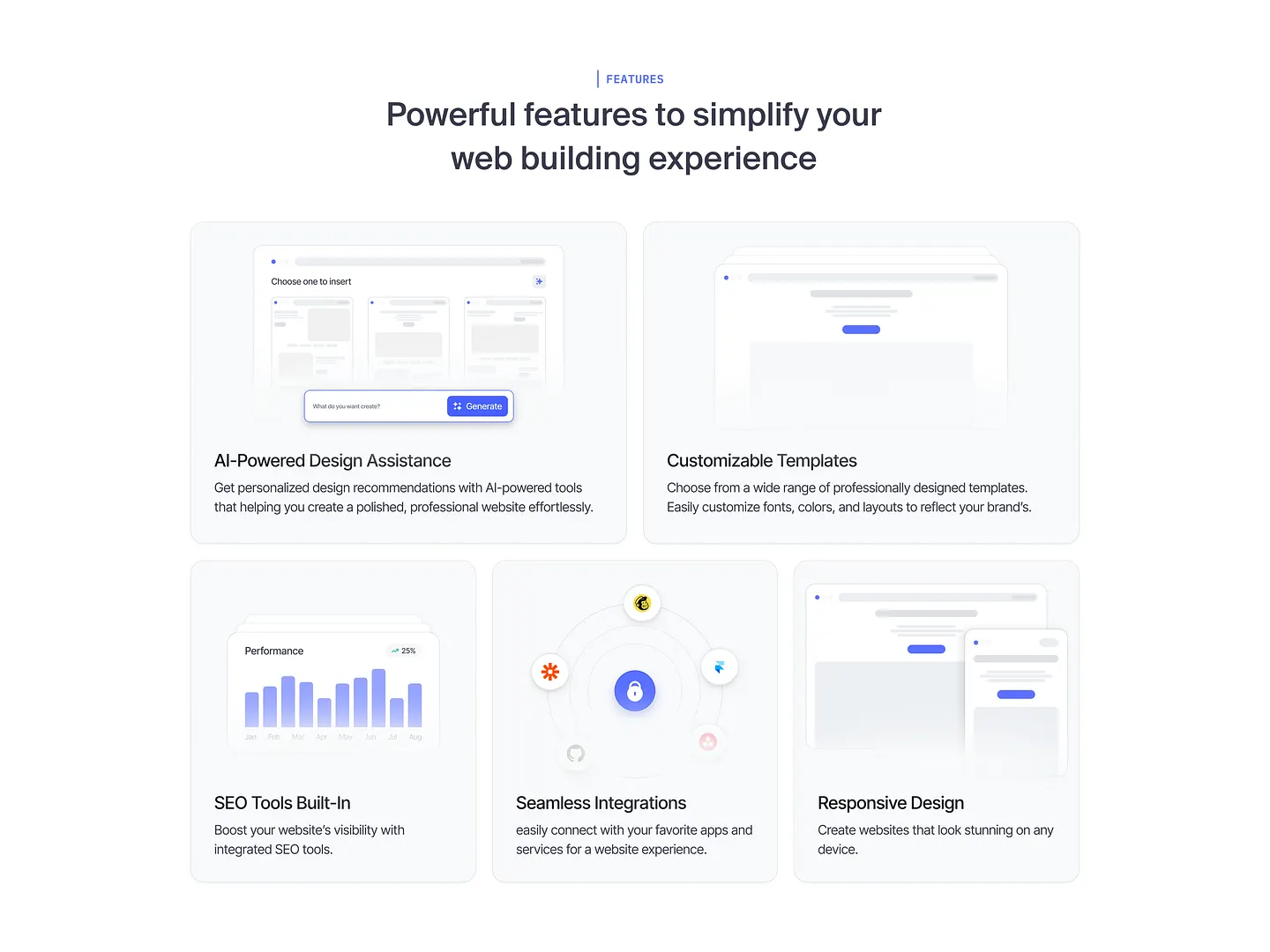
SiteCraft's Key Benefit Section highlights AI-powered design assistance, customizable templates, built-in SEO tools, seamless integrations, and responsive design. These features enable users to create professional websites effortlessly, meeting unique needs with ease.
Check out this example on Dribbble.
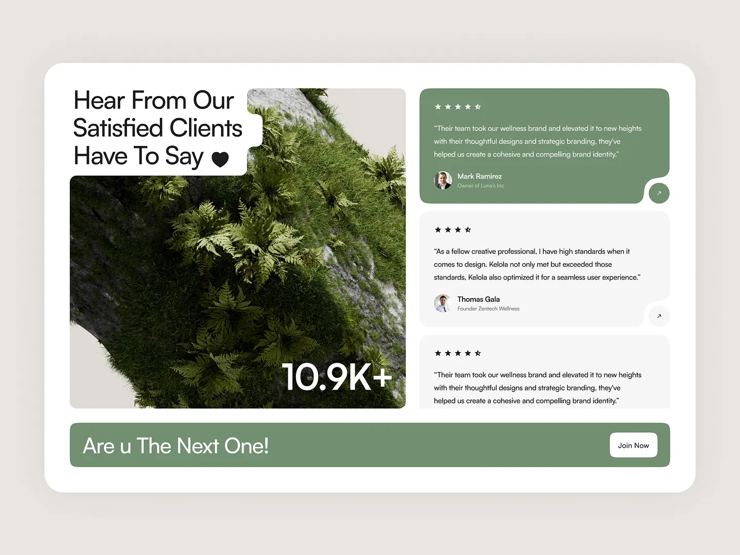
This Key Benefit Section showcases the power of client testimonials in enhancing brand credibility. Featuring lush green visuals and a clean layout, it emphasizes positive feedback from satisfied clients, highlighting their experiences and the transformative impact of thoughtful design and branding strategies.
Check out this example on Dribbble.
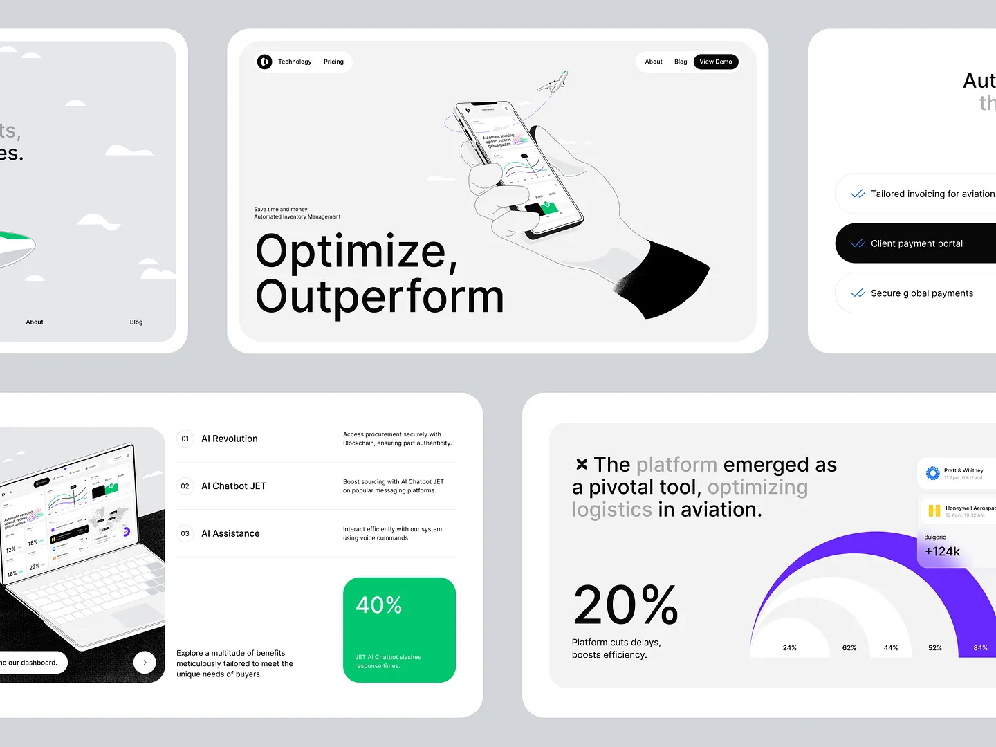
This Key Benefit Section for an aviation procurement platform features AI integration and blockchain security, using a clean layout and engaging visuals. The harmonious color palette enhances readability and user experience, making essential features stand out.
Check out this example on Dribbble.
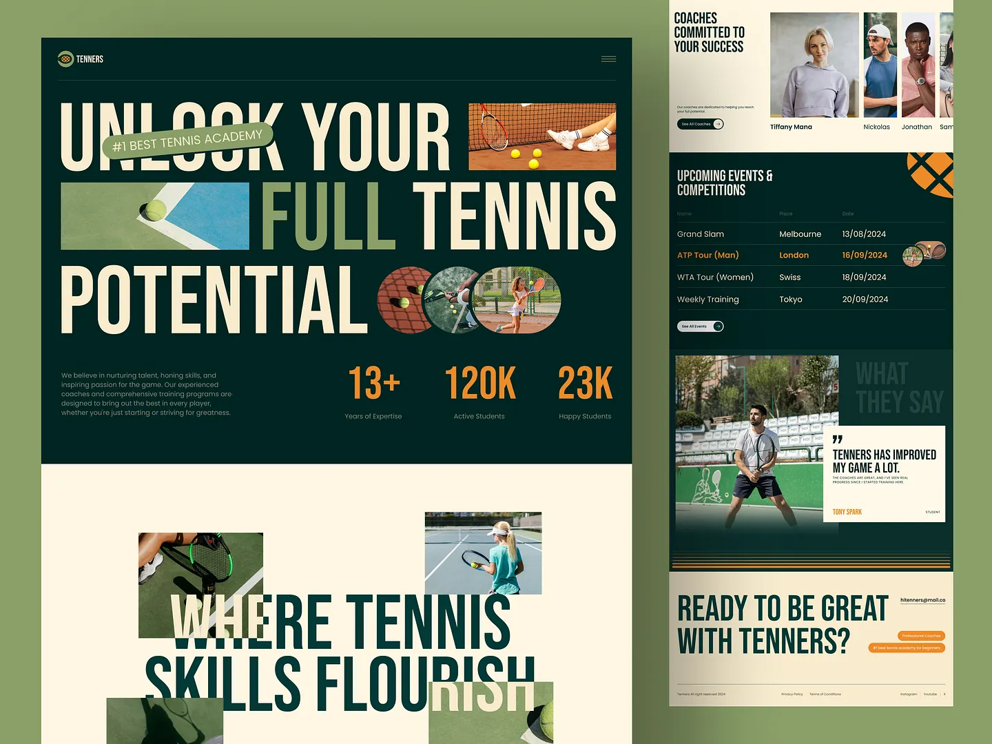
Tenners Academy's Key Benefit Section highlights over 13 years of expertise, personalized coaching, and a vibrant community of 120K active students. The design focuses on skill development and competition preparation, making it a standout for aspiring tennis players.
Check out this example on Dribbble.
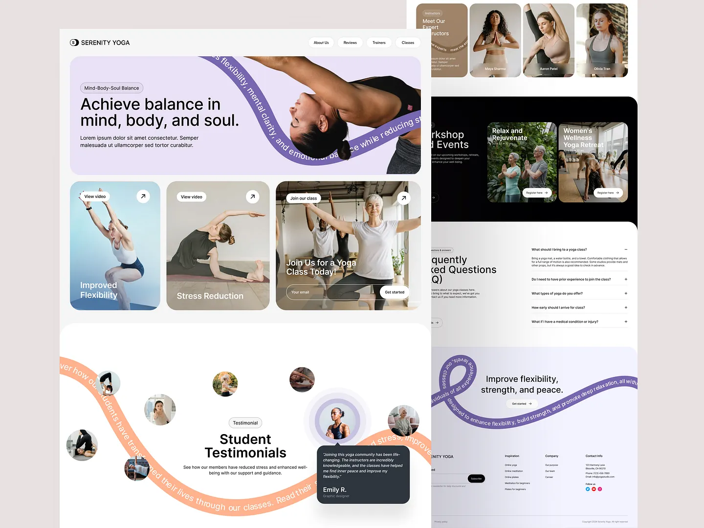
This visually appealing Key Benefit Section for Serenity Yoga highlights improved flexibility, stress reduction, and overall wellness. Calming colors and engaging visuals create an inviting atmosphere, encouraging potential members to explore yoga's transformative benefits.
Check out this example on Dribbble.
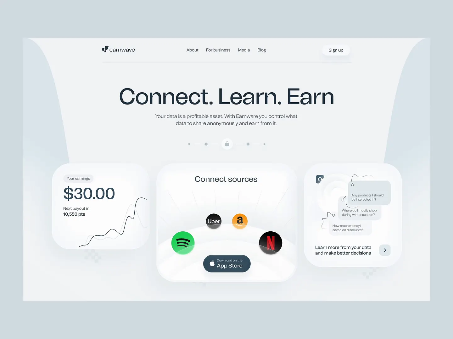
This design showcases a clean and modern key benefit section, emphasizing user engagement with a clear call to action. Soft colors and intuitive layouts highlight the platform's core offerings, such as data control and monetization, making it visually appealing and user-friendly.
Check out this example on Dribbble.
Ready to design your own Key Benefit Section? Subframe streamlines the process with its intuitive interface and responsive canvas, making it easy to achieve professional, pixel-perfect results quickly.
Join the ranks of industry professionals who trust Subframe for their design needs. Start for free today!
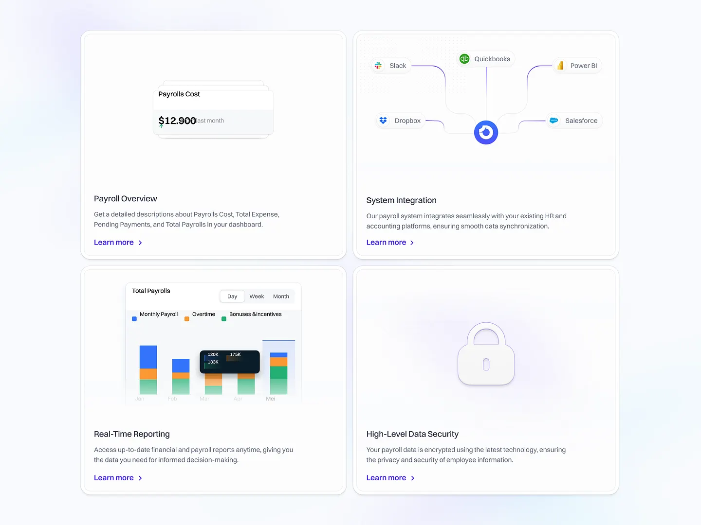
This HR Management SaaS platform design highlights streamlined payroll, real-time reporting, and robust system integration. Unique features include payroll cost tracking and high-level data security, ensuring efficient management and protection of employee information.
Check out this example on Dribbble.
Monty Hayton's Dark UI Feature Section uses a sleek, modern design to enhance visual appeal and improve user engagement. The dark theme reduces eye strain and emphasizes key features, making it perfect for tech-savvy audiences.
Check out this example on Dribbble.
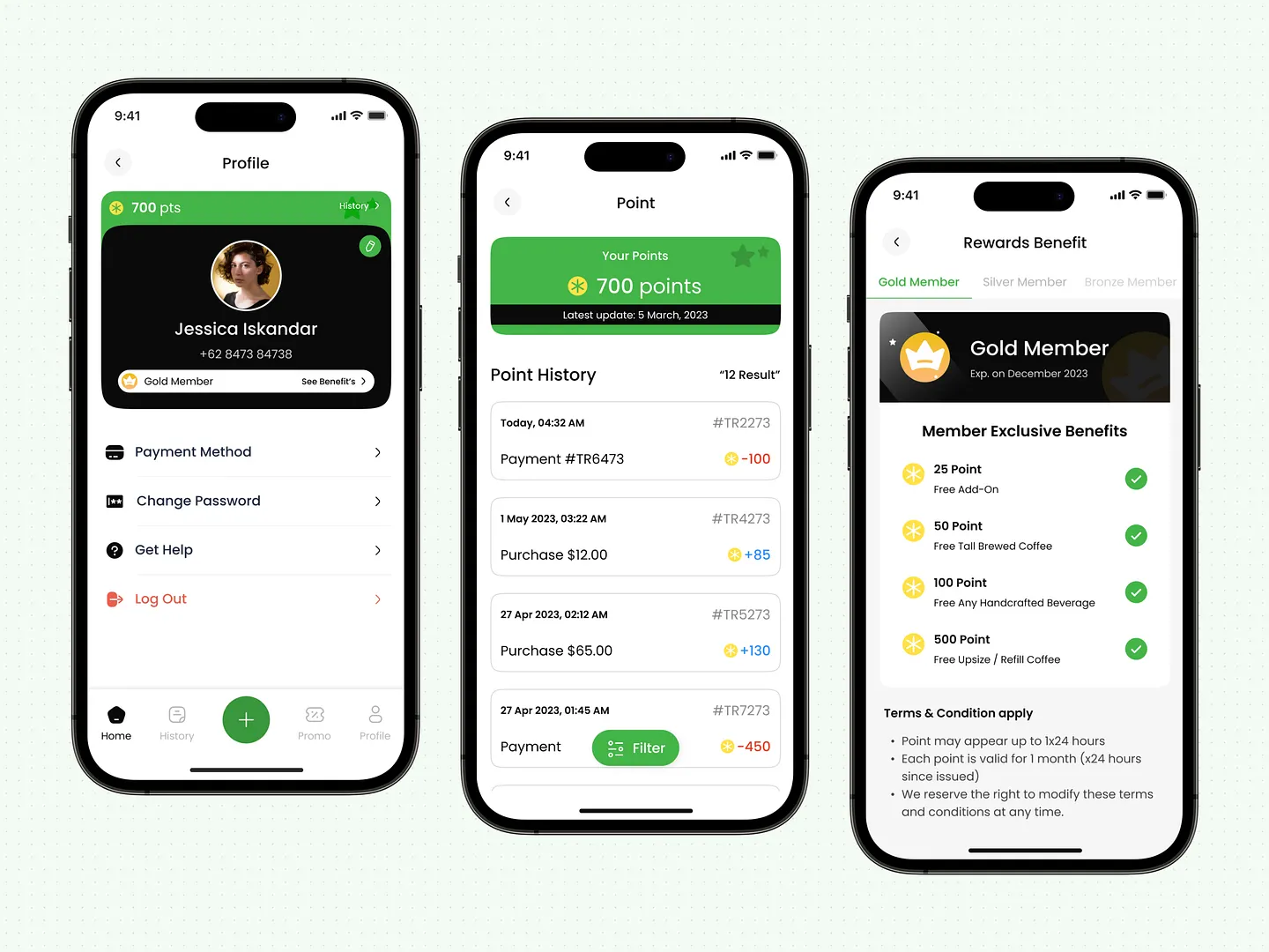
CuppaCo's rewards program Key Benefit Section features a clean layout with vibrant colors, highlighting point milestones and rewards like free beverages and add-ons. This design enhances user engagement and loyalty through exclusive perks for Gold Members.
Check out this example on Dribbble.
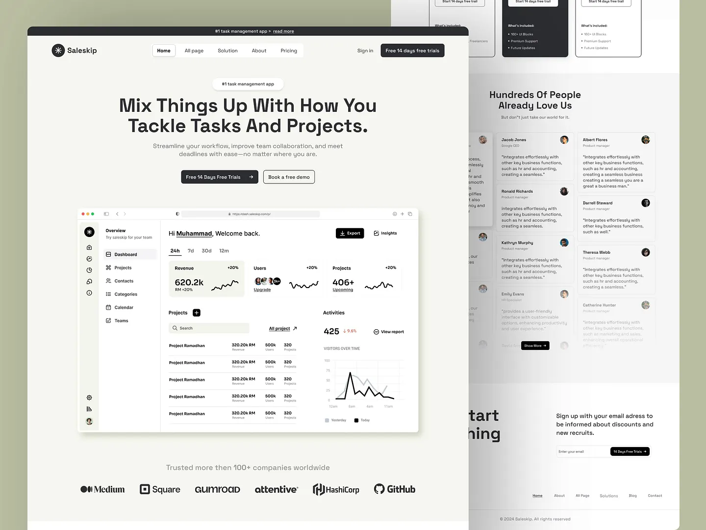
This task management landing page emphasizes streamlined workflows and improved team collaboration with a clean layout and engaging visuals. User-friendly dashboards and insightful analytics help teams meet deadlines efficiently, making it a standout design.
Check out this example on Dribbble.
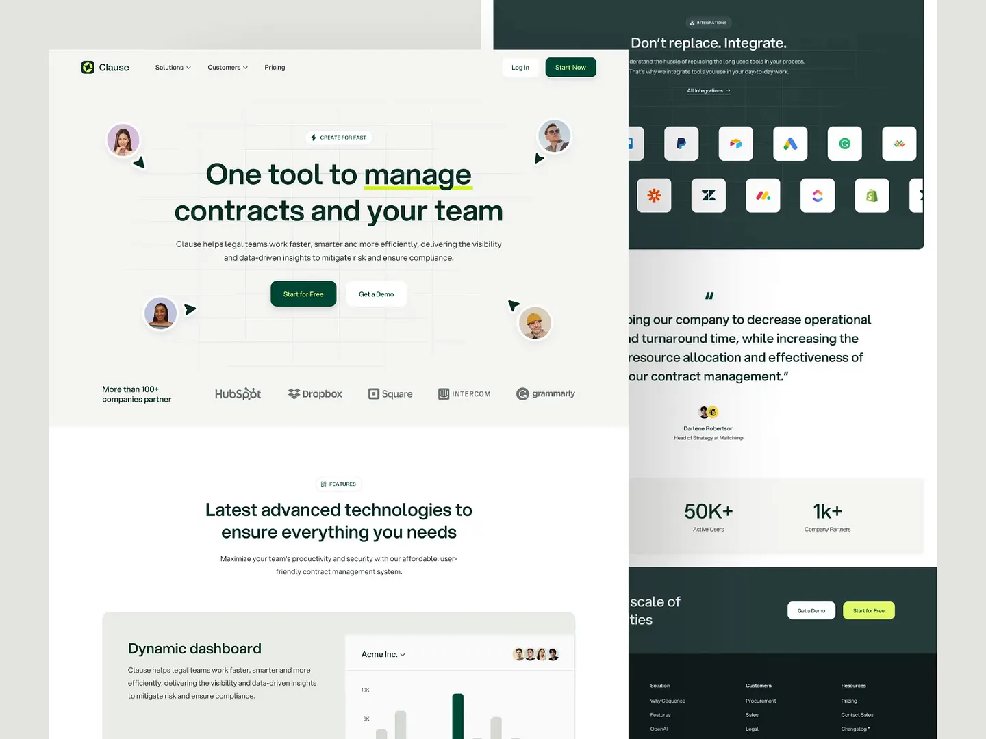
Clause's contract management landing page enhances team productivity and compliance with a dynamic dashboard and integration capabilities. Unique features include real-time visibility and data-driven insights, empowering legal teams to manage contracts efficiently.
Check out this example on Dribbble.
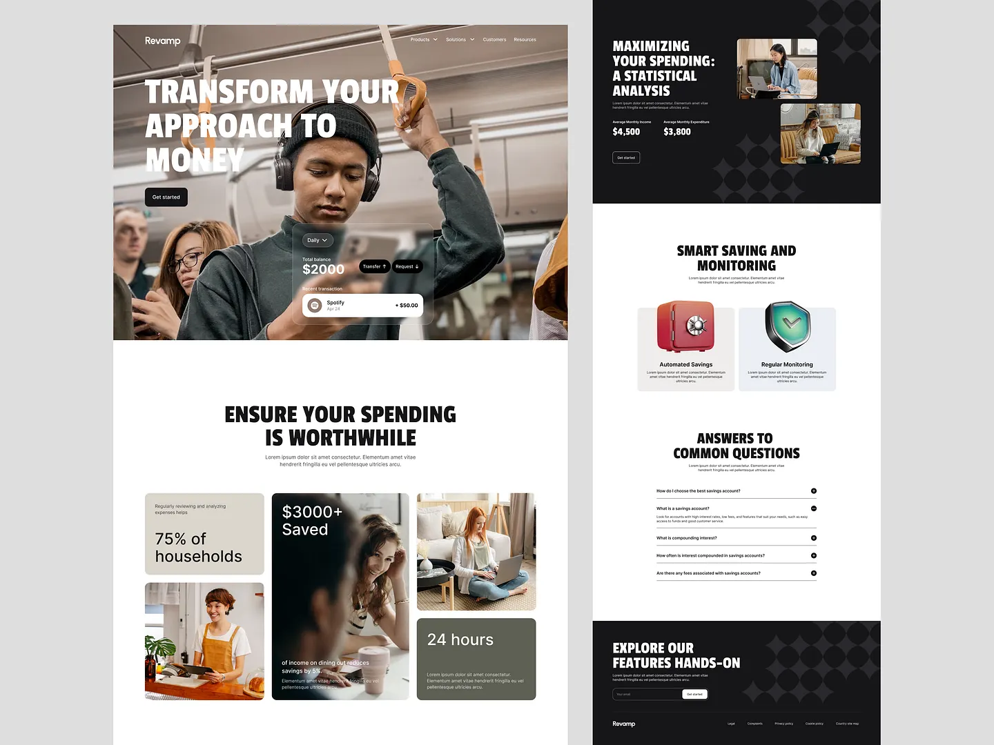
This key benefit section effectively highlights the advantages of using the savings app, showcasing features like automated savings and regular monitoring. The design utilizes engaging visuals and clear typography to emphasize the potential savings and financial insights, making it easy for users to understand the value of the app.
Check out this example on Dribbble.
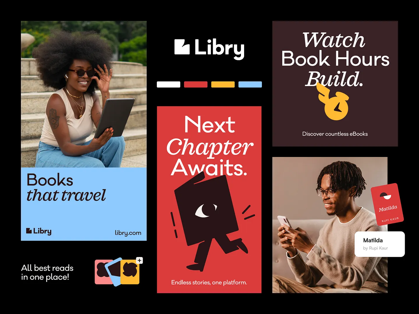
Libry Books' Key Benefit Section features bold typography and a modern color palette, emphasizing the convenience of accessing countless eBooks on one platform. The design highlights the ease of reading anywhere, anytime, inviting users to discover endless stories.
Check out this example on Dribbble.
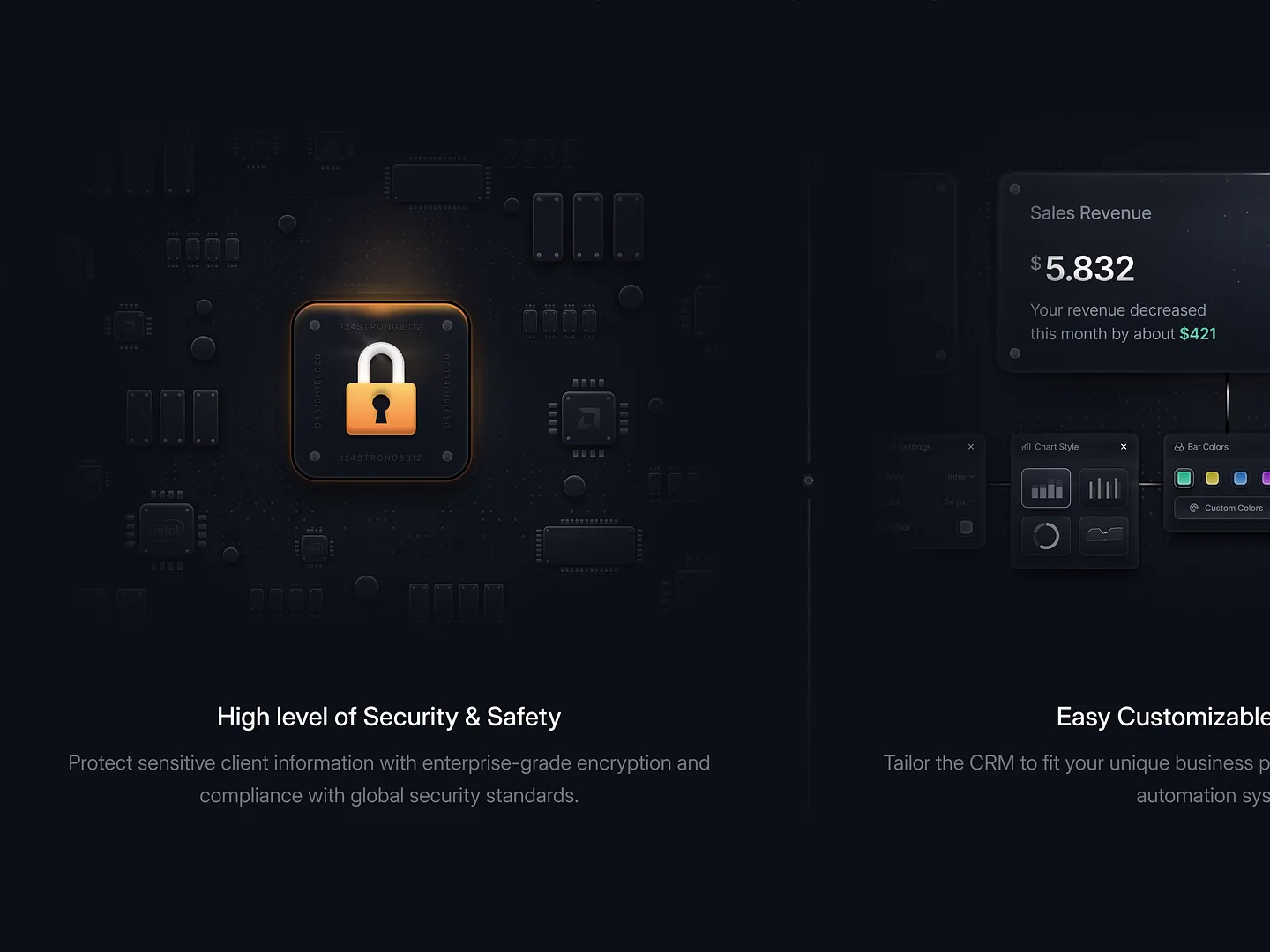
This SaaS platform's Key Benefit Section features high-level security with a lock icon against a dark circuit board background, symbolizing robust data protection. Customizable dashboards enhance user experience and adaptability, making it a standout design.
Check out this example on Dribbble.
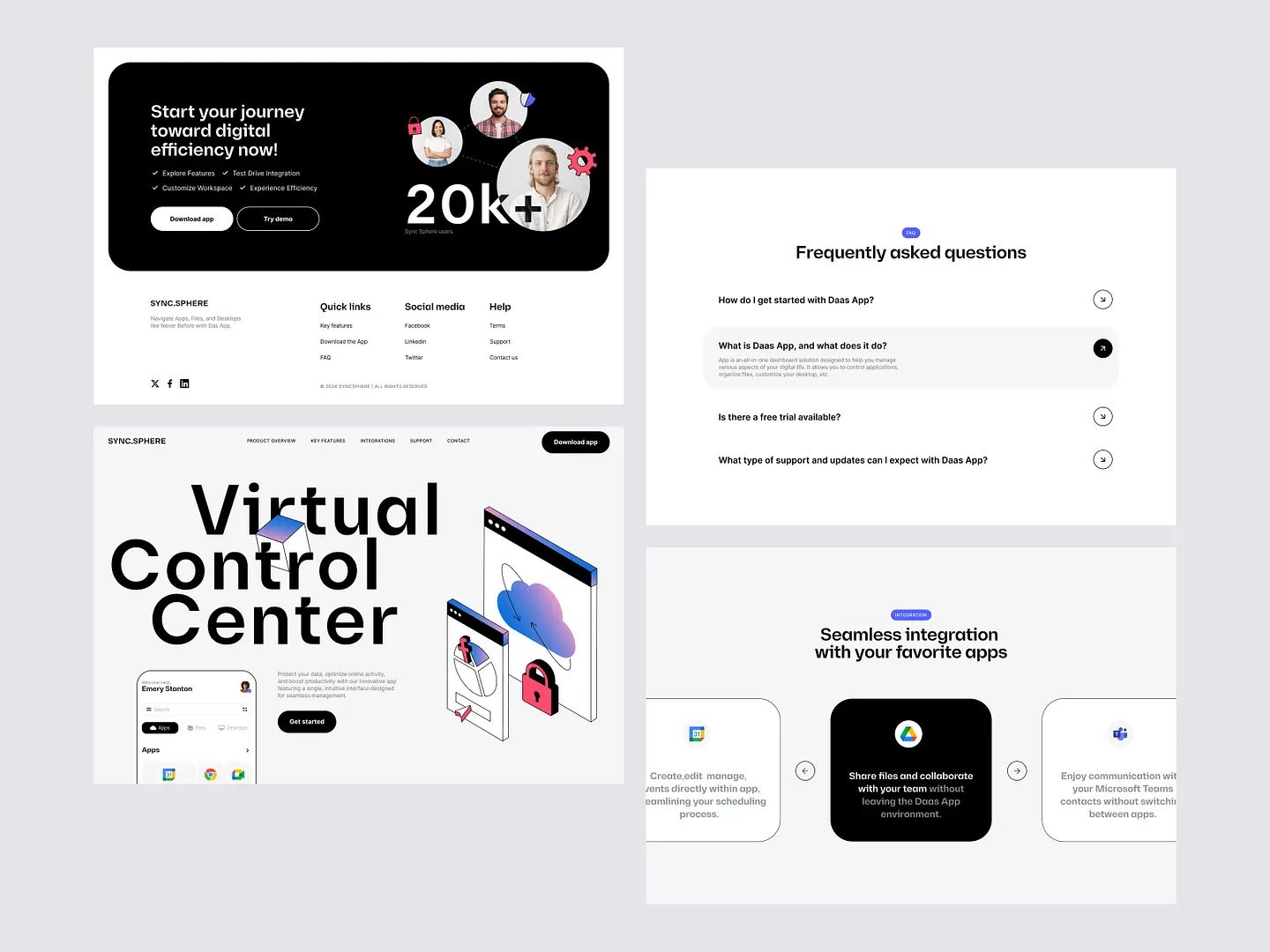
Sync.Sphere enhances digital efficiency with seamless integration and user-friendly features. The clean layout and bold typography highlight essential functionalities, while visual elements emphasize the app's capability to streamline workflows and improve collaboration.
Check out this example on Dribbble.
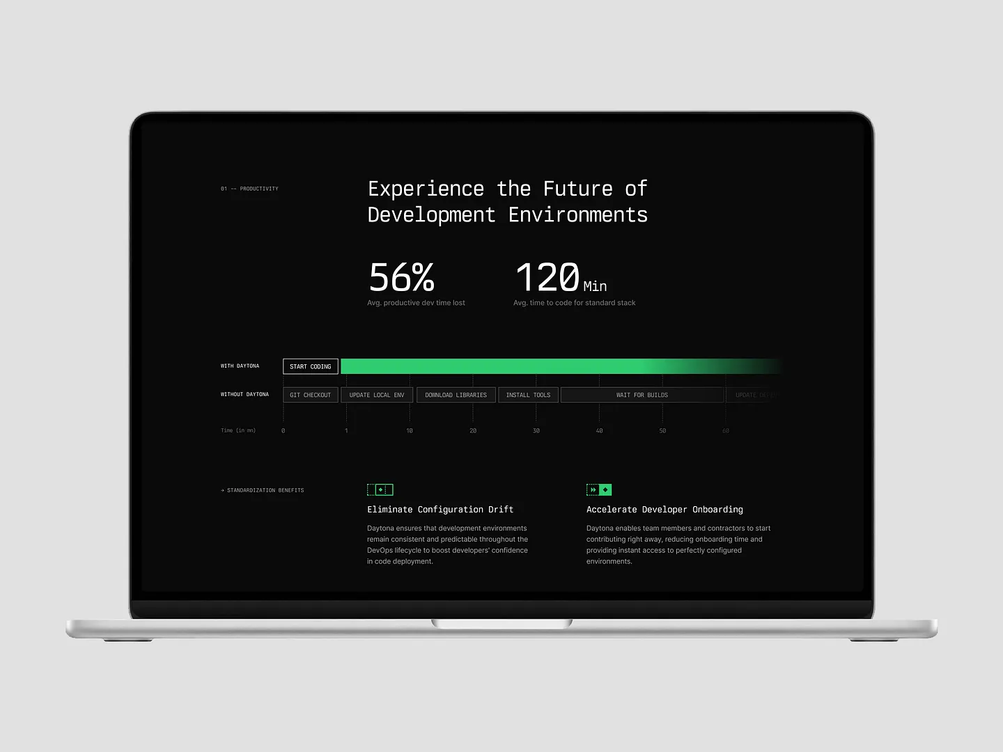
This Key Benefit Section highlights a 56% reduction in productive development time lost and an average coding time of 120 minutes, showcasing the efficiency of standardized tools and processes. Impactful statistics and a clean layout emphasize productivity gains and reduced setup times.
Check out this example on Dribbble.
In conclusion, designing an effective Key Benefit Section is crucial for capturing user attention and driving engagement. With Subframe, you can achieve this effortlessly, thanks to its intuitive interface and responsive canvas.
Experience the efficiency and precision of creating pixel-perfect UI immediately. Start for free and begin designing your standout Key Benefit Section today!


