
In today's data-driven world, presenting information in a visually appealing and interactive manner is more crucial than ever. Interactive charts not only make data more accessible but also engage users by allowing them to explore and manipulate the information themselves.
From business dashboards to educational tools, interactive charts enhance user experience by providing a dynamic way to understand complex data. They transform static numbers into compelling stories, making it easier for users to draw insights and make informed decisions.
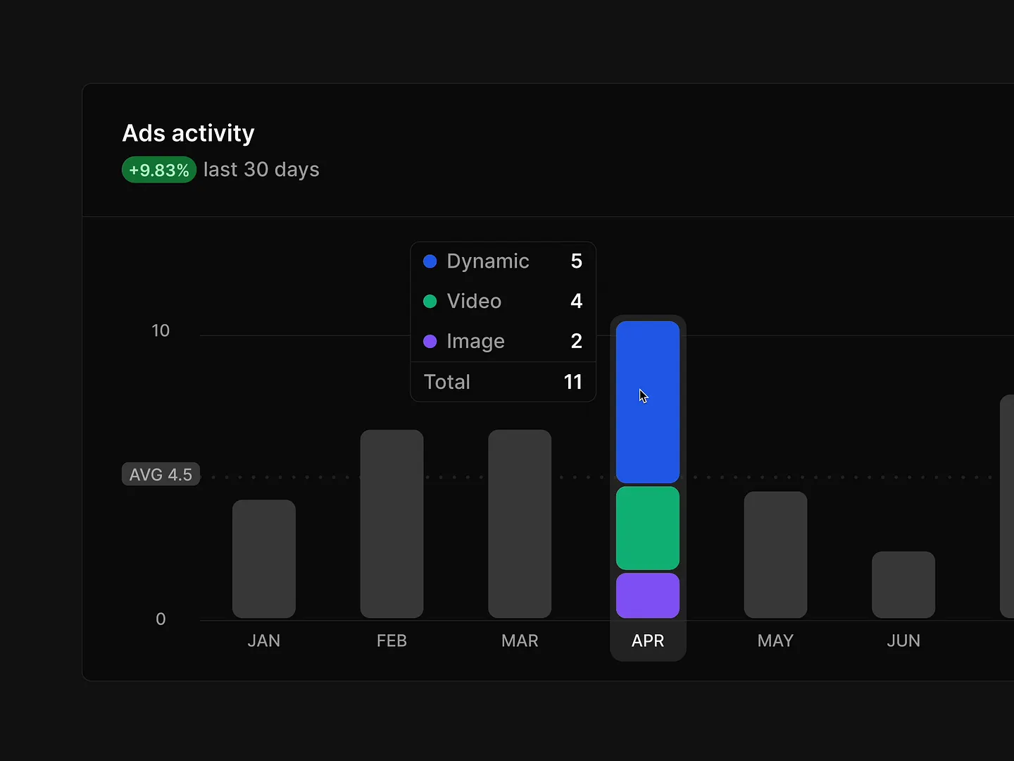
This interactive segmented bar chart showcases ad activity over the last 30 days with a vibrant color scheme and clear segmentation. It allows users to easily analyze performance across dynamic, video, and image ads, enhancing engagement and understanding.
Check out this example on Dribbble.

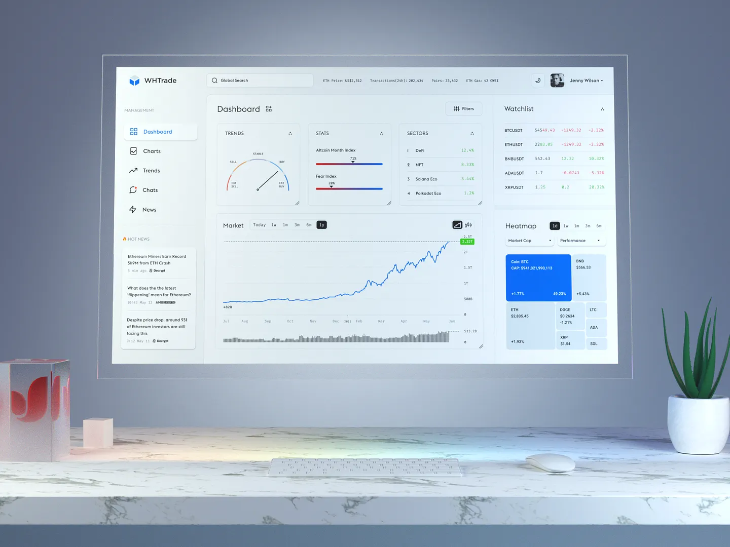
This trading dashboard features real-time portfolio analytics and stock performance tracking. Its clean layout, vibrant colors, and intuitive navigation make it easy to track investments and market trends.
Check out this example on Dribbble.
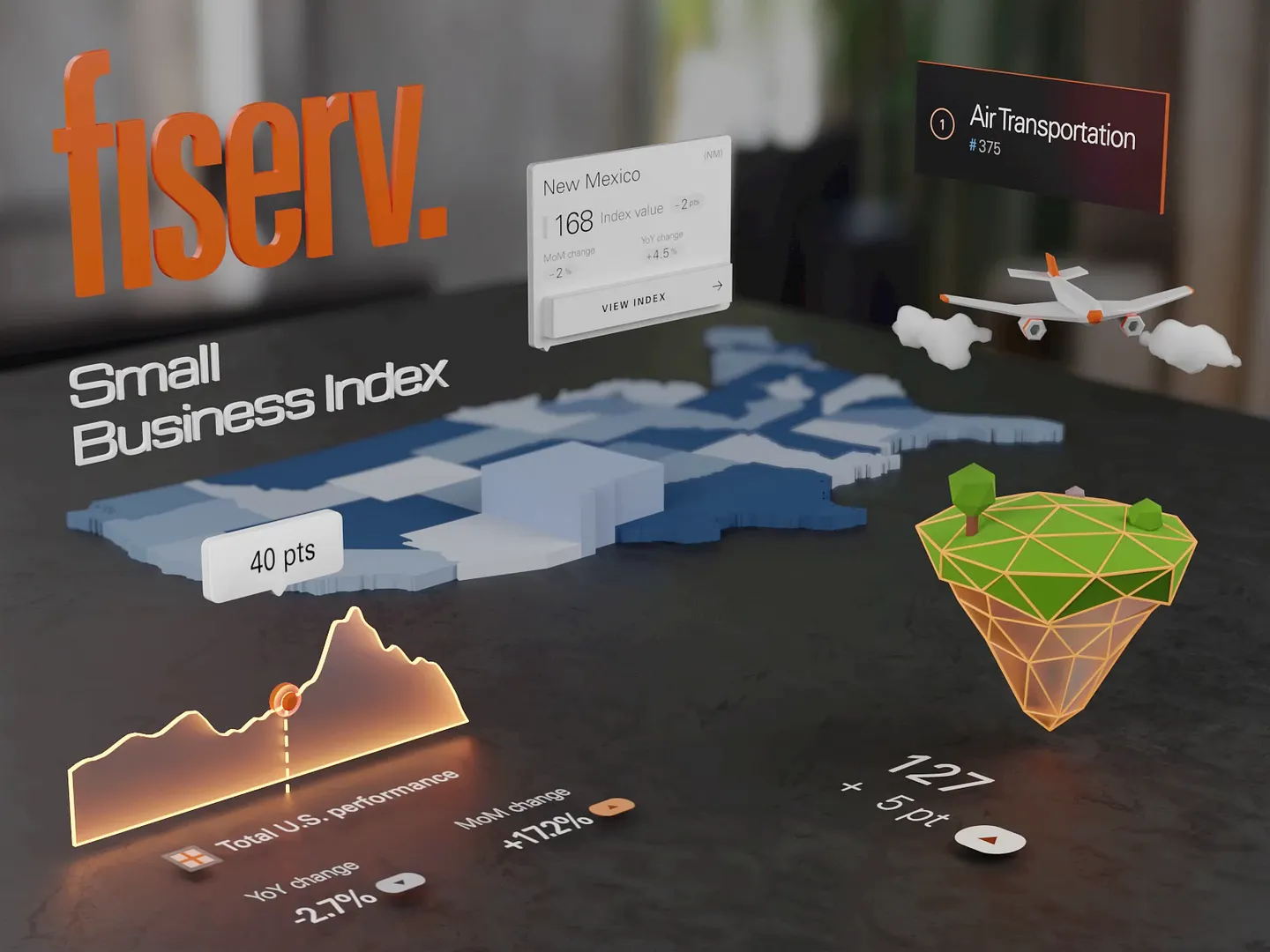
This finance management app features a dynamic layout with 3D elements, vibrant colors, and engaging graphics. It effectively communicates complex data insights, making it easier for users to understand financial trends and performance metrics.
Check out this example on Dribbble.

This interactive chart design visualizes CO₂ emissions breakdown with vibrant colors and clear segments, representing different emission sources. Unique features include the ability to pin key categories and view detailed subcategories, making complex data easily digestible.
Check out this example on Dribbble.

This modern financial dashboard features vibrant colors and intuitive layouts, using dynamic graphs and clear visual indicators to enhance user engagement. It effectively tracks budgets, transactions, and investments, making financial management straightforward and visually appealing.
Check out this example on Dribbble.

Designers and developers, elevate your interactive chart designs with Subframe's drag-and-drop interface and intuitive, responsive canvas. Loved by professionals, Subframe ensures pixel-perfect UI every time.
Ready to transform your data visualization? Start for free today!
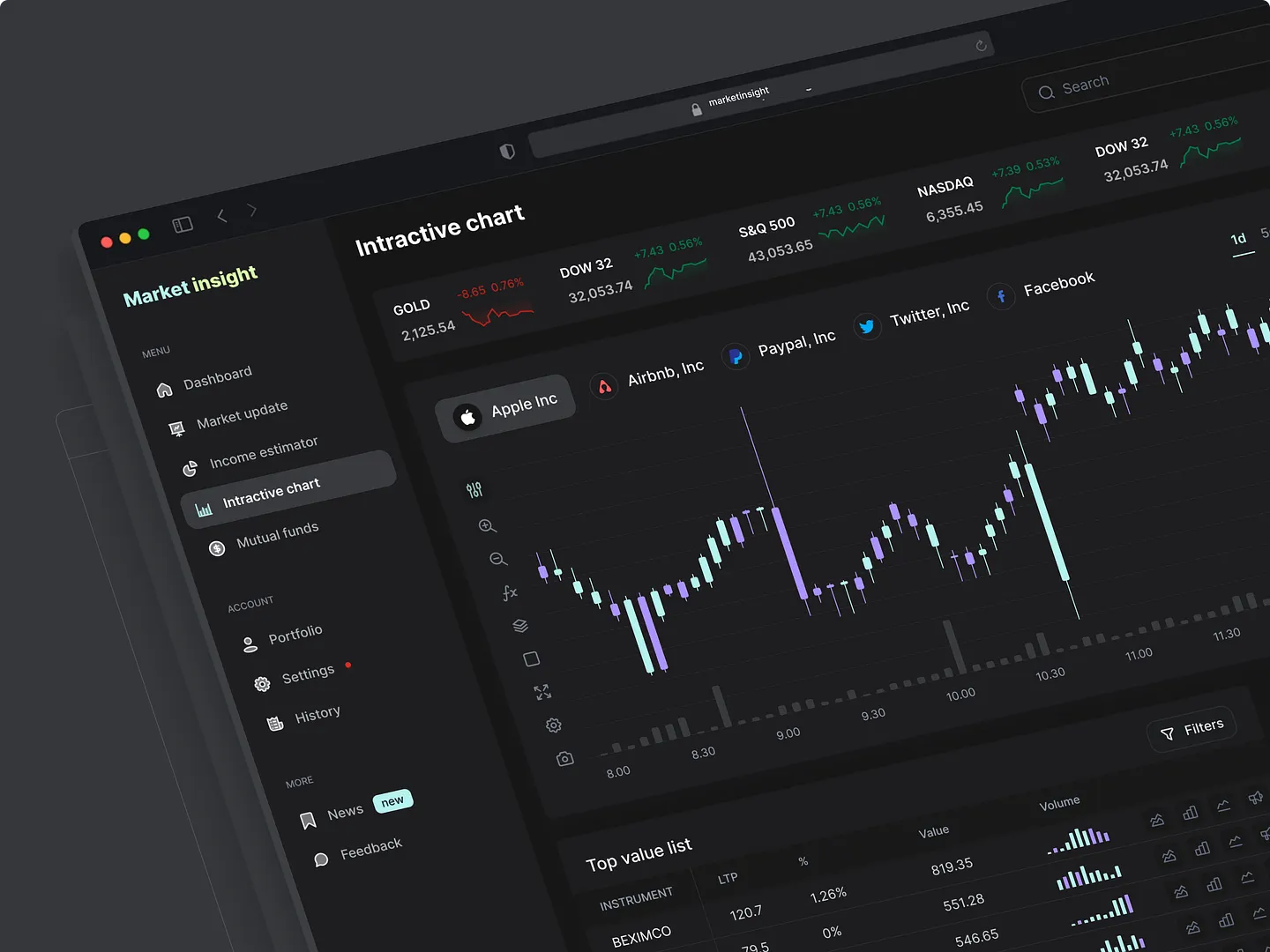
This modern interactive chart design enhances user engagement with real-time data visualization. Featuring a dark theme, vibrant color accents, and intuitive layouts, it effectively presents market trends and stock performance, making it an essential tool for financial analysis.
Check out this example on Dribbble.
This interactive trading dashboard features real-time data visualization, customizable layouts, and engaging color schemes. It enhances user experience and decision-making in financial markets with its flexible widgets and minimal visual noise.
Check out this example on Dribbble.
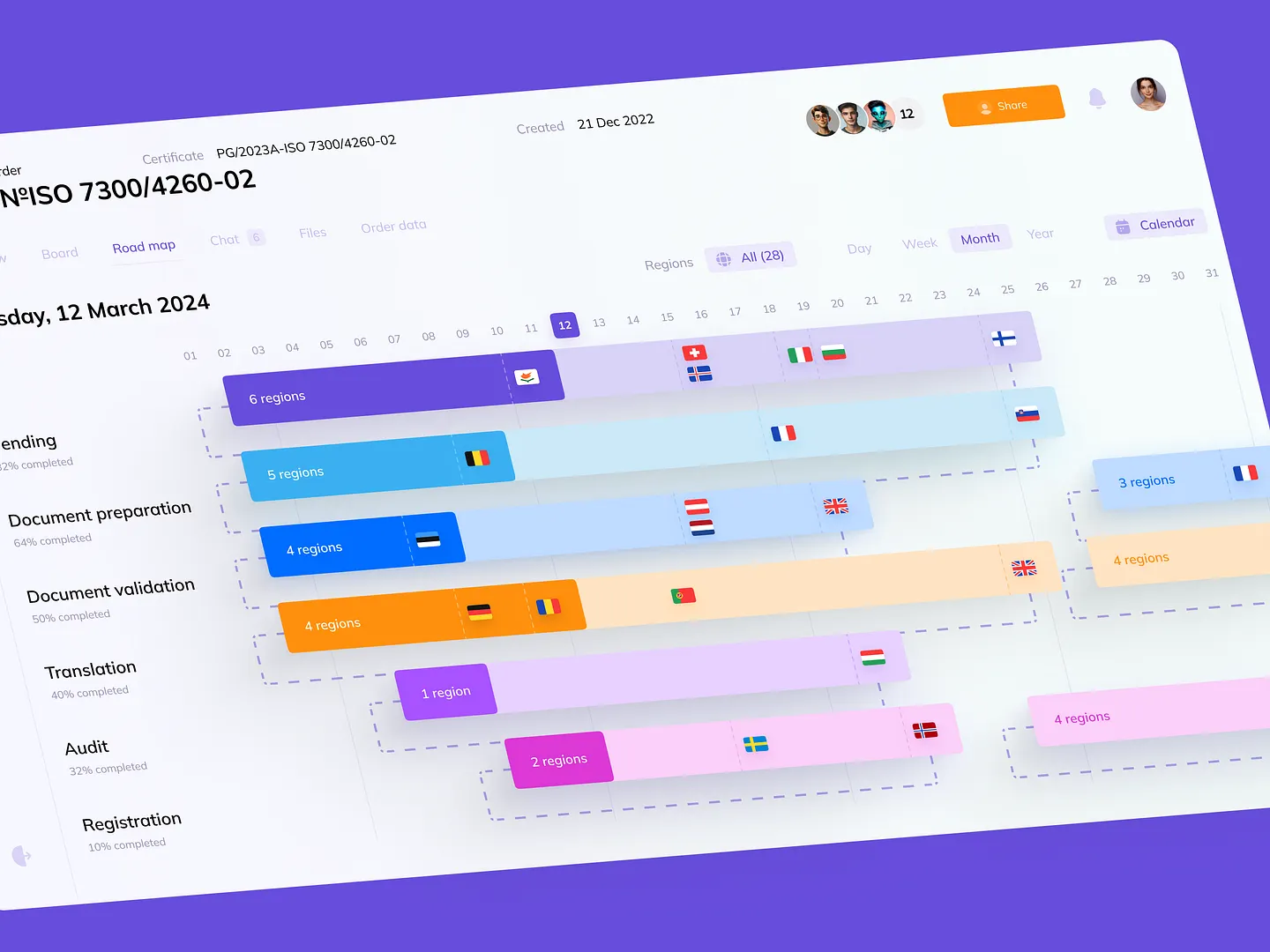
This interactive chart design for project timelines in SaaS platforms uses vibrant colors and clear segmentation to represent tasks and regions, making it easy to track progress and deadlines. Unique features include customizable layouts and real-time updates.
Check out this example on Dribbble.
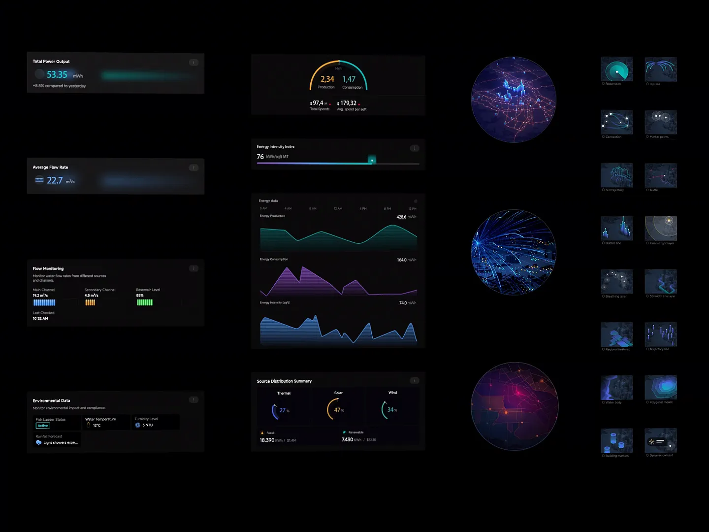
This interactive chart design presents energy data with sleek, dark-themed visuals. Dynamic graphs and gauges offer real-time insights into power output, flow rates, and environmental metrics, enhancing user engagement and understanding of energy consumption and production trends.
Check out this example on Dribbble.

This game dashboard's interactive chart design showcases player statistics and progress with vibrant visuals and an intuitive layout. Unique features include real-time updates and customizable views, enhancing user engagement and making data interpretation seamless and enjoyable.
Check out this example on Dribbble.

This energy management dashboard features a sleek layout with vibrant color-coded data visualizations, effectively communicating energy consumption, generation, and efficiency metrics. Unique elements include real-time updates and intuitive navigation, making complex data easily digestible for users.
Check out this example on Dribbble.

This dark mode insight widget features a sleek, minimalist layout with a dynamic spending graph that clearly communicates financial trends. Its intuitive design makes data interpretation engaging and straightforward for users.
Check out this example on Dribbble.
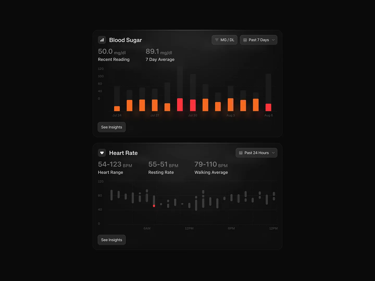
This innovative interactive chart design in dark mode highlights blood sugar and heart rate data with vibrant colors, making it easy to track trends over time. The sleek visuals emphasize clarity and user engagement, perfect for health monitoring applications.
Check out this example on Dribbble.
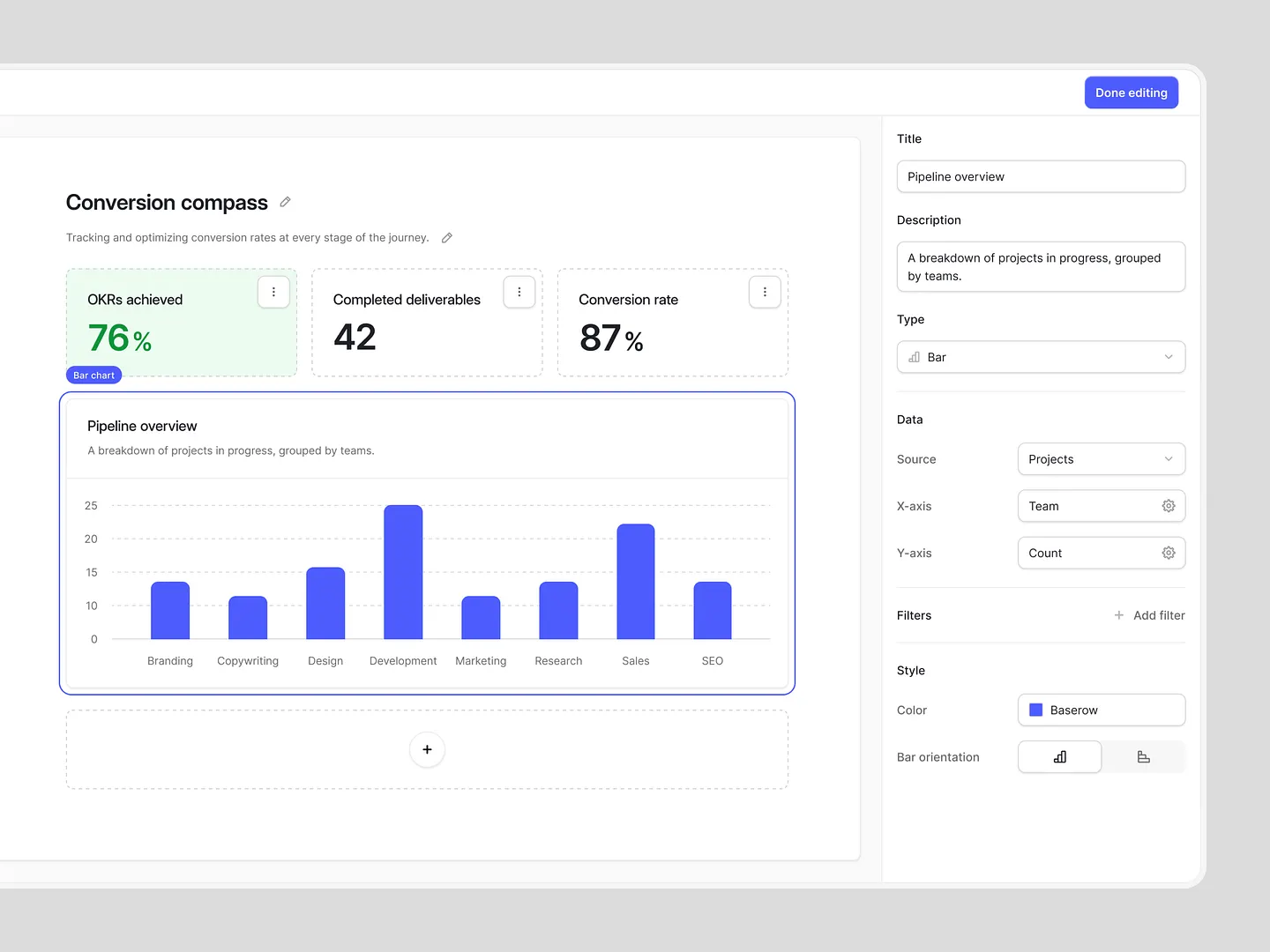
This interactive bar chart showcases project progress across various teams with a vibrant blue color scheme, enhancing visual appeal and clarity. Its user-friendly layout allows easy interpretation of key metrics and performance indicators, making data presentation effective and engaging.
Check out this example on Dribbble.
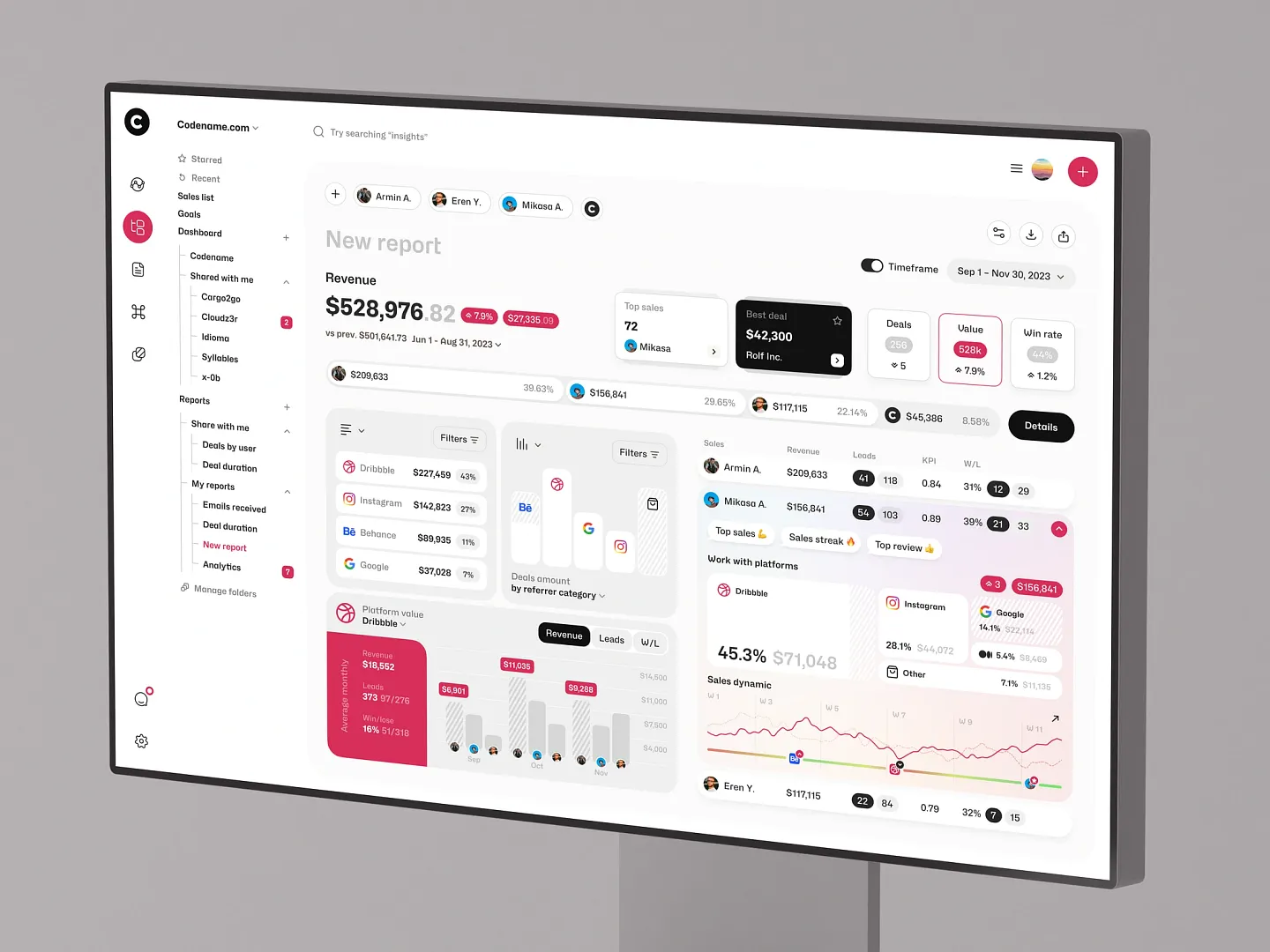
This sales tracking dashboard features vibrant colors and intuitive layouts, effectively visualizing revenue, leads, and sales dynamics. Unique elements include multi-channel data aggregation and interactive charts, enhancing user engagement and data comprehension.
Check out this example on Dribbble.
Ready to design your own interactive chart? Subframe streamlines the process with its intuitive interface and responsive canvas, making it easy to achieve professional, pixel-perfect results quickly.
Elevate your data visualization game today. Start for free!
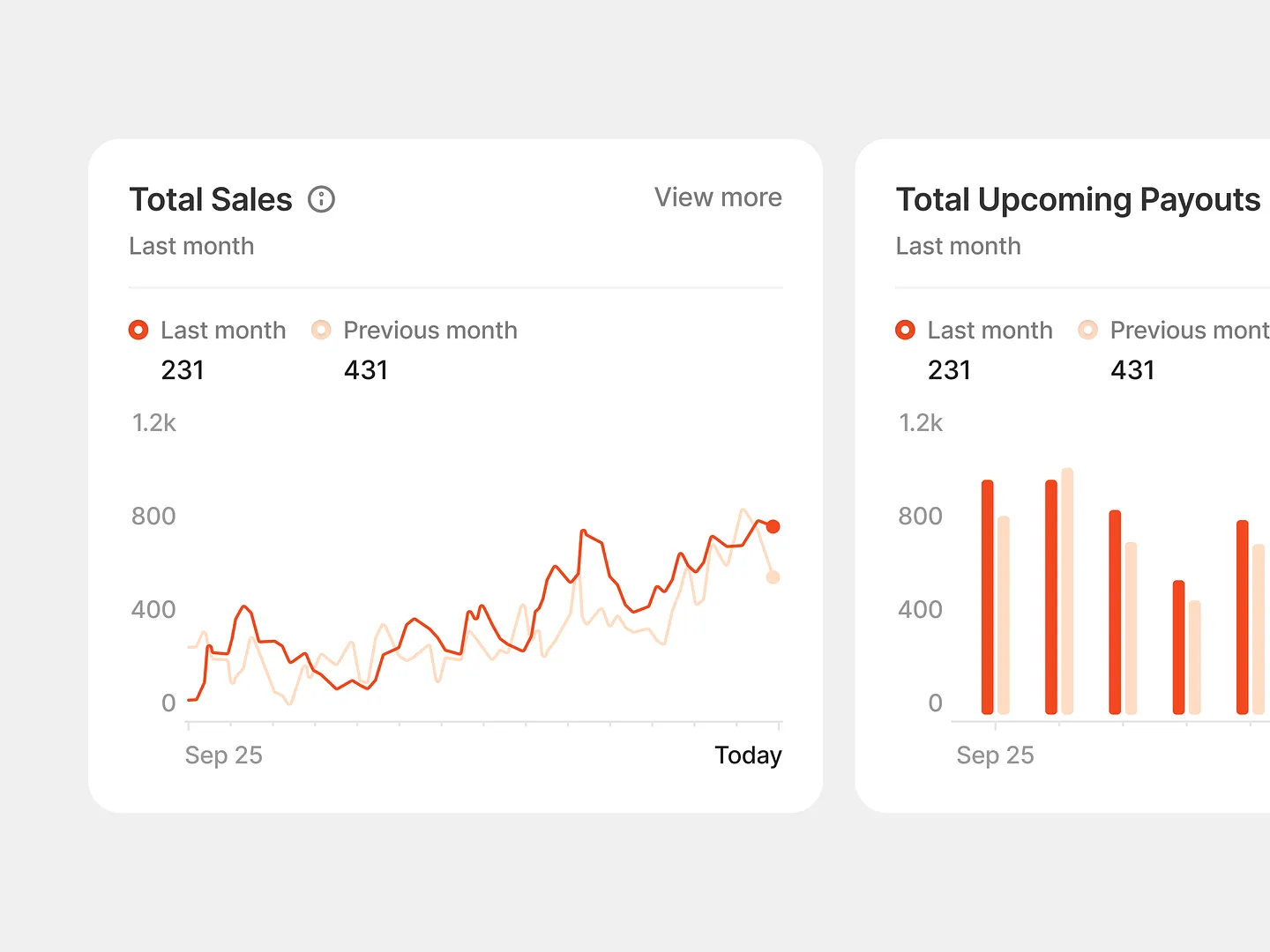
This interactive chart design blends line and bar graphs with a warm palette of reds and oranges to clearly show total sales and upcoming payouts. Unique features include dynamic elements that enhance user engagement and data comprehension.
Check out this example on Dribbble.

This sales analytics dashboard visualizes key metrics like gross revenue, order value, and transaction activity using engaging graphs and heat maps. Unique features include dynamic elements that enhance user experience and data comprehension.
Check out this example on Dribbble.

This sleek and modern interactive chart design in the crypto swap dashboard emphasizes user-friendly navigation with clear visuals. It showcases real-time trading data and price trends, combining functionality with aesthetic appeal, ideal for cryptocurrency enthusiasts.
Check out this example on Dribbble.

This business metrics dashboard features vibrant colors and clear visualizations, effectively communicating key data points like sales pipeline, subscriptions by product, and demographic insights. Unique elements include dynamic layouts and intuitive navigation, enhancing user engagement and data comprehension.
Check out this example on Dribbble.

This sales activity report features a sleek black background and vibrant green visuals, effectively communicating spending patterns over the week. Unique elements include dynamic layouts and intuitive navigation, making data interpretation engaging and straightforward.
Check out this example on Dribbble.
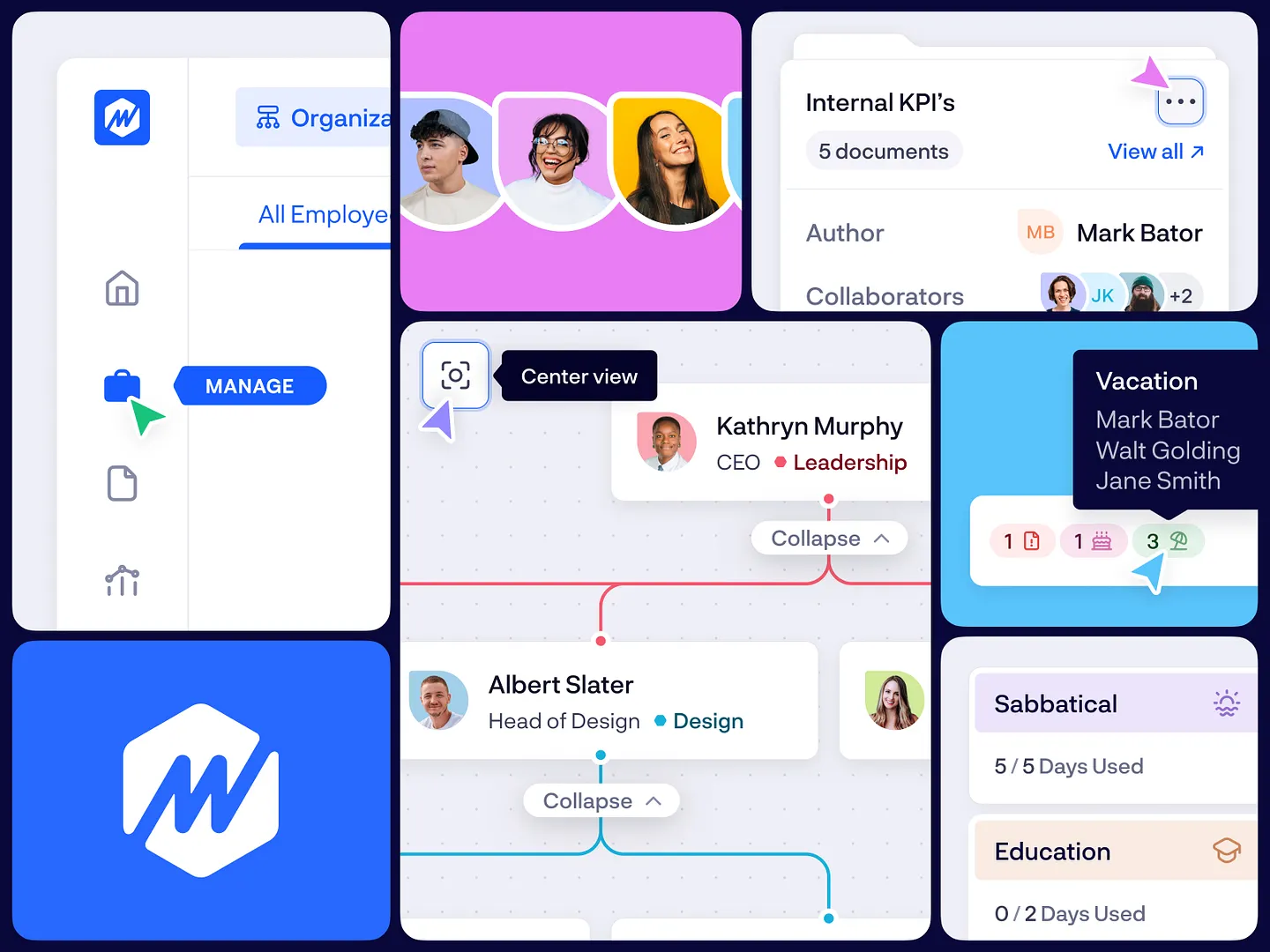
This innovative interactive chart design for HR management systems features a user-friendly interface with vibrant colors, intuitive layouts, and clear visual hierarchies. It simplifies navigating employee data and tracking key performance indicators, enhancing overall user experience.
Check out this example on Dribbble.

The Crewline flight attendant app features an innovative interactive chart design that visualizes flight statistics like mileage, hours, and flight counts. Engaging graphs and clear layouts enhance user experience and data comprehension, making it a standout tool.
Check out this example on Dribbble.

ChainGPT Labs' portfolio management interface features a sleek layout with vibrant colors and dynamic data visualization. Unique elements like real-time updates and intuitive navigation enhance user engagement and provide clear insights into project performance and growth metrics.
Check out this example on Dribbble.
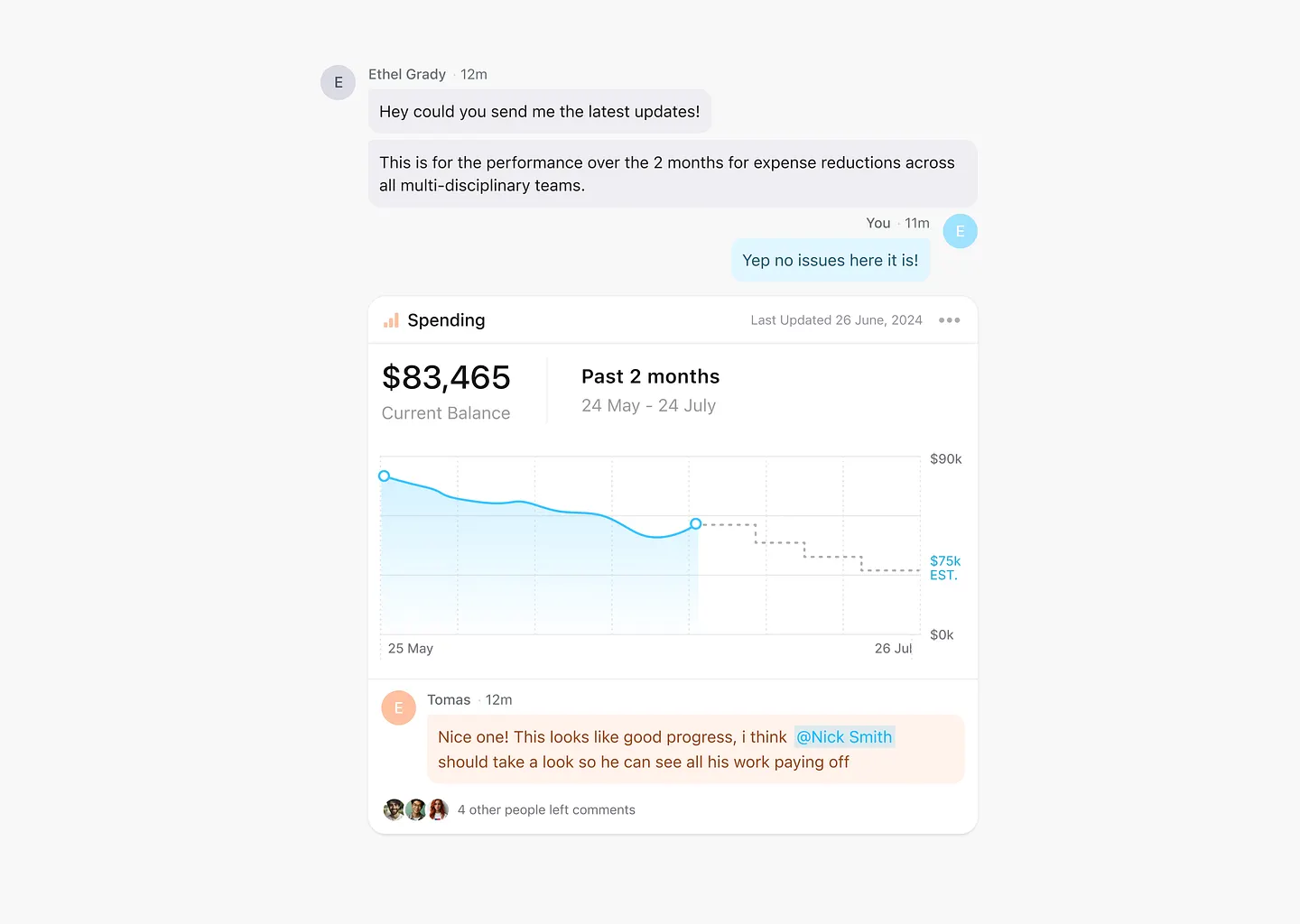
This innovative interactive chart design features a sleek layout that clearly shows spending trends over two months. Vibrant colors and intuitive navigation make complex data easily digestible, enhancing user engagement and comprehension.
Check out this example on Dribbble.

This sleek and modern interactive chart design in the crypto swap dashboard visualizes Bitcoin and Ethereum market data with a clean color palette and intuitive navigation. Real-time data and usability make it ideal for cryptocurrency trading platforms.
Check out this example on Dribbble.
In conclusion, designing interactive charts has never been easier or more efficient. With Subframe, you can create pixel-perfect UI immediately, ensuring your data visualizations are both stunning and functional.
Don't wait to elevate your data presentation. Start for free and begin creating your interactive charts right away!


