
In the digital age, the headline section of a website is more than just a title; it's the first impression that captures a visitor's attention. A well-designed headline section can make the difference between a user staying to explore further or bouncing off the page. It's the gateway to your content, setting the tone and providing a snapshot of what lies ahead.
Effective headline sections not only grab attention but also enhance the overall user experience. They guide visitors, highlight key information, and create a visual hierarchy that makes navigation intuitive. In this article, we'll explore 25 headline section design examples that showcase how thoughtful design can elevate your website's appeal and functionality.
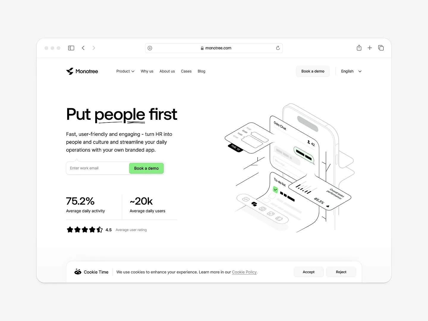
Monotree's headline section stands out with its clean, user-friendly layout. Bold typography and a clear call-to-action draw users in, while the minimalist aesthetic enhances engagement. Unique elements like ample white space and essential information make it effective.
Check out this example on Dribbble.
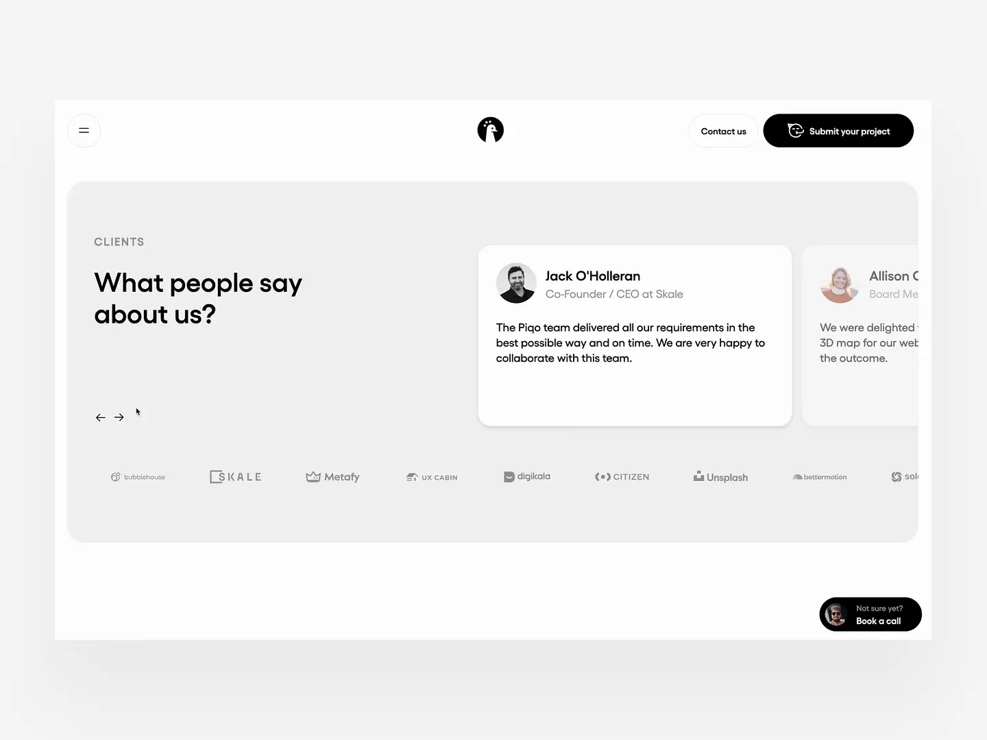
This headline section effectively showcases client testimonials with a clean, modern layout. Ample white space, bold typography, and subtle color contrasts enhance readability and draw attention to positive feedback, building trust and credibility.
Check out this example on Dribbble.
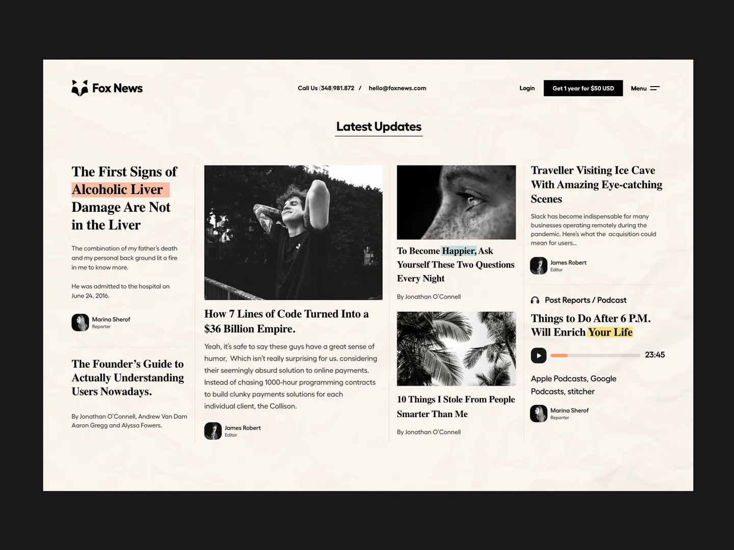
The headline section in this news website design features bold typography and a clean, modern aesthetic. Contrasting colors and strategic spacing enhance readability, drawing attention to key articles while maintaining a cohesive visual flow.
Check out this example on Dribbble.

This headline section effectively showcases testimonials from industry leaders, enhancing credibility and trust. Featuring a clean layout with diverse portraits, it utilizes a modern color palette and clear typography to draw attention, inviting visitors to explore success stories.
Check out this example on Dribbble.
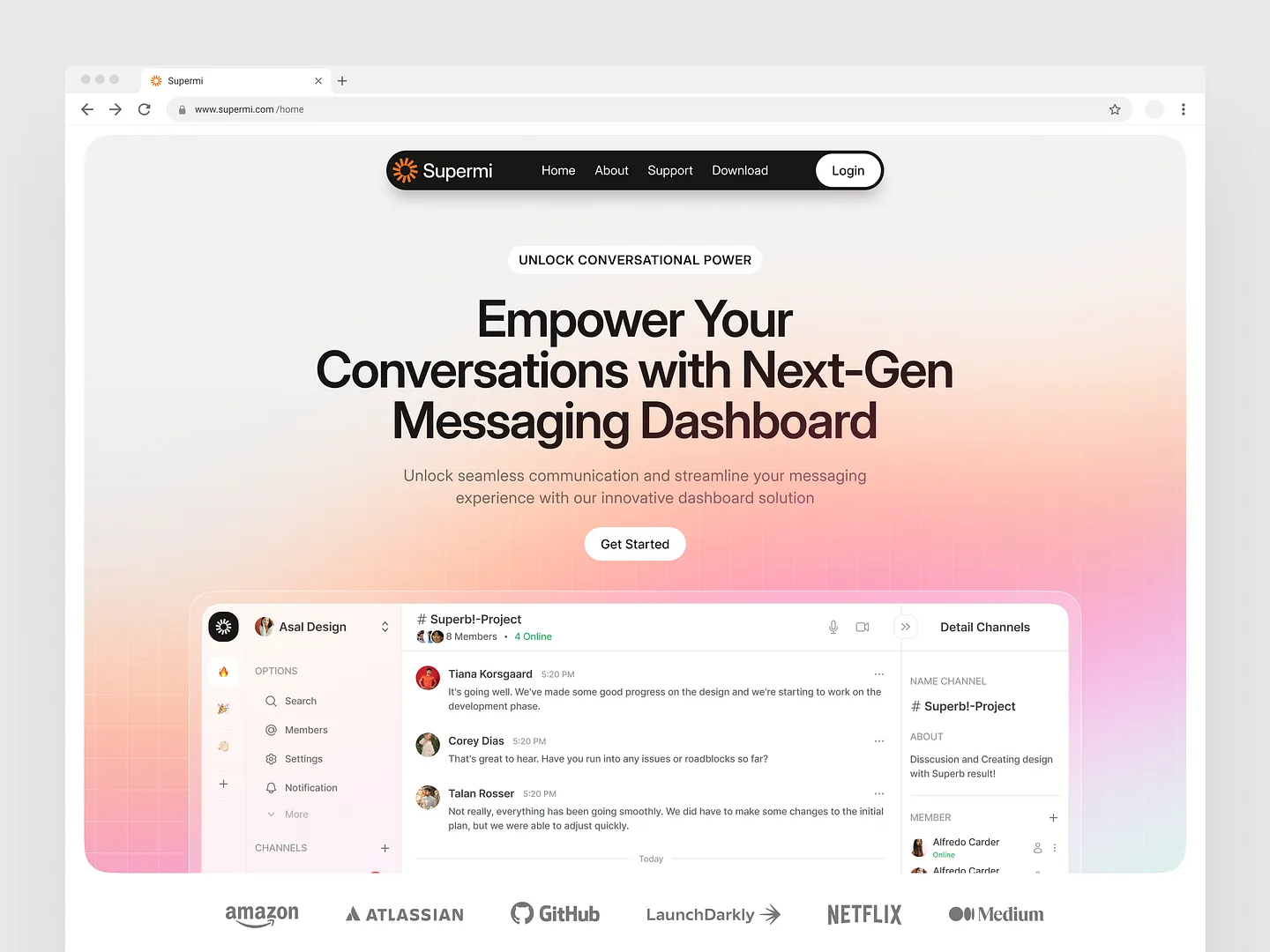
Supermi's headline section features a gradient background transitioning from soft pink to light orange. Bold typography emphasizes an empowering message, while a clean layout and intuitive navigation enhance user experience, making it a standout example of modern web design.
Check out this example on Dribbble.

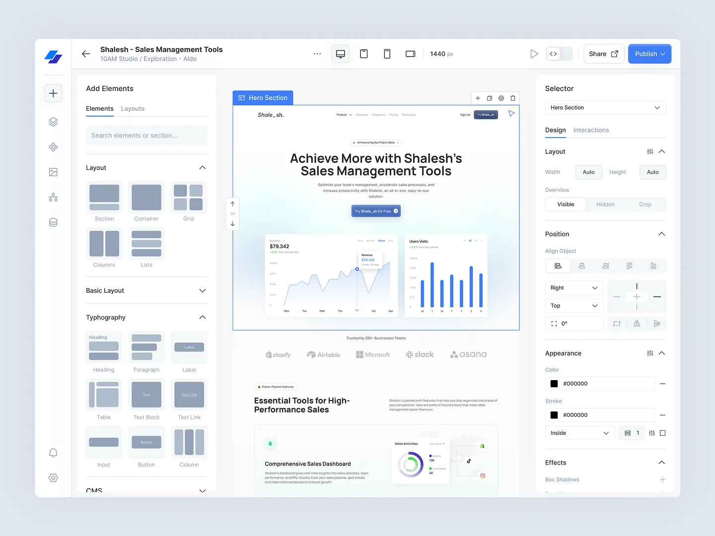
Designers and developers, elevate your headline sections with Subframe's drag-and-drop interface and intuitive, responsive canvas. Loved by professionals, Subframe ensures pixel-perfect UI every time.
Ready to transform your designs? Start for free today!

The headline section of the Pipelined CRM platform by Plainthing Studio features bold typography and a clean layout. Strategic use of color and clear calls to action enhance user engagement, effectively communicating the brand's message.
Check out this example on Dribbble.

TrustLine's headline section features a clean, modern layout with a bold title and concise messaging. The soothing color palette and intuitive design elements enhance user experience, effectively communicating the service's value proposition.
Check out this example on Dribbble.
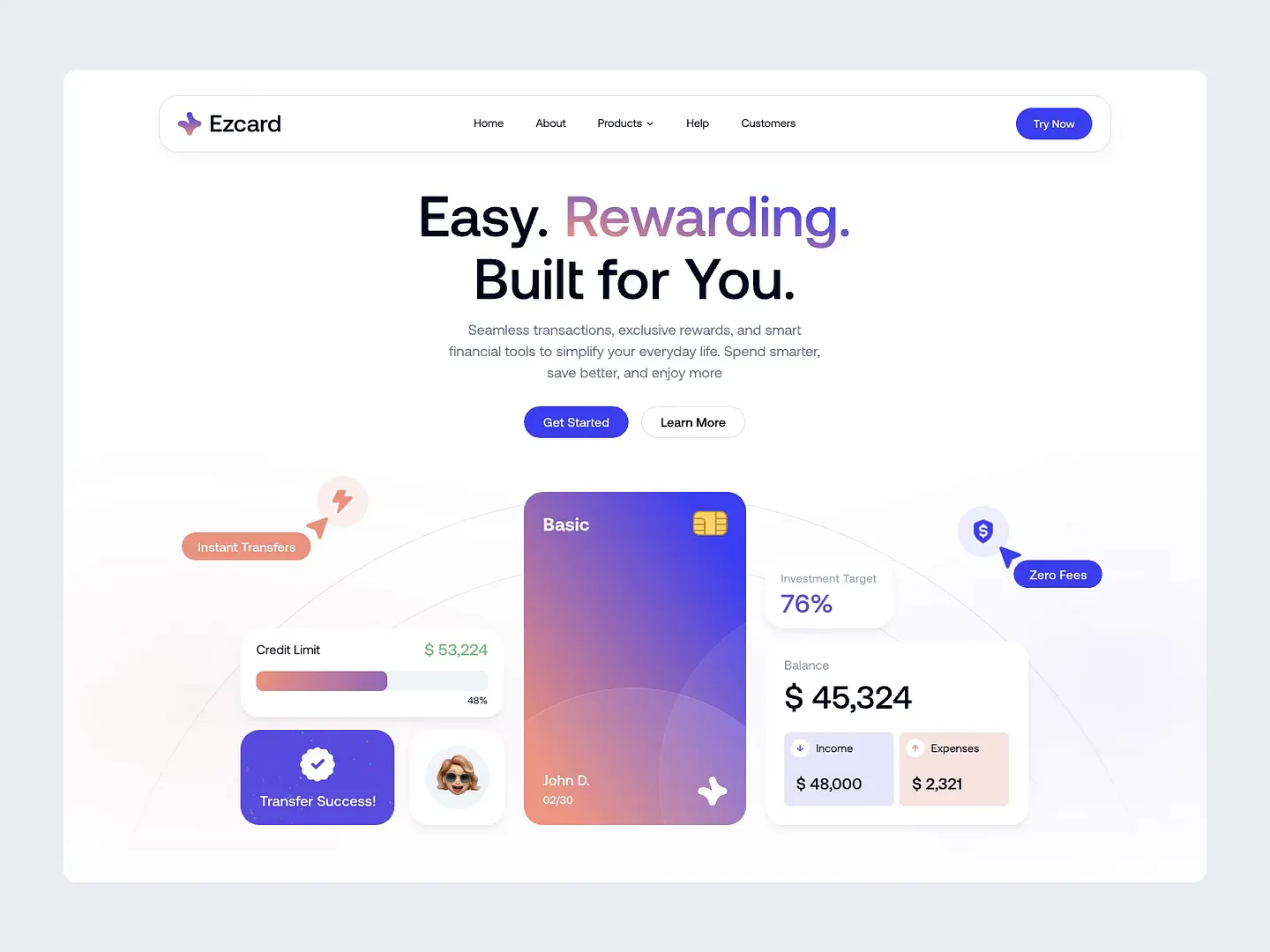
This headline section features a clean and modern layout, emphasizing user-friendly navigation and vibrant colors. Bold typography and engaging visuals highlight key features like instant transfers and zero fees, creating an inviting atmosphere for potential users.
Check out this example on Dribbble.
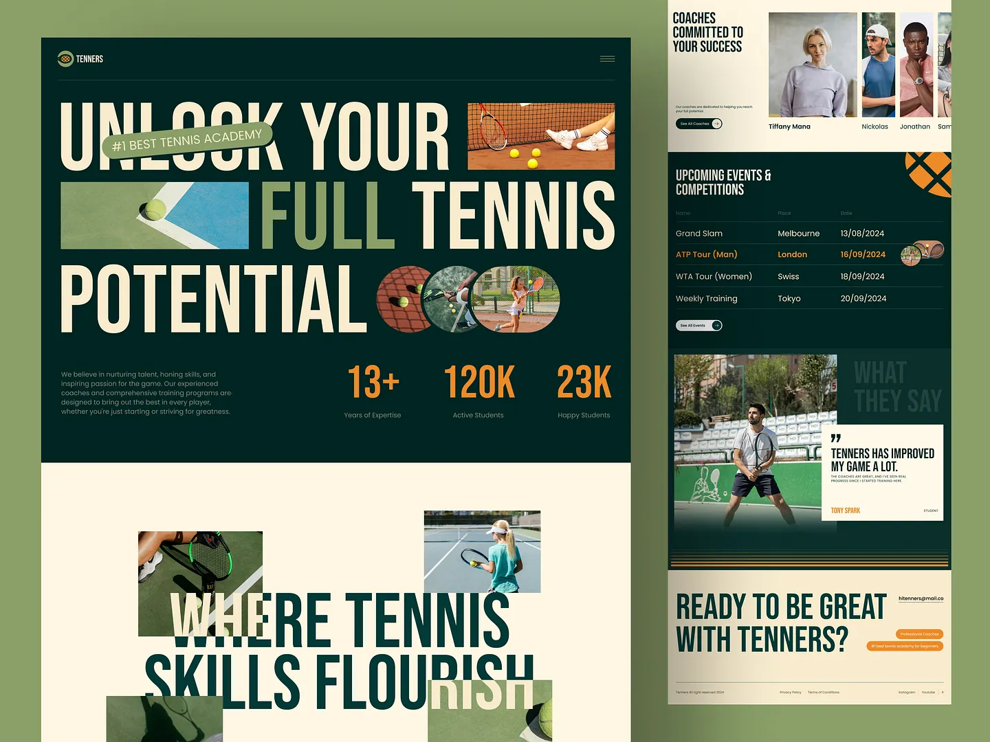
The headline section of Tenners Tennis Academy captivates with bold typography and vibrant visuals. It effectively communicates the academy's mission to unlock potential, featuring engaging statistics and a call to action that inspires aspiring players to join the community.
Check out this example on Dribbble.
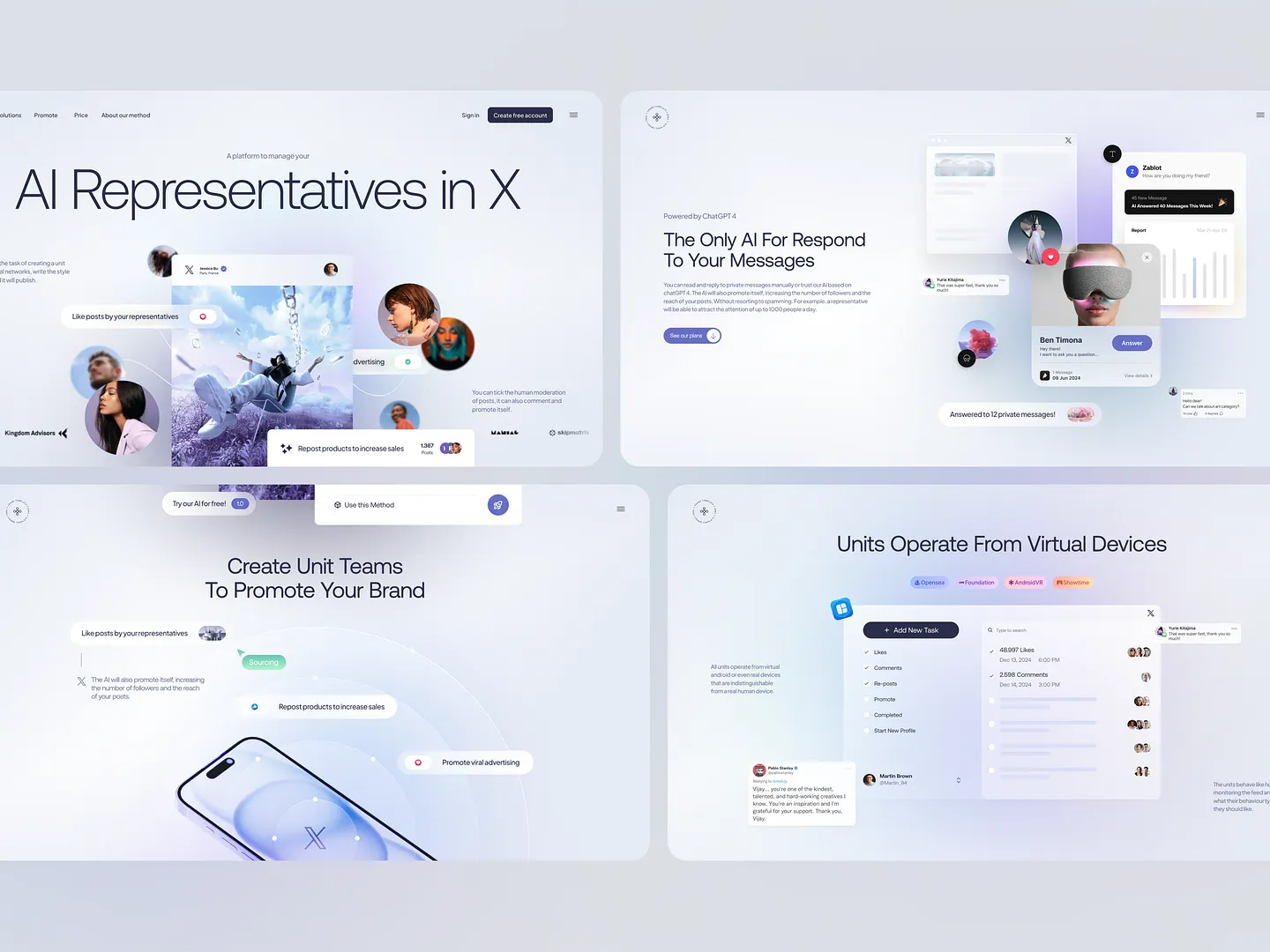
The AI Units headline section features bold typography and engaging visuals, creating a clean layout with a soft color palette. Interactive elements like buttons and links invite user engagement, ensuring clarity and focus on key messages.
Check out this example on Dribbble.
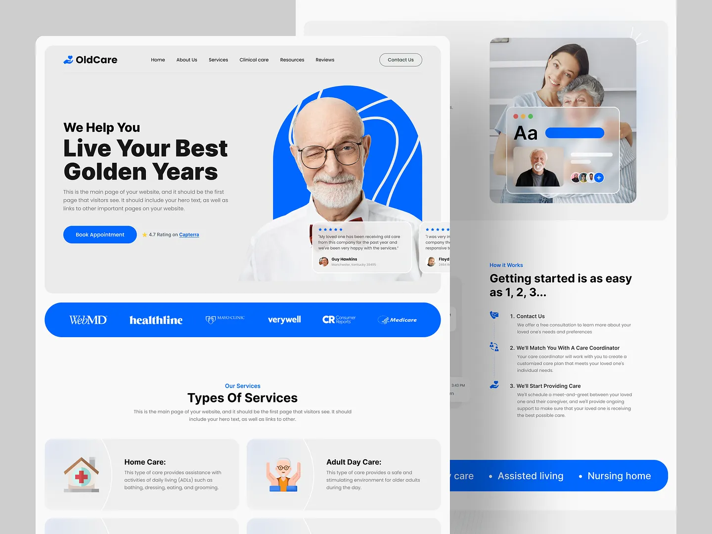
This headline section features a bold, inviting design that emphasizes the mission of helping seniors live their best lives. The clean layout, vibrant colors, and clear typography enhance readability, while the prominent call-to-action encourages visitors to book appointments easily.
Check out this example on Dribbble.

This headline section features a sleek, modern design with a gradient background that captures attention. Bold typography emphasizes the key message, while the call-to-action button invites users to engage, making it essential for driving conversions.
Check out this example on Dribbble.
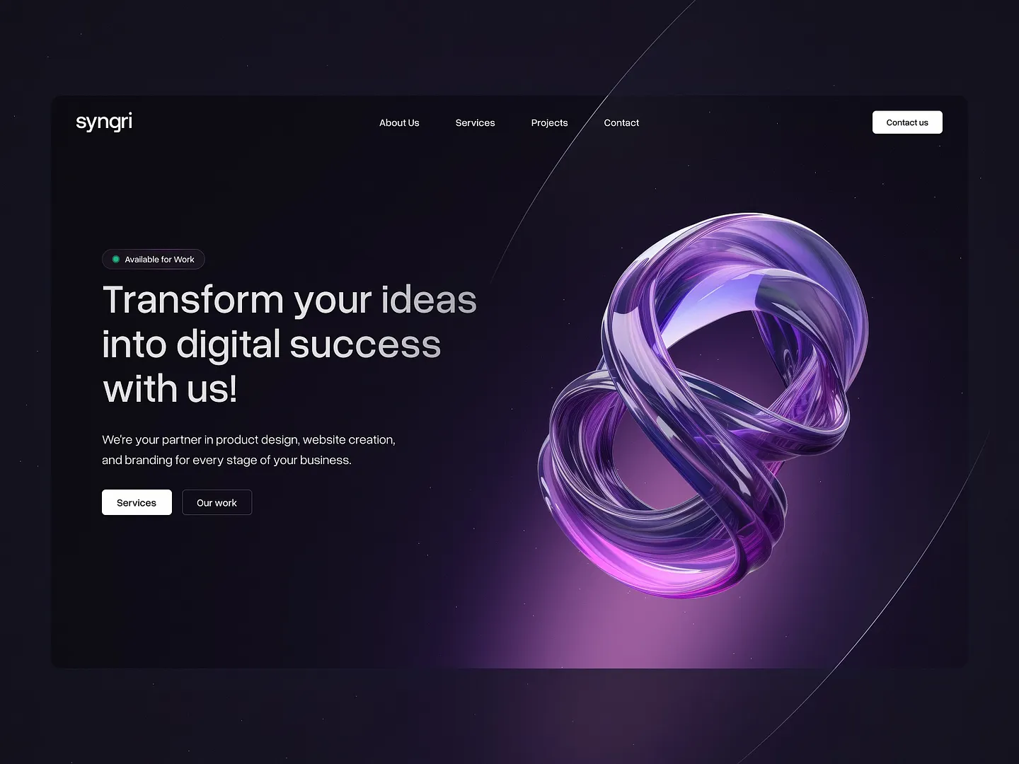
This headline section features a sleek, modern layout with a striking 3D abstract graphic in vibrant purple hues. Bold typography and a minimalist aesthetic create an engaging focal point, effectively communicating the brand's commitment to innovation and creativity.
Check out this example on Dribbble.
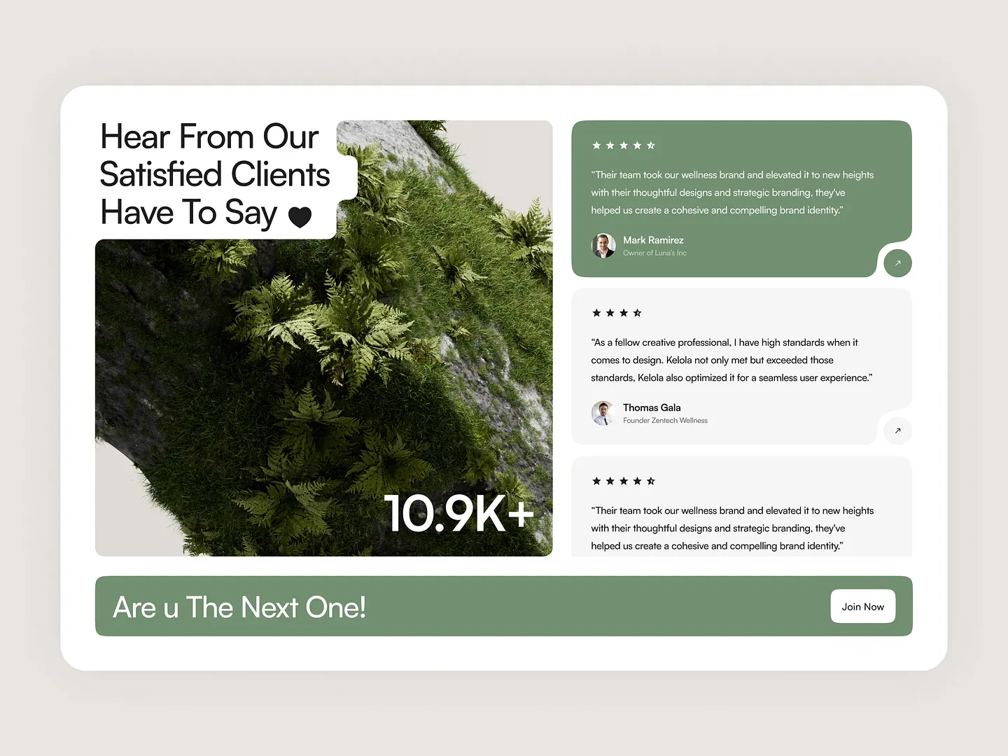
This headline section showcases client testimonials with a modern design that emphasizes user experience. Vibrant greens and earthy textures create a calming aesthetic, while the clear layout and engaging typography highlight positive feedback, inviting potential clients to connect.
Check out this example on Dribbble.
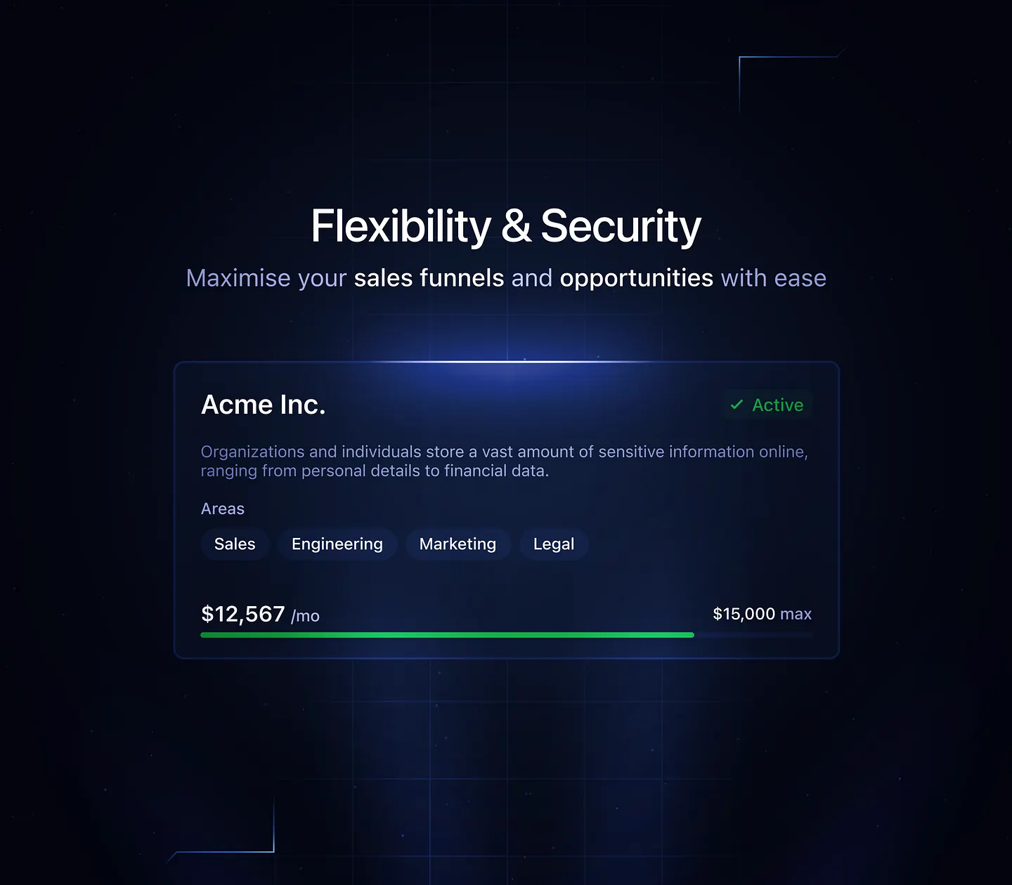
This sleek dark UI headline section emphasizes flexibility and security, perfect for showcasing sales funnels. The modern design features a clean layout with highlighted areas of focus, ensuring that sensitive information is presented clearly and effectively.
Check out this example on Dribbble.
Ready to design your own headline section? Subframe streamlines the process with its intuitive interface and responsive canvas, making it easy to achieve professional, pixel-perfect results quickly.
Join the community of designers and developers who trust Subframe for their projects. Start for free today!
This headline section design captures attention with a clean aesthetic, focusing on typography and visual hierarchy. Contrasting colors and strategic positioning highlight key information, enhancing user engagement and driving conversions.
Check out this example on Dribbble.
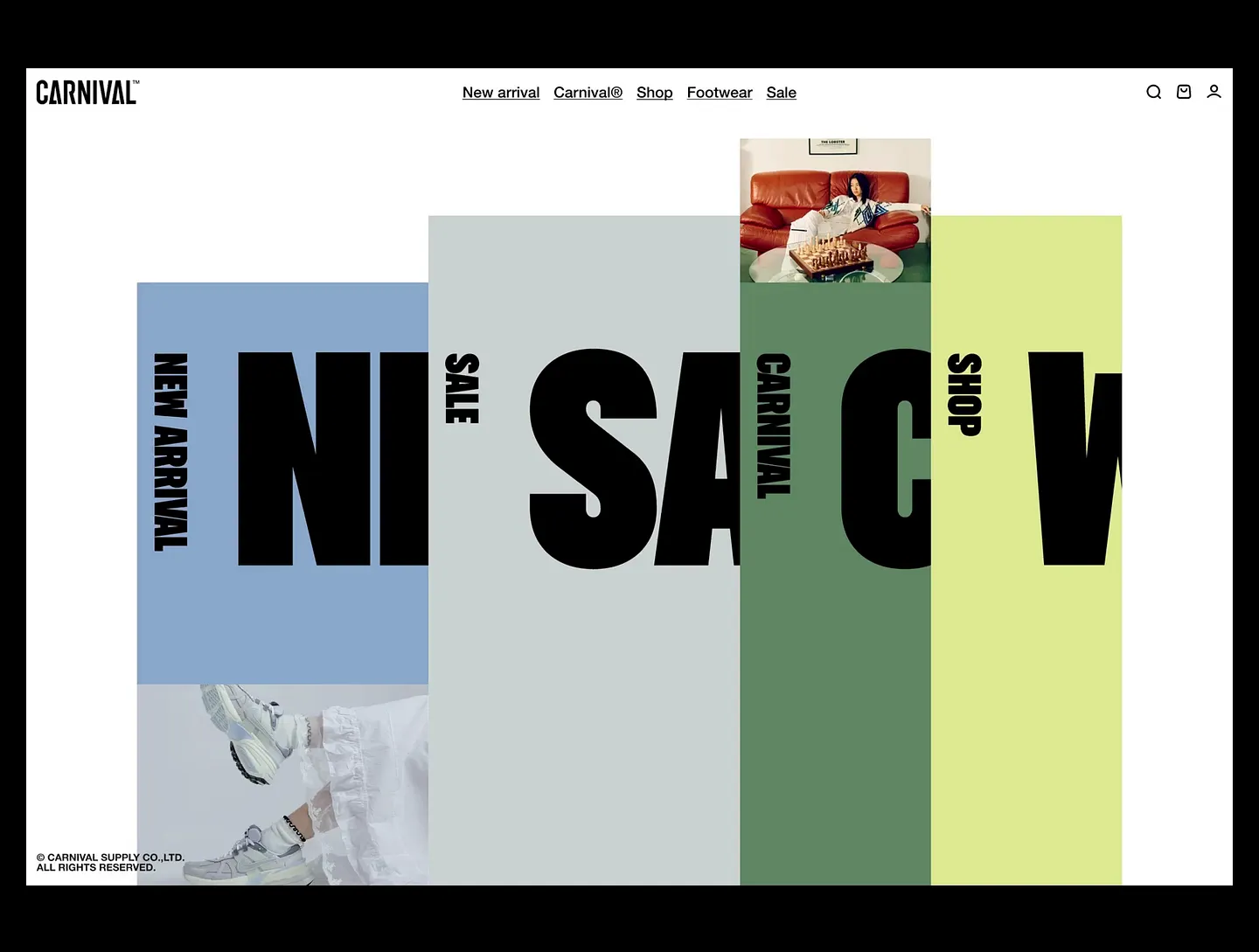
Carnival™'s headline section features bold typography and a vibrant color palette, effectively highlighting key categories like 'New Arrival' and 'Sale.' The engaging visual hierarchy draws users in and enhances navigation, making it easy to explore the site.
Check out this example on Dribbble.
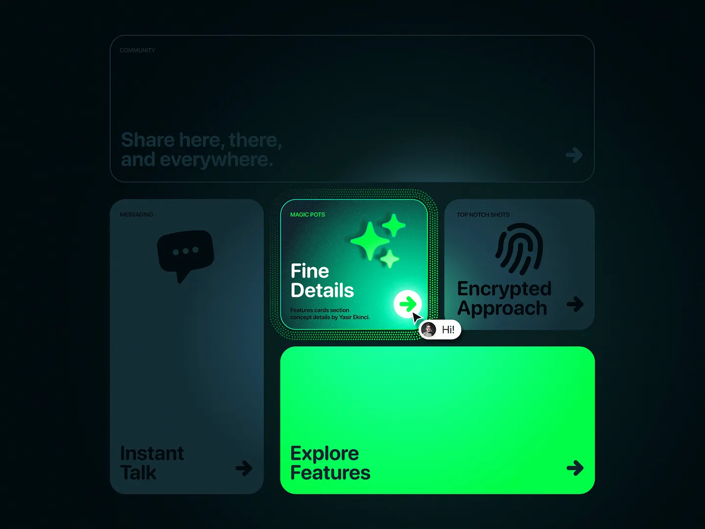
This headline section uses vibrant green accents against a dark background, creating a striking contrast that draws attention. Intuitive navigation elements and modern typography highlight key features, maintaining a sleek, user-friendly interface.
Check out this example on Dribbble.
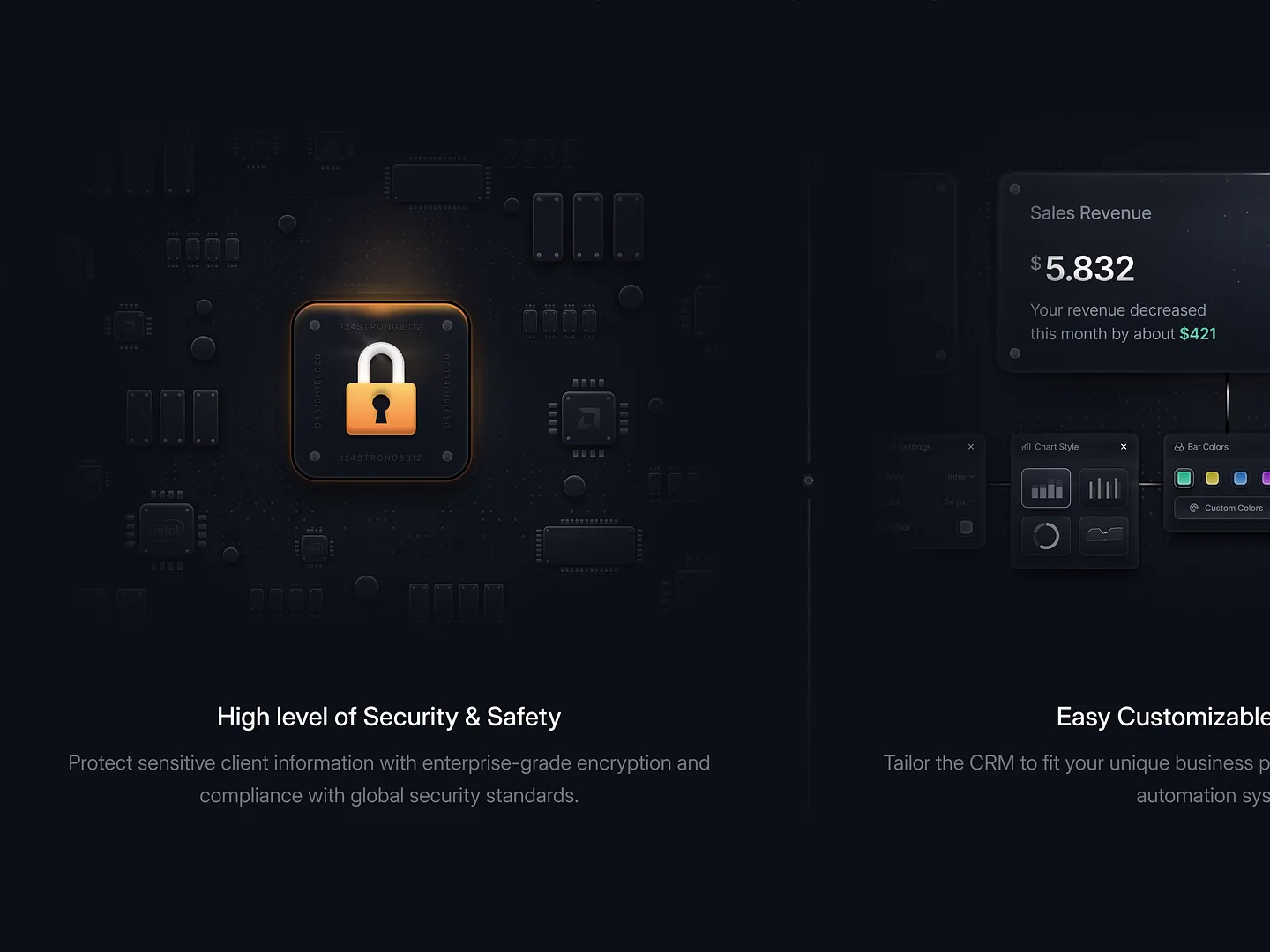
This headline section for SaaS websites features a sleek lock icon against a dark background, symbolizing robust protection. The clean, modern layout ensures key information stands out, enhancing user engagement and trust with a focus on security and customization.
Check out this example on Dribbble.
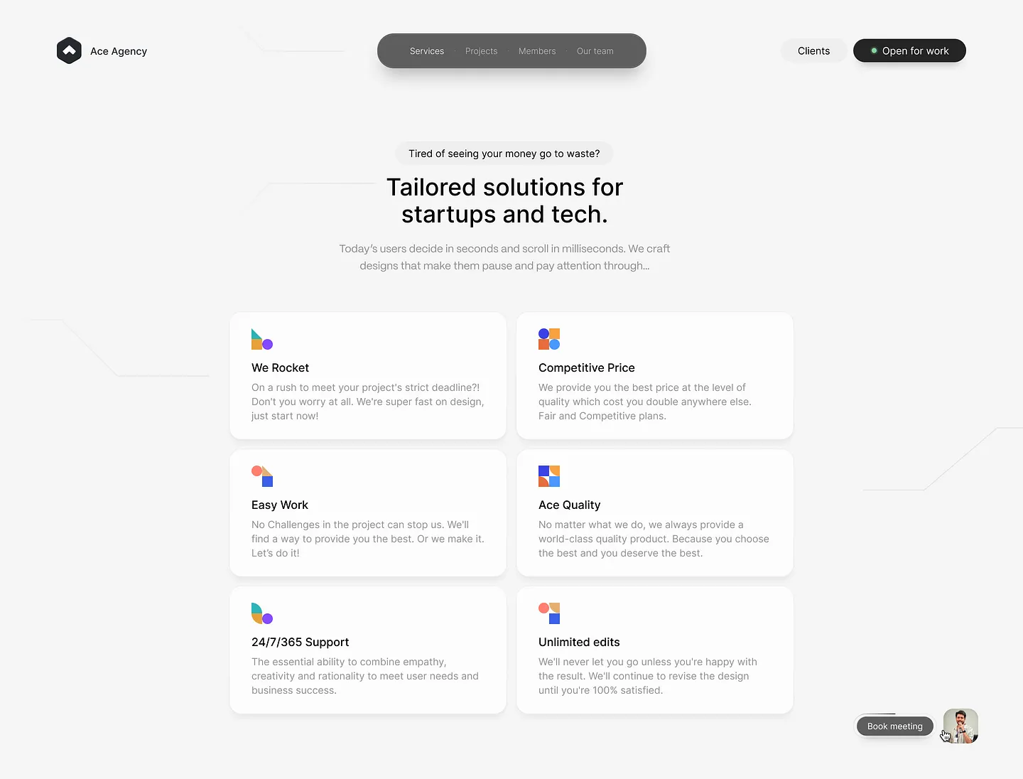
This headline section captivates visitors with a clean, modern design that emphasizes tailored solutions for startups and tech. Bold typography and vibrant icons effectively communicate key services like fast project delivery, competitive pricing, and unlimited edits, ensuring users are drawn in and informed at a glance.
Check out this example on Dribbble.
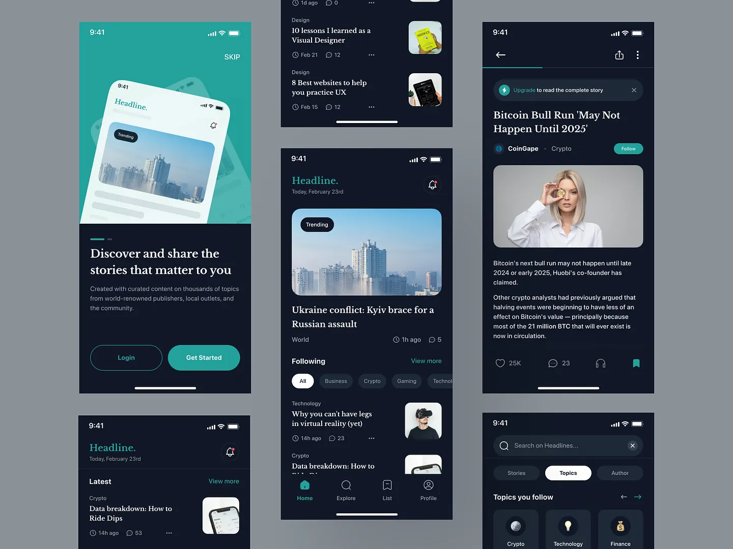
This headline section for news applications features a sleek dark mode aesthetic, emphasizing readability with clear typography and engaging visuals. Unique elements like intuitive navigation and trending topics make it easy for users to explore curated content.
Check out this example on Dribbble.
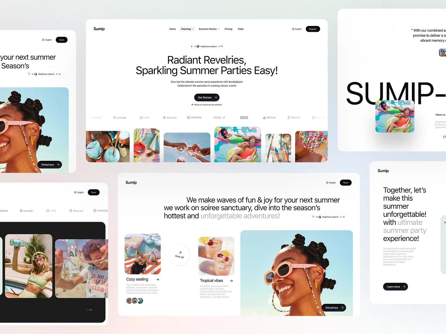
Sumip's headline section for summer events features bold typography and vibrant imagery, capturing attention and conveying fun and joy. Unique elements like playful language and engaging visuals make it perfect for promoting unforgettable summer parties.
Check out this example on Dribbble.
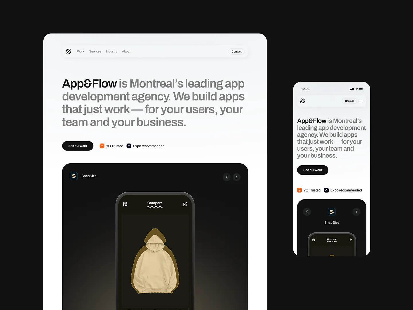
This headline section design features a sleek layout with bold typography and a dark theme, effectively highlighting key messages while maintaining a clean aesthetic. Unique elements like intuitive navigation and strategic use of whitespace make it stand out.
Check out this example on Dribbble.
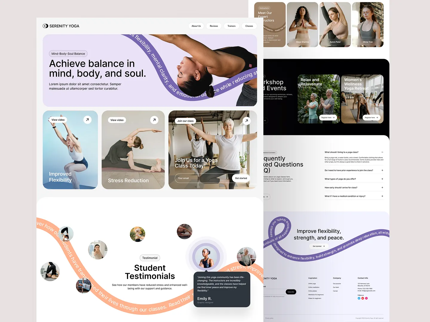
This headline section captivates visitors with a soothing color palette and inviting typography, emphasizing the balance of mind, body, and soul. Dynamic visuals and clear calls to action encourage users to explore classes and workshops, promoting improved flexibility and stress reduction.
Check out this example on Dribbble.
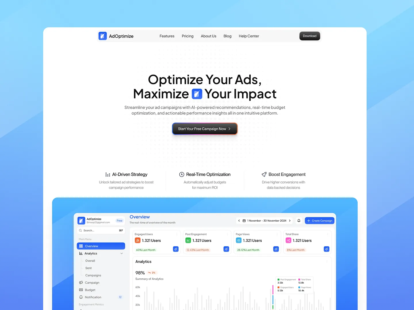
The headline section of the AdOptimize landing page features a clean, modern layout with a bold, engaging title that captures attention. Utilizing a harmonious color palette of blues and whites, it effectively communicates the platform's value proposition while ensuring easy readability and a user-friendly experience.
Check out this example on Dribbble.
Designing an effective headline section is crucial for capturing your audience's attention and enhancing user experience. With Subframe, you can achieve this effortlessly, thanks to its intuitive interface and responsive canvas.
Ready to create pixel-perfect UI immediately? Start for free and experience the efficiency and ease of Subframe. Begin designing your headline section today!


