Looking for Headless UI alternatives? Compare top react component libraries with unique features, pricing, and benefits to find your ideal match.
Irvin Zhan
•
2025-01-13
For developers seeking alternatives to Headless UI, a variety of options are available that cater to different needs and preferences. This article explores ten such alternatives, each offering unique features and capabilities.
Whether you're looking for more customization, better documentation, or specific functionalities, these alternatives provide a range of choices to suit your project requirements. Dive in to discover the best fit for your next development endeavor.
What is Headless UI?
Headless UI provides unstyled, fully accessible UI components designed to integrate seamlessly with Tailwind CSS. The library offers a range of components, including Dropdown Menu, Disclosure, Dialog, Popover, Tabs, and Transition.
Additionally, it features various form elements like Button, Checkbox, Combobox, Fieldset, Input, Listbox, Radio Group, Select, Switch, and Textarea. These components are built to ensure usability for all users while allowing full customization.
What to Consider When Selecting a Headless UI Alternative?
Customization Options: The ability to fully customize components to match your project's design requirements is crucial. Look for libraries that offer unstyled components or extensive theming capabilities.
Accessibility: Ensure the library adheres to accessibility standards like WCAG. Features such as keyboard navigation, screen reader support, and compliance with accessibility guidelines are essential.
Component Variety: A wide range of components can save time and effort. Libraries with a comprehensive set of UI elements, from basic buttons to complex data tables, are more versatile.
Integration Capabilities: The ease with which the library integrates with other tools and frameworks, such as Tailwind CSS or React, can significantly impact your workflow. Seamless integration ensures a smoother development process.
Community and Support: An active community and robust support system can be invaluable. Look for libraries with extensive documentation, active forums, and responsive customer support to help troubleshoot issues and share best practices.
Best Alternatives to Headless UI in 2025
1) Subframe
Subframe is a code-first design tool for building user interfaces quickly and efficiently. It features beautifully crafted components, a drag-and-drop visual editor, and generates pixel-perfect React + Tailwind code. With real-time collaboration and responsive design, Subframe empowers teams to create stunning UIs seamlessly.
Pros of Using Subframe
Subframe offers a range of advantages that make it a standout choice for UI development.
Design with real components: Utilize a visual UI editor that allows for drag-and-drop functionality on a responsive canvas, ensuring pixel-perfect results every time.
Stunning UI templates: Access a collection of templates inspired by world-class products, crafted by designers, and built with reusable components, so you never have to start from scratch.
High-quality code: Skip the handoff process by copying and pasting front-end code directly into your codebase, allowing you to focus more on building and less on pixel-pushing CSS.
Free UI building: Start building your user interfaces visually without any upfront costs or the need for a credit card.
Personalized templates: Enjoy templates that are tailored to your specific needs, making the design process more efficient and customized.
These are just a few of Subframe's many features. Check them out here to learn more.
Who Should Use Subframe?
Subframe targets a diverse range of users, including founders, designers, developers, and non-technical individuals who need to ship frontend code quickly. It is particularly beneficial for startups, growing teams, freelancers, and large companies that require high-quality UI solutions without extensive frontend expertise.
Subframe Pricing
Subframe offers three pricing options:
Free: $0 per user/month
Pro: $29 per user/month
Custom: Contact support for pricing
Subframe Reviews
Subframe has received glowing reviews from its users, earning a perfect score of 5 out of 5. Users consistently praise the platform for its ease of use and exceptional support. One user noted, "Huge shoutout to Subframe guys! Super easy to create UI, and the support is great. Highly recommend!" Another user shared, "Nobody on our team is a frontend engineer or designer, but Subframe allows us to look like we have it together in that department."
2) AntBlocks UI
AntBlocks UI is a library of high-quality, responsive, customizable, and ready-to-use React and Figma components built on Ant Design, designed to streamline web development workflows and help create stunning web applications with ease.
Pros of Using AntBlocks UI
Copy & Paste Components: Allows for quick and seamless integration of components into projects by simply copying and pasting them.
Built with Tokens: Enables easy customization of color schemes, fonts, and more to match the brand's identity.
Dedicated Figma UI Kit: Provides a UI kit for Figma that mirrors the components in the code, supporting Figma's latest features and ensuring design consistency.
Cons of Using AntBlocks UI
Limited Customization Options: While AntBlocks UI offers a range of components, the customization options are somewhat limited compared to other libraries. This can be a drawback for developers looking for highly tailored solutions.
Steep Learning Curve: The library's extensive feature set and reliance on Ant Design can make it challenging for new users to get up to speed quickly. This steep learning curve may slow down initial development efforts.
AntBlocks UI Pricing
Basic Plan for Teams (subscription): $349 billed annually + local taxes
Pro Plan for Teams (subscription): $449 billed annually + local taxes
Ultimate Package for Teams (one-time payment): $1199 billed once + local taxes
AntBlocks UI Reviews
AntBlocks UI has received a score of 3.5 out of 5. Users generally mention that while the components are high-quality, the customization options are limited and the learning curve is steep.
3) Park UI
Park UI is a UI component framework that offers beautifully designed components compatible with various JavaScript frameworks such as React, Vue, and Solid, built using Ark UI and Panda CSS.
Pros of Using Park UI
Framework Compatibility: Park UI supports React, Solid, and Vue, making it versatile for developers working with different frameworks.
Real-time Collaboration: The document sharing feature allows team members to collaborate in real-time, with options to set access levels (read/write).
Comprehensive Notification Management: Users can manage notifications for various events like disputes, fraudulent payments, and successful payments, ensuring they stay informed.
Cons of Using Park UI
Steep Learning Curve: The extensive feature set and reliance on multiple frameworks like React, Solid, and Vue can make it challenging for new users to get up to speed quickly. This complexity may slow down initial development efforts.
Limited Customization Options: While Park UI offers a range of components, the customization options are somewhat limited compared to other libraries. This can be a drawback for developers looking for highly tailored solutions.
Park UI Pricing
Starter Plan: $19/month
Pro Plan: $49/month
Enterprise Plan: $99/month
Custom Plan: Contact support for pricing
Park UI Reviews
Park UI has received a score of 3 out of 5. Users generally mention that while the components are high-quality, the customization options are limited and the learning curve is steep.
4) Grommet
Grommet is a React-based framework designed to streamline the development of responsive and accessible web applications, offering a comprehensive component library that supports mobile-first projects and adheres to modern web standards.
Pros of Using Grommet
Accessibility Support: Grommet includes features like keyboard navigation and screen reader tags to ensure inclusivity, adhering to W3C’s WCAG 2.1 specifications.
Theming Tools: Allows customization of the component library to match specific color schemes, typography, and layout needs, including control over component interactions.
Flexible Layouts: Utilizes Flexbox and CSS Grid to support various devices, from new phones to widescreen displays.
Cons of Using Grommet
Poor Documentation: Users have reported that Grommet's documentation is lacking in detail, making it difficult to fully understand and utilize the framework's features. This can lead to increased development time and frustration, especially for those new to the library.
Limited Component Selection: Grommet offers a relatively small selection of components compared to other UI libraries. This limitation can be a significant drawback for developers looking for a comprehensive set of tools to build complex applications.
Grommet Pricing
Starter Plan: $19/month
Pro Plan: $49/month
Enterprise Plan: $99/month
Custom Plan: Contact support for pricing
Grommet Reviews
Grommet has received a score of 3 out of 5. Users generally mention that while the components are high-quality, the customization options are limited and the learning curve is steep.
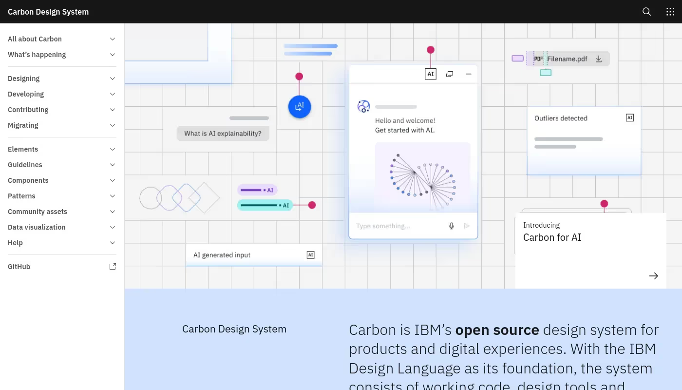
5) Carbon Design
Carbon Design is an open-source design system developed by IBM, offering a comprehensive collection of reusable components, design tools, and guidelines to create consistent and high-quality digital experiences.
Pros of Using Carbon Design
IBM Design Language Foundation: Built on the IBM Design Language, ensuring high standards of design quality and consistency across all components and guidelines.
Support for Multiple Frameworks: Offers component libraries for React, Angular, Vue, Svelte, and Web Components, making it versatile and adaptable for various projects.
Accessibility Focus: Provides detailed guidelines and best practices to ensure designs are inclusive and accessible to all users, including those with disabilities.
Cons of Using Carbon Design
Difficult to make Carbon truly theme-friendly: Doing more than color theming is challenging and often brittle. Changing the font family or removing the outline on focus for buttons can be particularly difficult, and not all components have theme variables.
Complex and difficult-to-navigate documentation: Users have reported that the documentation is not ideal, especially for React components. This complexity can slow down development and make it harder to fully utilize the framework's features.
Carbon Design Pricing
Carbon Design's pricing is not public. Contact their support for more info.
Carbon Design Reviews
Carbon Design has received a score of 2.5 out of 5. Users generally mention that the system is complex, difficult to navigate, and theming beyond color is challenging and brittle.
6) PrimeReact
PrimeReact is a comprehensive UI component library for React.js, offering over 80 customizable, feature-rich components designed to elevate web applications with accessibility compliance and mobile optimization.
Pros of Using PrimeReact
80+ UI Components: PrimeReact provides an extensive set of UI components, making it a one-stop solution for developers looking to build feature-rich applications. These components are designed to be highly customizable and easy to integrate.
Styled or Unstyled: Developers can choose from a variety of pre-built themes or implement their own design systems using CSS libraries like TailwindCSS. This flexibility allows for a high degree of customization to match specific design requirements.
Blocks: PrimeReact offers over 400 pre-designed UI blocks that can be easily copied and pasted into applications. These blocks help in rapidly building visually appealing and functional user interfaces without starting from scratch.
Cons of Using PrimeReact
Steep Learning Curve: PrimeReact's extensive feature set and customization options can be overwhelming for new users. This complexity may slow down initial development efforts and require a significant time investment to master.
Limited Documentation: Users have reported that the documentation is not as comprehensive or detailed as it could be. This can make it challenging to fully understand and utilize the library's features, leading to increased development time and potential frustration.
PrimeReact Pricing
Single Developer: $79 per developer/year
Team: $399 per year
Enterprise: $1,499 per year
Enterprise Plus: $2,499 per year
PrimeReact Reviews
PrimeReact has received a score of 2 out of 5. Users generally mention that the documentation is limited and the learning curve is steep.
7) Ariakit
Ariakit is an open-source library for building accessible web applications with React, offering unstyled, primitive components and a collection of styled examples that developers can easily integrate into their projects.
Pros of Using Ariakit
Unstyled Components: Ariakit offers unstyled components, allowing developers to style them according to their needs.
Primitive Components: The library includes primitive components that can be composed to create complex UIs.
Styled Examples: A collection of styled examples is available for developers to copy and paste into their applications.
Cons of Using Ariakit
Steep Learning Curve: Ariakit's extensive feature set and reliance on primitive components can be overwhelming for new users. This complexity may slow down initial development efforts and require a significant time investment to master.
Limited Documentation: Users have reported that the documentation is not as comprehensive or detailed as it could be. This can make it challenging to fully understand and utilize the library's features, leading to increased development time and potential frustration.
Ariakit Pricing
Ariakit Plus: $214 (discounted from $237)
Ariakit Reviews
Ariakit has received a score of 2 out of 5. Users generally mention that the documentation is limited and the learning curve is steep.
8) NextUI
NextUI is a React UI library designed to help developers create beautiful, fast, and modern web applications. It offers a range of customizable components, supports light and dark themes, and emphasizes accessibility and developer experience.
Pros of Using NextUI
Themeable: HeroUI provides a plugin to customize default themes, allowing users to change semantic tokens or create entirely new themes.
Fast: Built on Tailwind CSS, HeroUI ensures no runtime styles and no unnecessary classes in the bundle, leading to faster performance.
Light & Dark UI: HeroUI automatically changes the theme based on HTML theme prop changes, making it easy to implement dark mode.
Cons of Using NextUI
Limited Feature Compatibility: Many components work in React server components, but more complex components will only work in client components, which can limit the flexibility and functionality of your application.
Steep Learning Curve: The extensive feature set and customization options can be overwhelming for new users, requiring a significant time investment to master and potentially slowing down initial development efforts.
NextUI Pricing
Solo Plan: $249 (one-time payment, plus local taxes)
Startup Plan: $399 (one-time payment, plus local taxes)
Organization Plan: $799 (one-time payment, plus local taxes)
NextUI Reviews
NextUI has received a score of 4.8 out of 5. Users generally mention that the library is simple and good for Next.js, with some noting it as a nice UI library.
9) Tetrisly
Tetrisly is a comprehensive design system that includes user-friendly components for React, full compatibility with Figma, TypeScript support, customization options, and extensive documentation, aiming to improve development efficiency and ensure a consistent design process.
Pros of Using Tetrisly
Seamless Integration with Figma and React: Tetrisly offers a unique feature that allows for effortless synchronization between Figma designs and React components, ensuring a smooth design-to-development workflow.
Export Design Tokens: This feature enables the conversion of Figma Variables into React-ready code, streamlining the process of maintaining design consistency across different platforms.
Interactive Storybook: Tetrisly provides an interactive Storybook for component demos, allowing developers to explore and understand components in a hands-on manner, enhancing the overall development experience.
Cons of Using Tetrisly
Steep Learning Curve: Tetrisly's extensive feature set and customization options can be overwhelming for new users, requiring a significant time investment to master and potentially slowing down initial development efforts.
Limited Documentation: Users have reported that the documentation is not as comprehensive or detailed as it could be. This can make it challenging to fully understand and utilize the library's features, leading to increased development time and potential frustration.
Tetrisly Pricing
Solo Plan: $249 (one-time payment, plus local taxes)
Startup Plan: $399 (one-time payment, plus local taxes)
Organization Plan: $799 (one-time payment, plus local taxes)
Tetrisly Reviews
Tetrisly has received a score of 2 out of 5. Users generally mention that the documentation is limited and the learning curve is steep.
10) Material UI
Material UI is a comprehensive suite of React UI tools designed to help developers build user interfaces more efficiently. It includes foundational components, advanced components for complex use cases, templates, design kits, and tools for building dashboards and internal apps.
Pros of Using Material UI
Implements Google's Material Design: Material UI adheres to Google's Material Design principles, ensuring a consistent and visually appealing user interface across applications.
Advanced Components for Complex Use Cases: MUI X offers a suite of advanced components designed to handle complex scenarios, making it easier to build sophisticated applications.
Fully Built Templates and Design Kits: Material UI provides ready-to-use templates and design kits, allowing developers to kickstart their projects quickly and maintain design consistency.
Cons of Using Material UI
Very hard to customize: Users have reported significant challenges in customizing Material UI components, even for minor adjustments. This difficulty can hinder developers who need to tailor the UI to specific design requirements.
Weird abstractions: The grid system in Material UI is not an actual grid, which can be confusing and counterintuitive for developers. This abstraction may lead to a steeper learning curve and potential frustration during implementation.
Material UI Pricing
Pro Plan: $15 per month per developer, billed annually at $180 per developer.
Premium Plan: $49 per month per developer, billed annually at $588 per developer.
Material UI Reviews
Material UI has received a score of 3 out of 5. Users generally mention that it is hard to customize and has weird abstractions, such as the grid not being an actual grid.
Which One Should You Go With?
Choosing the right UI library depends on your specific needs and project requirements. Each of the alternatives mentioned offers unique features and capabilities that can enhance your development process. Whether you prioritize customization, accessibility, or a comprehensive component library, there's an option that will suit your needs.
If you're looking for a tool that combines ease of use, high-quality code, and a robust set of features, we recommend Subframe. Its drag-and-drop visual editor, real-time collaboration, and responsive design capabilities make it an excellent choice for developers and teams aiming to build stunning UIs quickly and efficiently. However, any of the alternatives listed can be a great fit depending on your specific requirements.
Join thousands of happy builders.
Subframe lets you build stunning UI with beautifully crafted components and a drag-and-drop visual editor.


