
In today's digital age, data analytics websites have become indispensable tools for businesses and individuals alike. These platforms not only provide valuable insights but also enhance user experience by presenting data in a clear, intuitive manner.
From interactive dashboards to real-time data visualization, the design of a data analytics website can significantly impact how users interpret and utilize information. In this article, we will explore 25 exemplary data analytics website designs that set the standard for functionality and aesthetics.
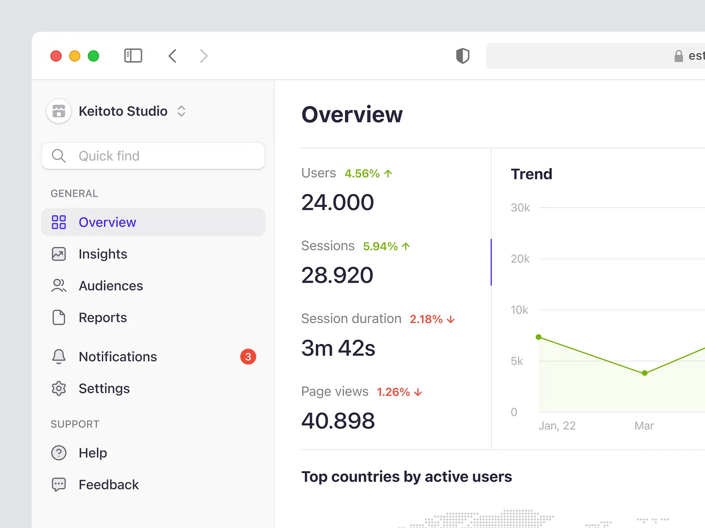
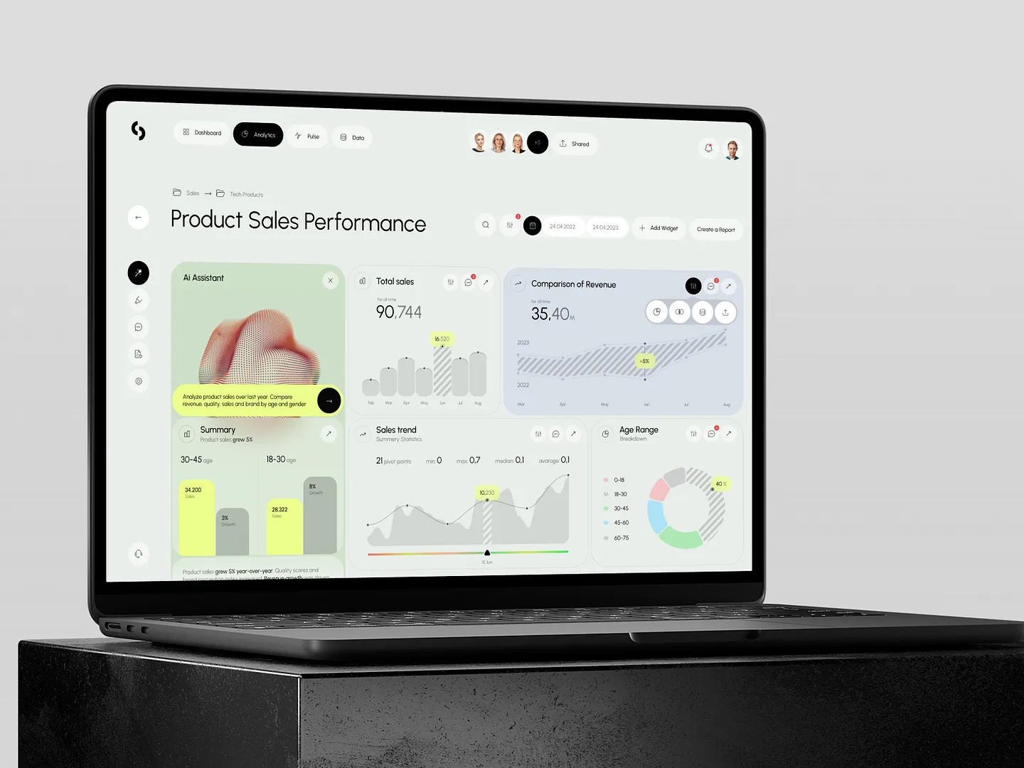
This data analytics website features an intuitive dashboard with key metrics like user engagement, session duration, and page views. Clear graphs and vibrant colors make data interpretation effortless. Unique elements include a sleek layout and visually appealing format.
Check out this example on Dribbble.
This data analytics website leverages a sleek, modern interface with vibrant colors and intuitive layouts. Unique features include dynamic data visualization and user-friendly navigation, making complex analytics accessible and engaging.
Check out this example on Dribbble.
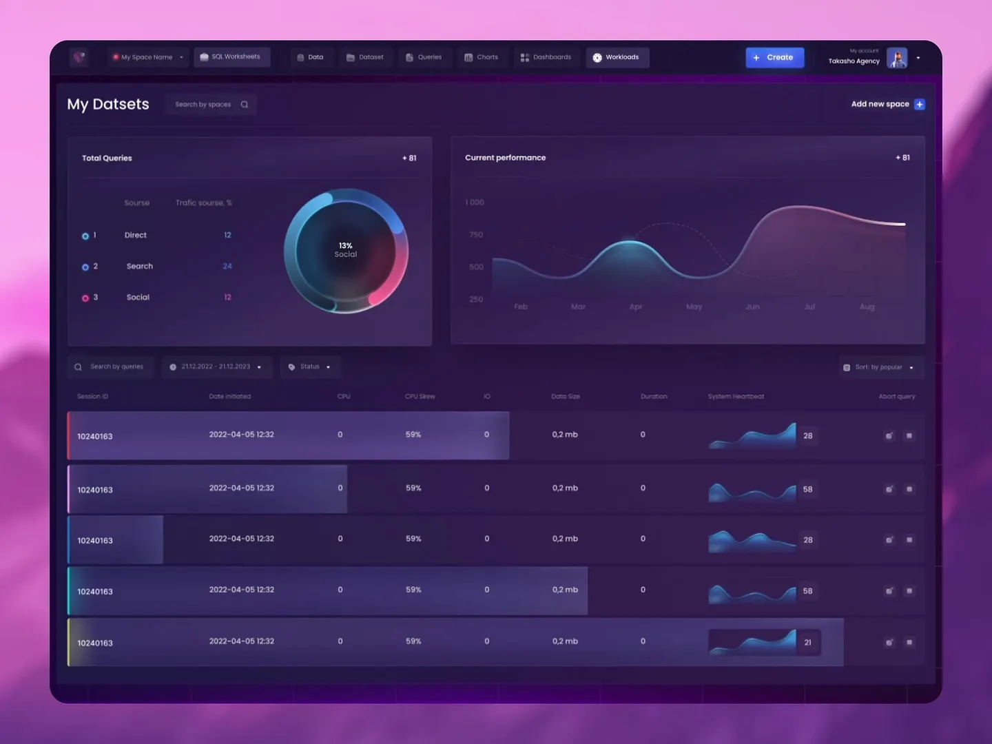
This data analytics website prioritizes user efficiency with a sleek, dark-themed interface. Vibrant visualizations and interactive graphs showcase key metrics, while clear data segmentation makes complex analytics accessible and engaging.
Check out this example on Dribbble.
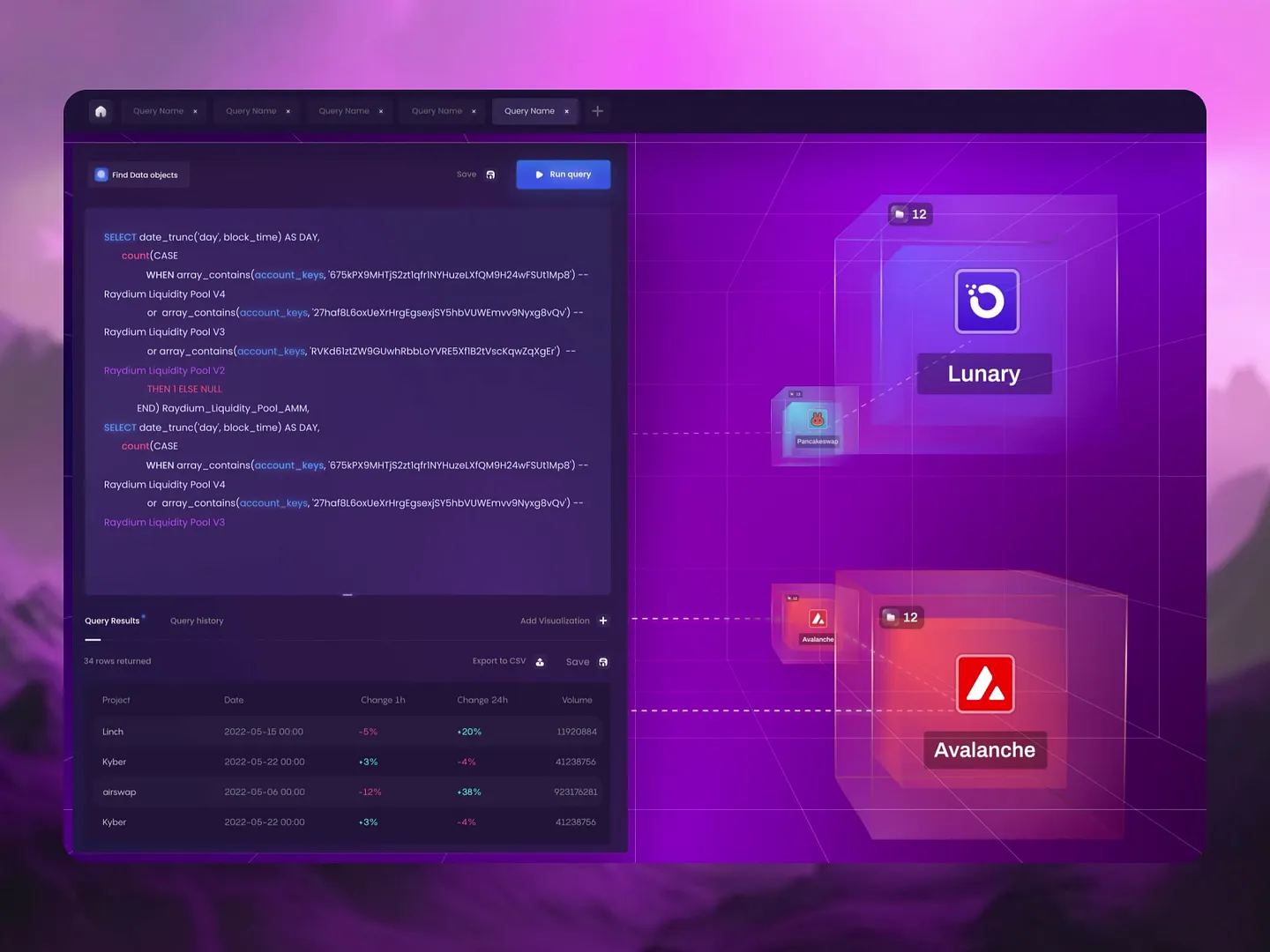
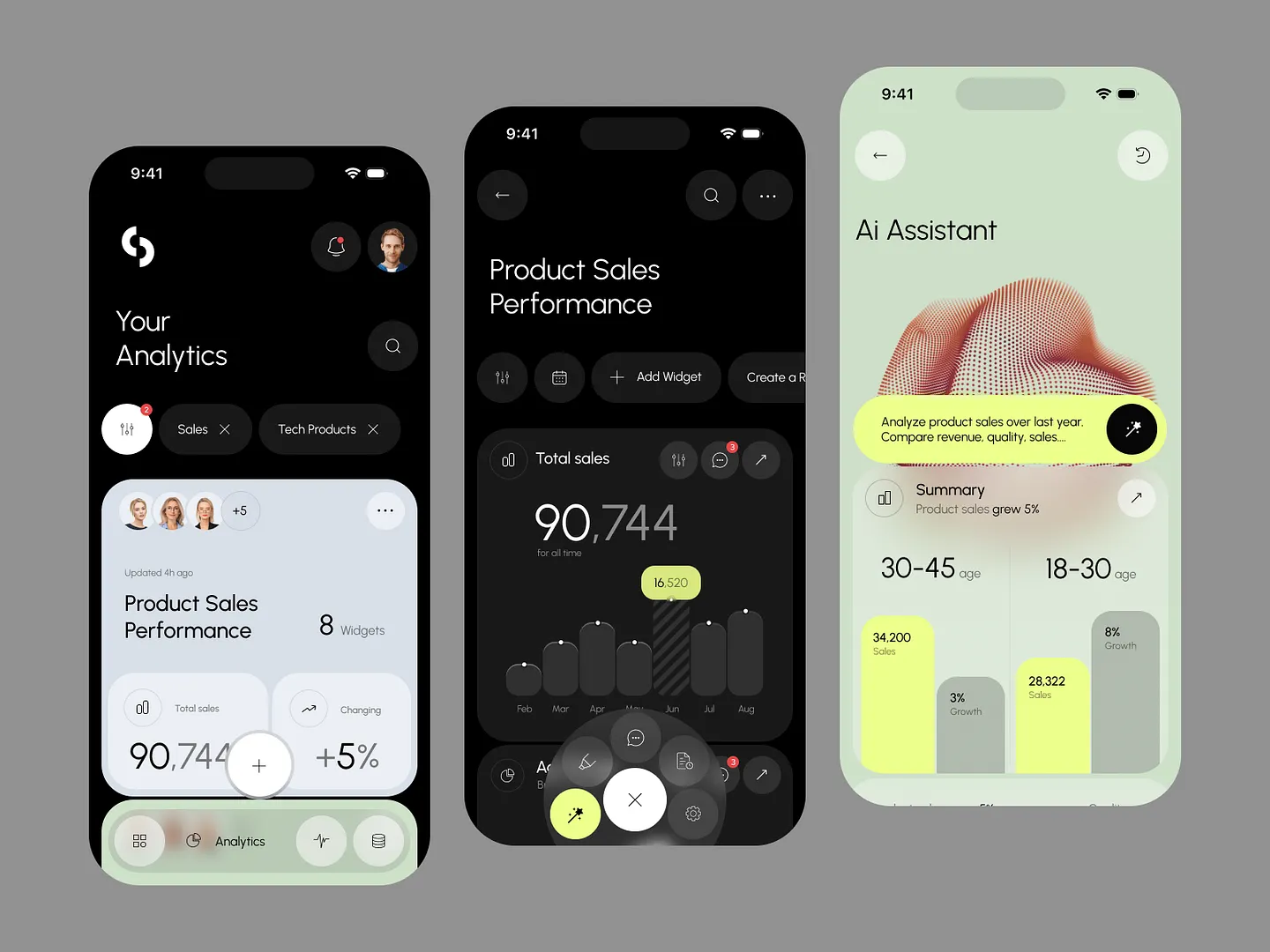
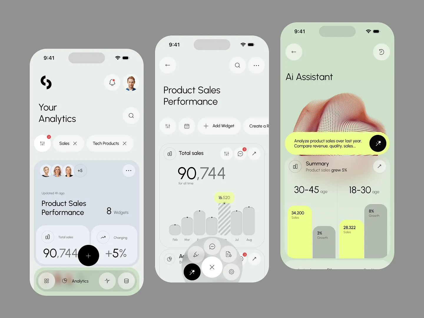
This cutting-edge data analytics website integrates AI-driven insights and visualizations with a modern layout featuring fluid shapes and vibrant colors. It emphasizes user engagement and intuitive navigation for seamless data exploration, making complex analytics accessible and engaging.
Check out this example on Dribbble.
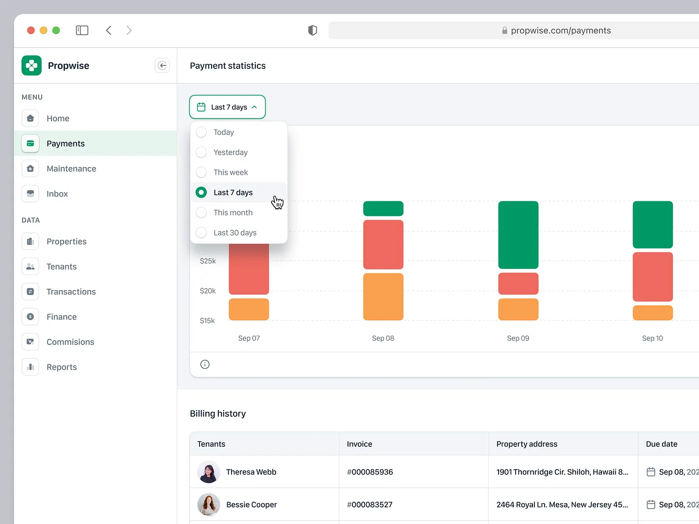
This data analytics website for property management features a user-friendly admin dashboard with vibrant bar graphs illustrating payment statistics over various time frames. The organized billing history section enhances usability, making it easy to track financial performance.
Check out this example on Dribbble.

Designers and developers, elevate your data analytics website with Subframe's drag-and-drop interface and intuitive, responsive canvas. Create pixel-perfect UIs effortlessly, every time. Loved by professionals for its ease and precision, Subframe is your go-to tool.
Start for free and experience the difference today!
This data analytics website design for Sisense features sleek layouts, contrasting color schemes, and intuitive navigation. Unique elements include AI-powered insights and interactive filters, making complex data accessible and actionable for users.
Check out this example on Dribbble.
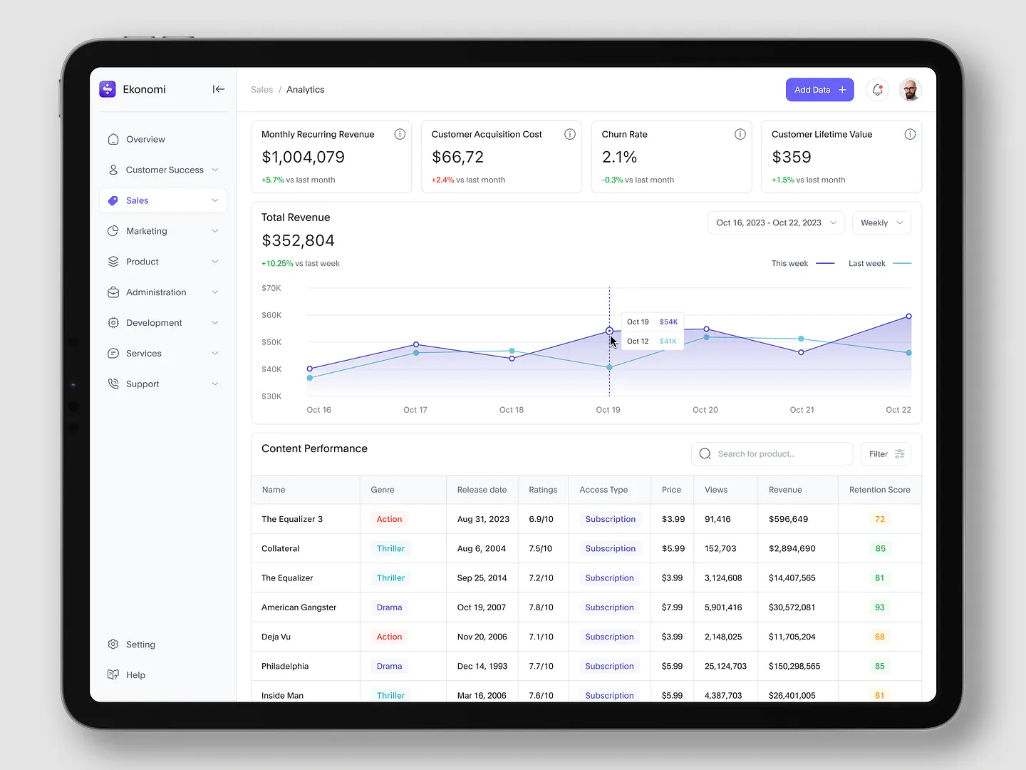
The Ekonomi finance management dashboard highlights key metrics like monthly recurring revenue and customer acquisition costs. Visually engaging graphs and performance tables enhance user experience and data interpretation, making it a standout design.
Check out this example on Dribbble.
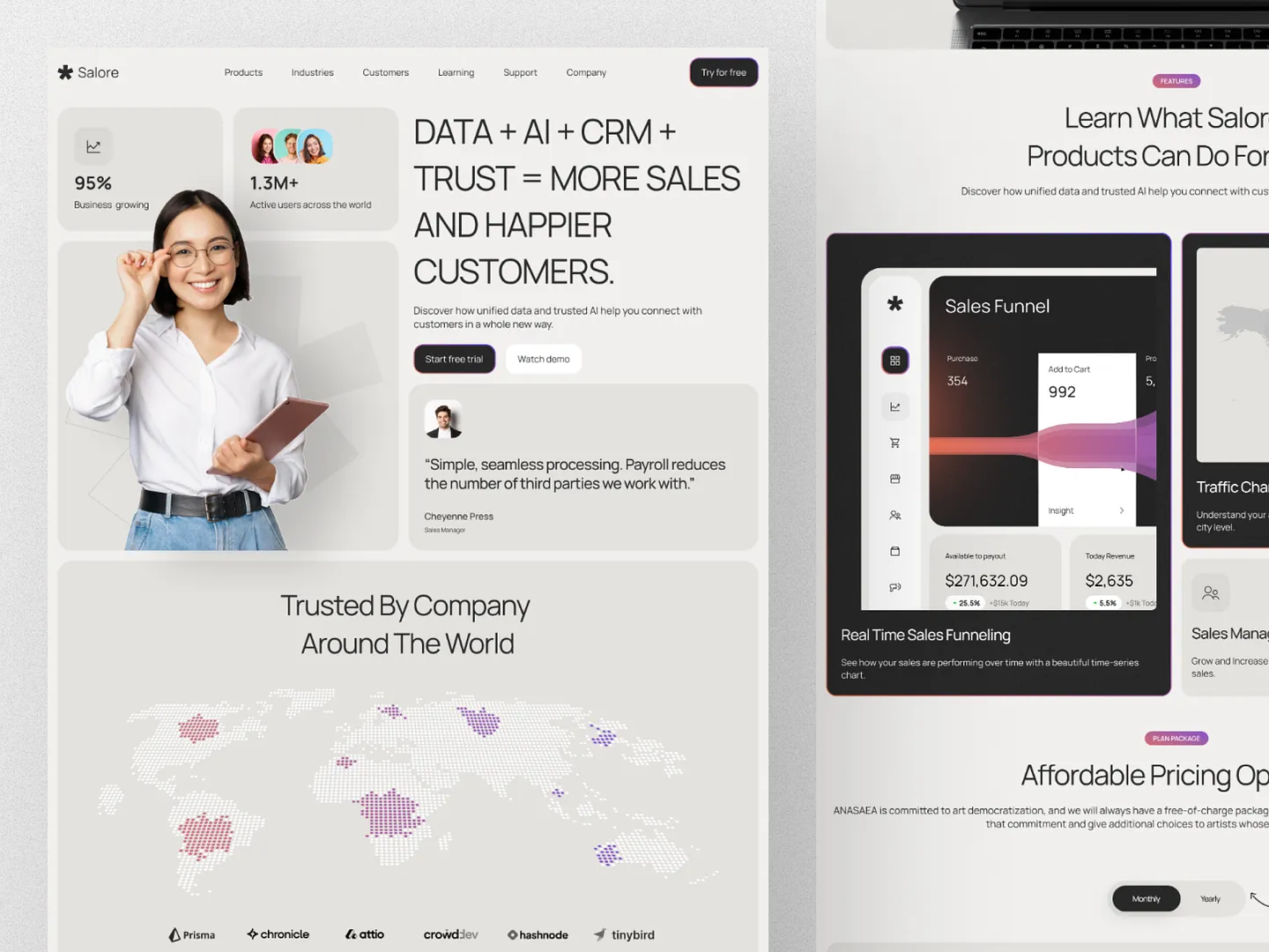
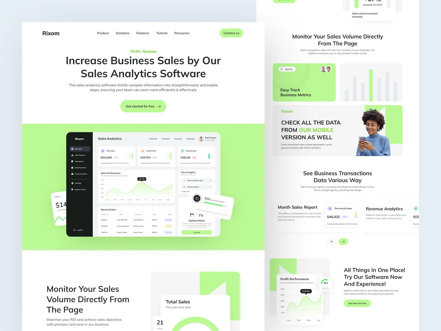
Salore's data analytics website features a clean layout with bold typography and interactive elements. Engaging visuals and intuitive design effectively communicate data-driven insights, making it an ideal example for SaaS landing pages.
Check out this example on Dribbble.
This data analytics website design emphasizes user engagement with intuitive navigation and vibrant visuals. The clean interface features interactive elements, showcasing key metrics and performance indicators in a visually appealing manner, ideal for businesses leveraging data insights.
Check out this example on Dribbble.
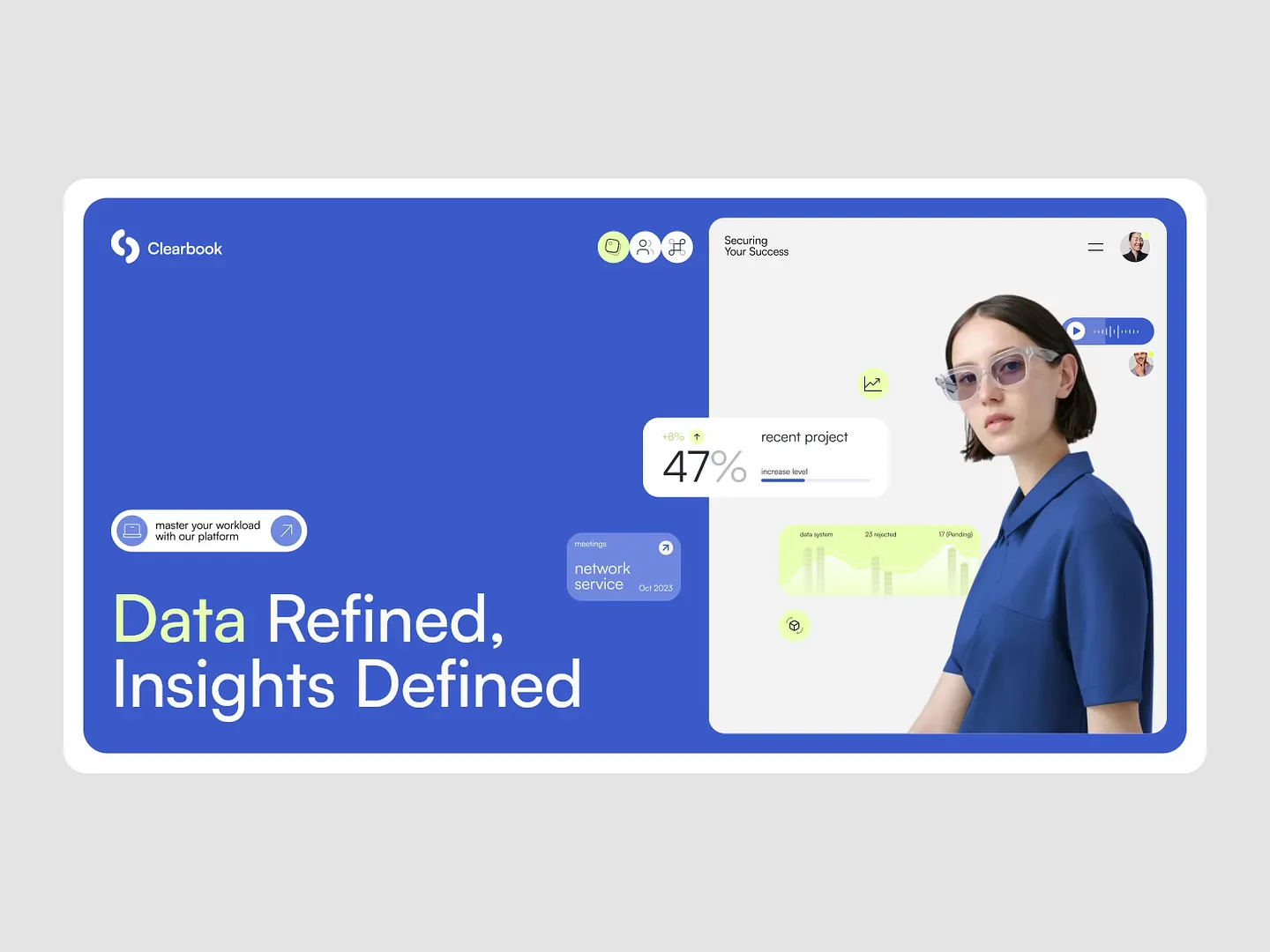
This data analytics website combines vibrant blue tones with sleek, user-friendly interfaces. Engaging visuals, interactive elements, and clear data presentation make it easy for users to master their workload and gain insights effectively. Unique features include dynamic charts and intuitive navigation.
Check out this example on Dribbble.
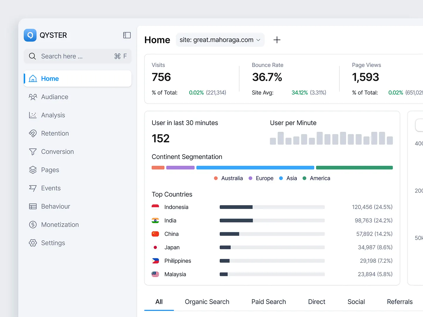
The Qyster dashboard offers real-time insights into user behavior and traffic metrics with detailed segmentation by continent and top countries. It showcases essential analytics like visits, bounce rates, and page views, making it an invaluable tool for optimizing online performance.
Check out this example on Dribbble.
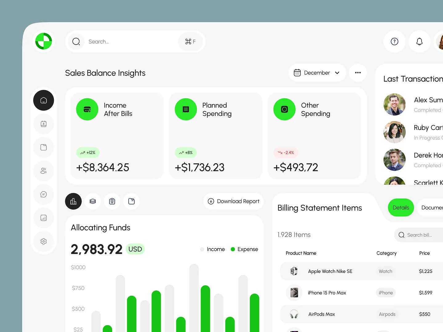
The Orca Sales Management Dashboard offers a sleek, modern design with vibrant green accents and intuitive graphs. It visualizes income, planned spending, and other financial metrics, making it easy to track and manage sales performance. Unique features include real-time insights and detailed financial tracking.
Check out this example on Dribbble.
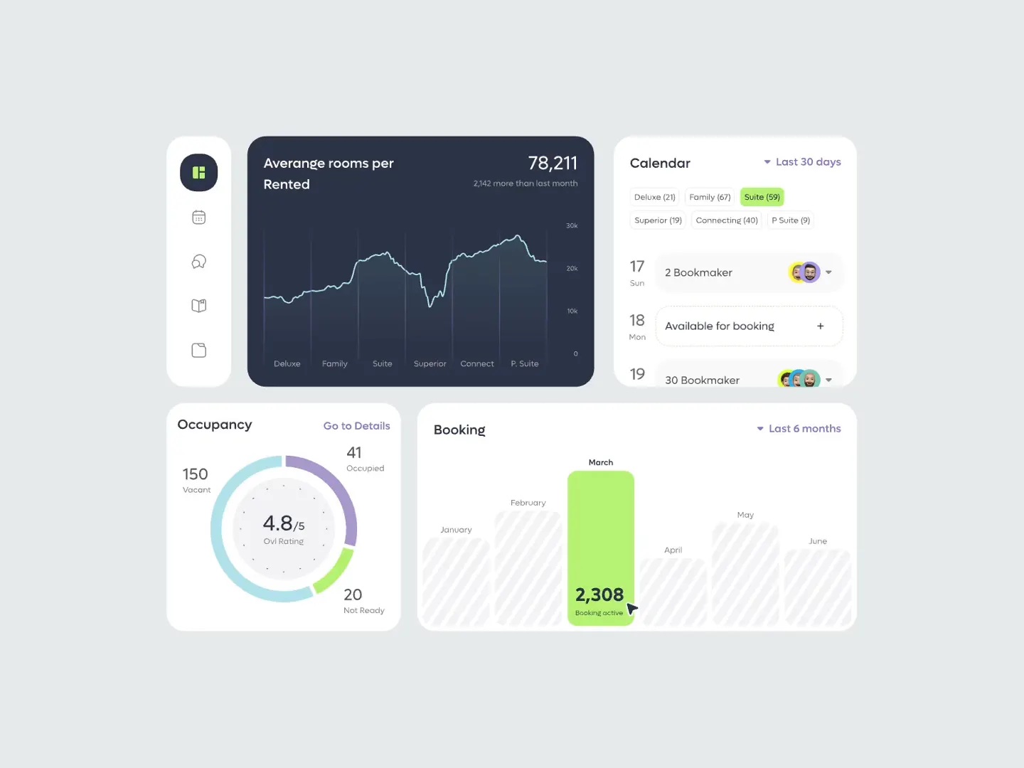
This data analytics website for booking management features intuitive graphs, occupancy rates, and a user-friendly calendar. The modern layout and clean color palette enhance user experience and data visualization, making it a standout design.
Check out this example on Dribbble.
This metrics dashboard for data analytics websites features a clean layout and intuitive navigation. It showcases key performance indicators like sales and order statistics with visually engaging graphs that highlight trends over time, making data interpretation effortless.
Check out this example on Dribbble.
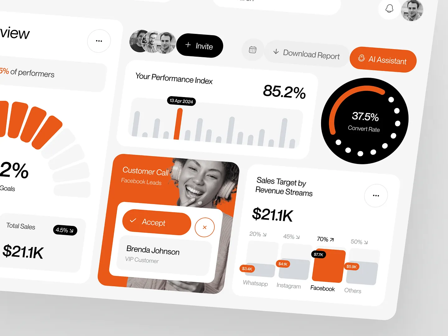
The Neura Sales Dashboard features a vibrant orange and gray color palette, visualizing performance metrics, sales targets, and customer interactions through intuitive graphs and engaging layouts. Unique elements include dynamic charts and a sleek, modern design.
Check out this example on Dribbble.
Ready to design your own data analytics website? Subframe streamlines the process with its intuitive interface and responsive canvas, allowing you to achieve professional, pixel-perfect results quickly.
Experience the ease and precision loved by professionals. Start for free and see the difference today!
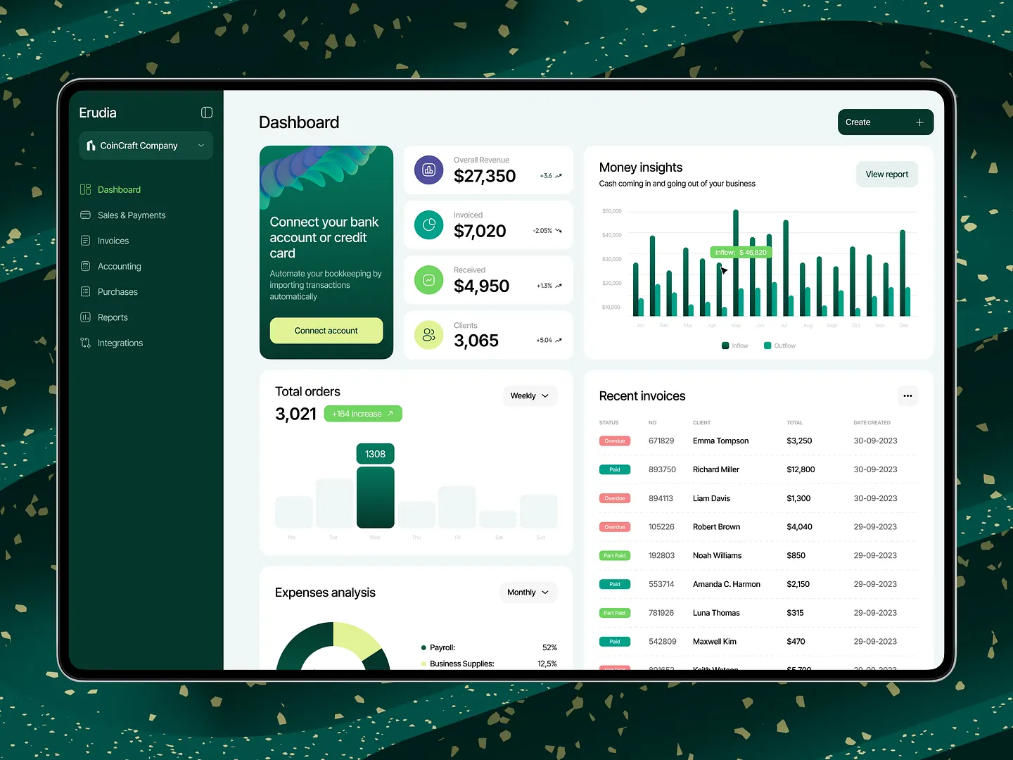
This data analytics website dashboard features vibrant visuals and intuitive layouts, showcasing key metrics like total orders, money insights, and recent invoices. The user-friendly format enhances data comprehension and decision-making, making it a standout design.
Check out this example on Dribbble.

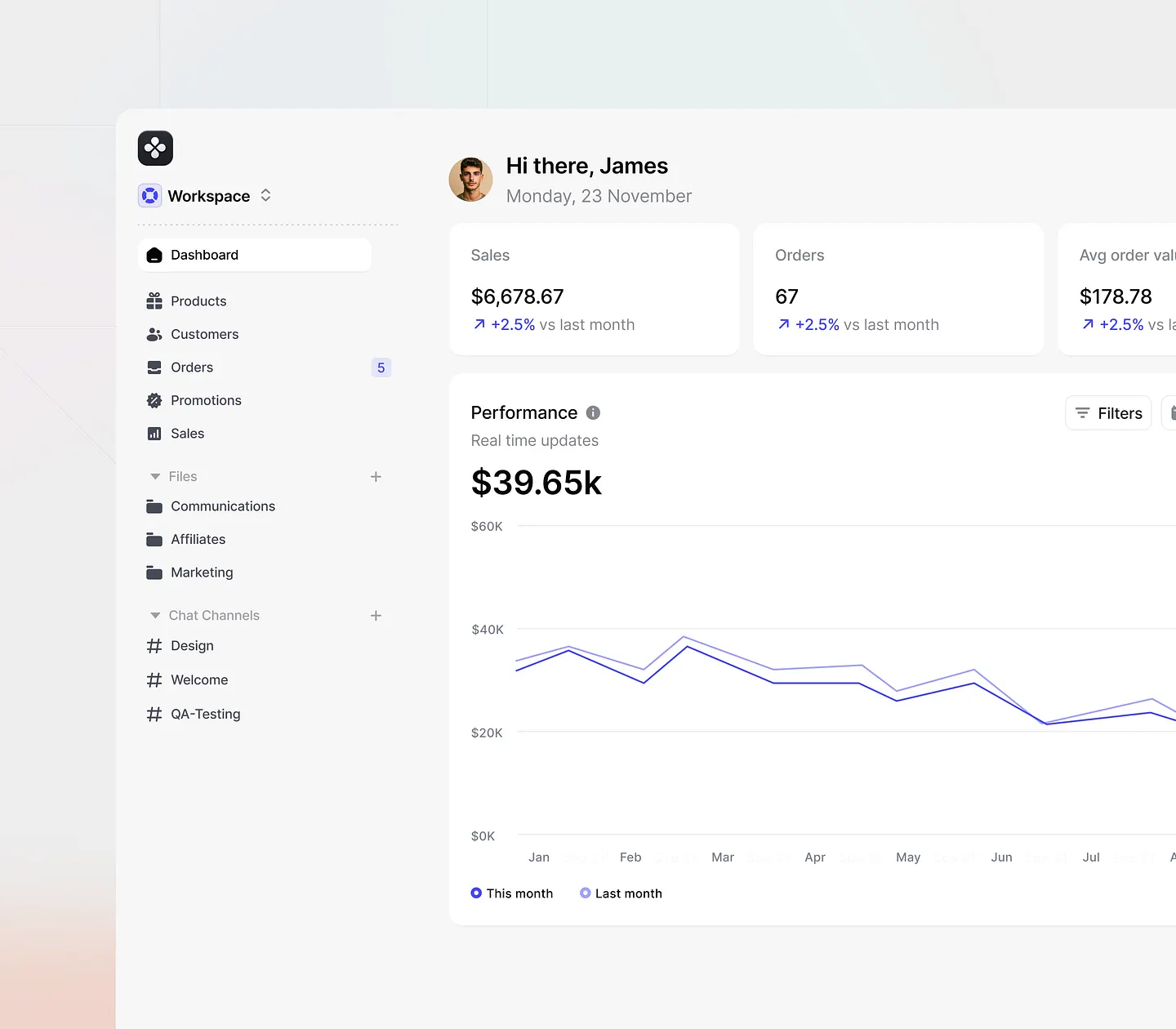
This data analytics website design for Salesforce CRM features sleek layouts, vibrant color schemes, and intuitive navigation. Unique elements include real-time sales analytics and comprehensive performance metrics, empowering businesses to visualize data effectively and make informed decisions.
Check out this example on Dribbble.
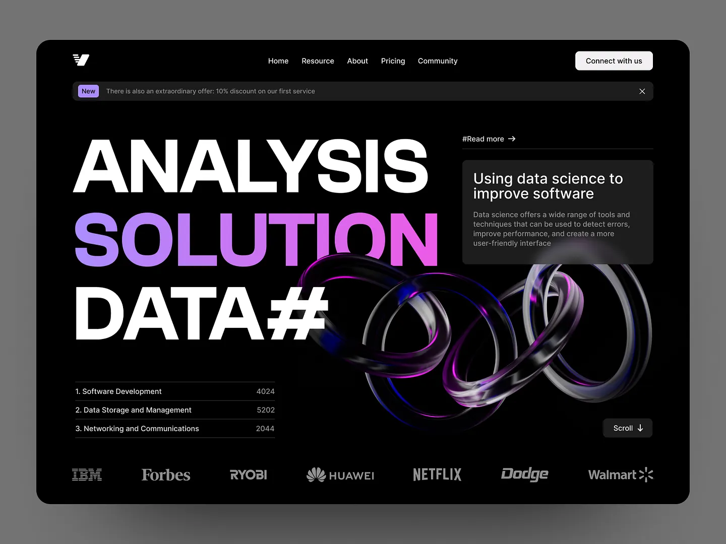
This data analytics website combines bold typography and sleek visuals to create an engaging user interface. The striking color palette and dynamic elements emphasize data science's role in software improvement and user-friendly navigation, making it a standout design.
Check out this example on Dribbble.
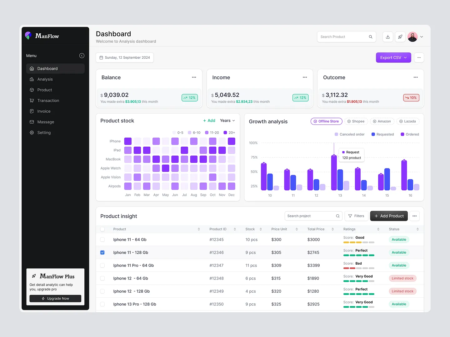
The ManFlow dashboard offers real-time sales insights with a modern layout, intuitive navigation, vibrant color coding, and detailed product stock analysis. This design enhances user experience and streamlines data management.
Check out this example on Dribbble.
This data analytics website dashboard visualizes key financial metrics with vibrant charts and graphs. Its user-friendly layout makes complex data easily digestible, focusing on clarity and functionality. Unique features include intuitive navigation and real-time performance tracking.
Check out this example on Dribbble.
This modern data analytics website design features sleek visuals and a user-friendly interface. The vibrant green and white color scheme highlights key metrics and analytics tools, ensuring users can easily navigate and access vital business data. Unique elements include intuitive navigation and real-time performance tracking.
Check out this example on Dribbble.
This data analytics website features a sleek, user-friendly interface designed for optimal business intelligence. Vibrant visuals, interactive charts, and a modern layout emphasize clarity and functionality, making data insights easily accessible and actionable. Unique elements include intuitive navigation and real-time performance tracking.
Check out this example on Dribbble.
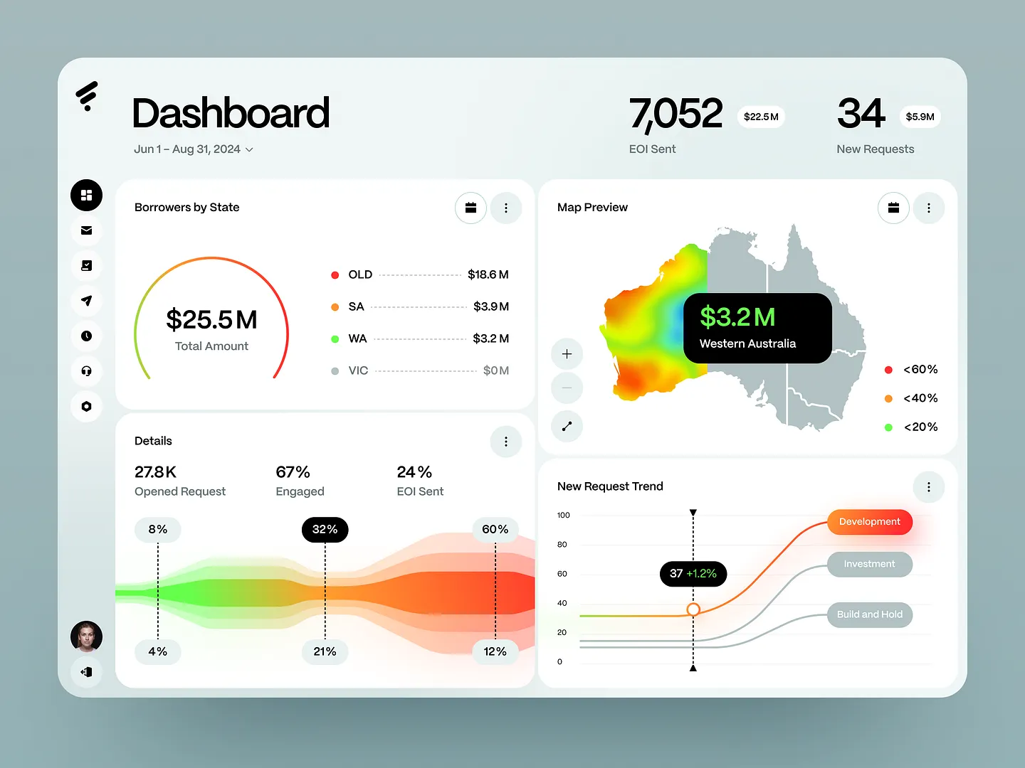
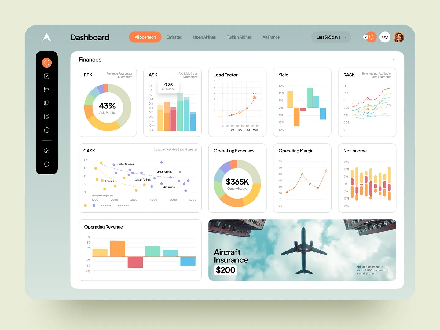
This finance analytics dashboard features a modern layout with vibrant color gradients, interactive maps, and engaging charts. It showcases key metrics and visualizations, making it easy to track financial performance and trends.
Check out this example on Dribbble.
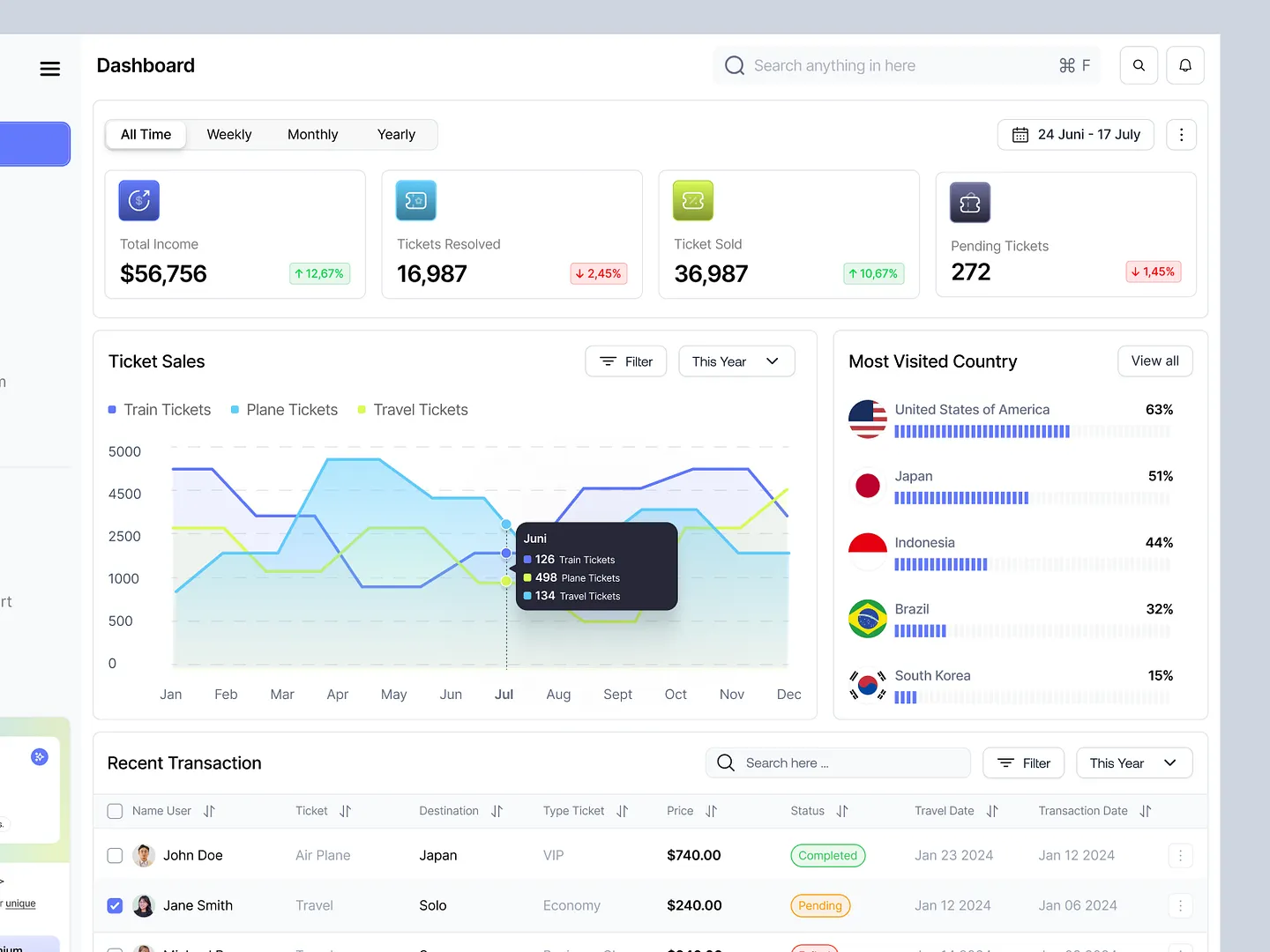
This data analytics website dashboard showcases ticket sales metrics for train, plane, and travel tickets with dynamic graphs and key performance indicators. The intuitive layout provides a comprehensive overview of total income, tickets sold, and the most visited countries, enhancing user experience and data visualization.
Check out this example on Dribbble.
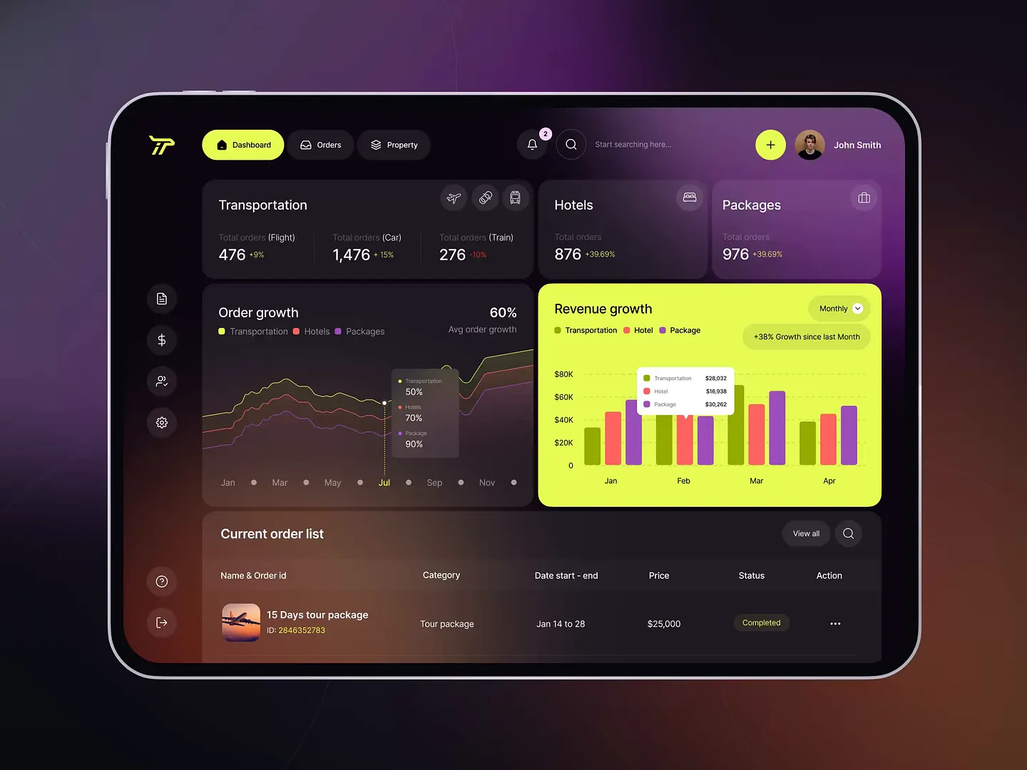
This data analytics dashboard for travel management features vibrant colors and intuitive layouts, showcasing key metrics like order growth and revenue trends. Users can easily analyze transportation, hotel, and package data, making it a standout design.
Check out this example on Dribbble.
In conclusion, designing a data analytics website that is both functional and visually appealing is crucial for effective data interpretation. Subframe offers the tools you need to achieve this with efficiency and precision.
Experience the ease of creating pixel-perfect UIs immediately. Start for free and begin designing your data analytics website today!


