
In the ever-evolving landscape of web design, callout sections have emerged as a powerful tool to capture user attention and convey critical information. These design elements not only break the monotony of text-heavy pages but also guide users towards key actions, enhancing overall user experience.
From highlighting special offers to emphasizing important messages, callout sections serve multiple purposes. They are instrumental in creating a visually appealing and user-friendly interface, making it easier for visitors to navigate and engage with the content. Dive into these 25 callout section design examples to see how you can elevate your website's design and functionality.
This callout section design features a clean layout with bold typography and interactive elements, effectively communicating key features and encouraging user action. Unique elements like dynamic buttons and clear visual hierarchy make it stand out.
Check out this example on Dribbble.
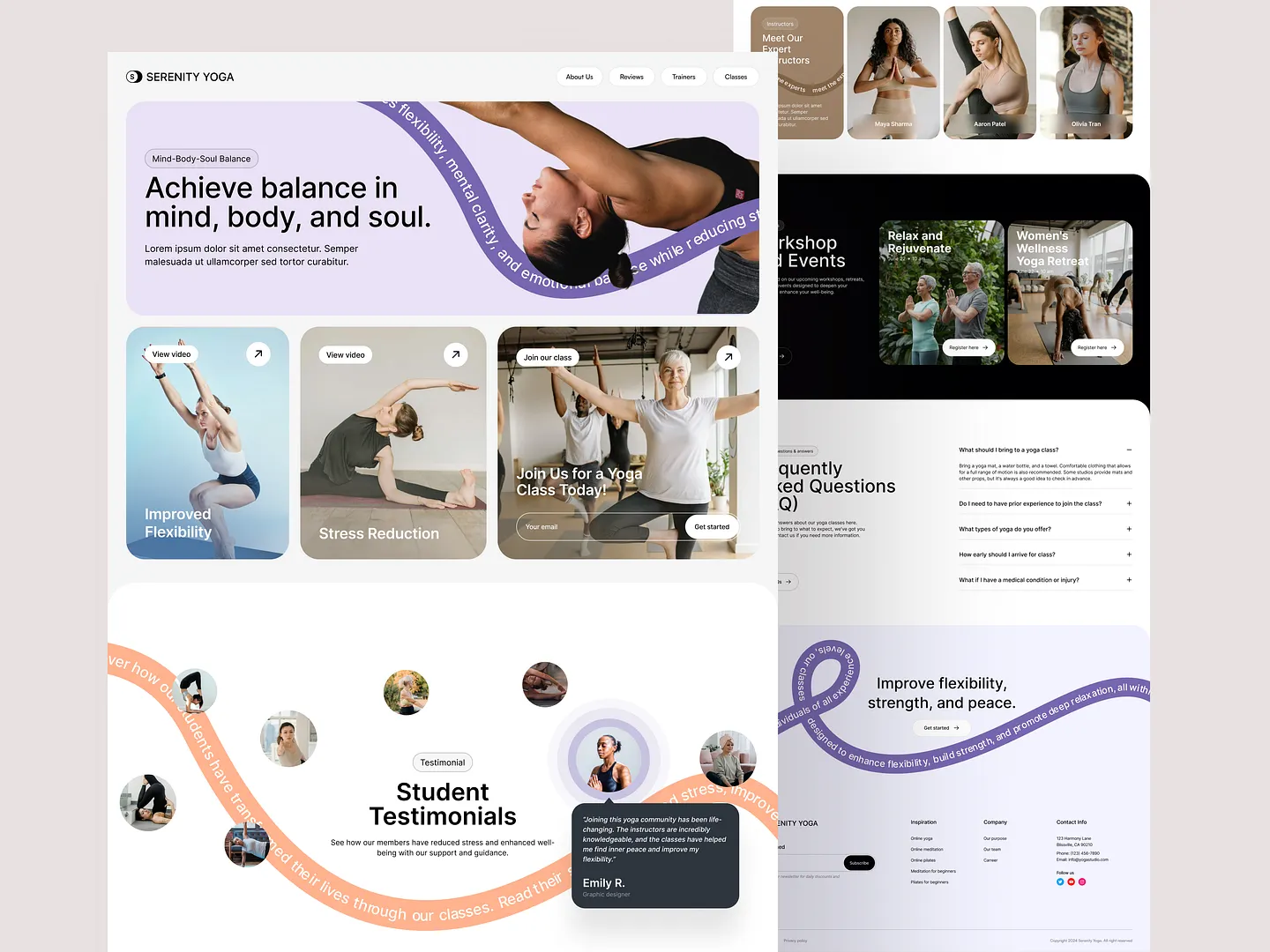
This yoga platform landing page features a visually striking callout section that emphasizes the benefits of yoga, such as improved flexibility and stress reduction. Soft colors and dynamic layouts draw attention, inviting users to explore classes and workshops while enhancing the overall user experience.
Check out this example on Dribbble.
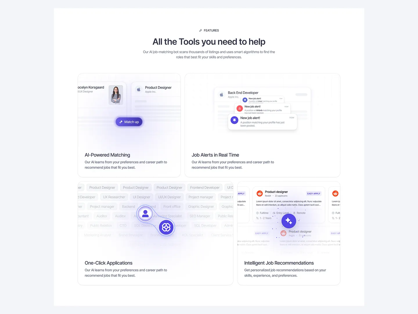
This callout section highlights key features of AI-driven job matching tools, including real-time job alerts, one-click applications, and intelligent recommendations. The clean layout and modern design enhance user engagement, making the platform's benefits clear.
Check out this example on Dribbble.
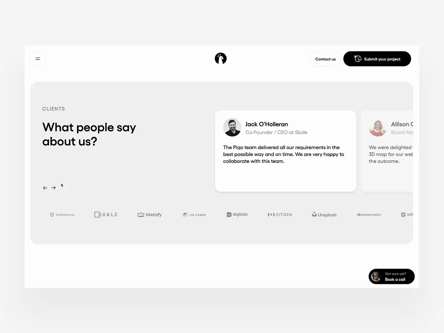
This callout section effectively showcases client testimonials with a clean, modern layout. Ample white space, bold typography, and subtle color contrasts enhance readability and draw attention to positive feedback, building trust and credibility.
Check out this example on Dribbble.
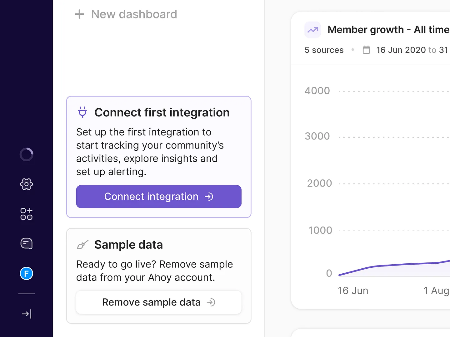
This onboarding callout section features a clear call to action, vibrant colors, and concise messaging, making it easy for users to connect integrations and access insights. Unique elements like dynamic buttons and a streamlined layout enhance user engagement and retention.
Check out this example on Dribbble.

Designers and developers, elevate your callout sections with Subframe's drag-and-drop interface and intuitive, responsive canvas. Create pixel-perfect UI effortlessly, loved by professionals across the industry.
Ready to transform your designs? Start for free today!
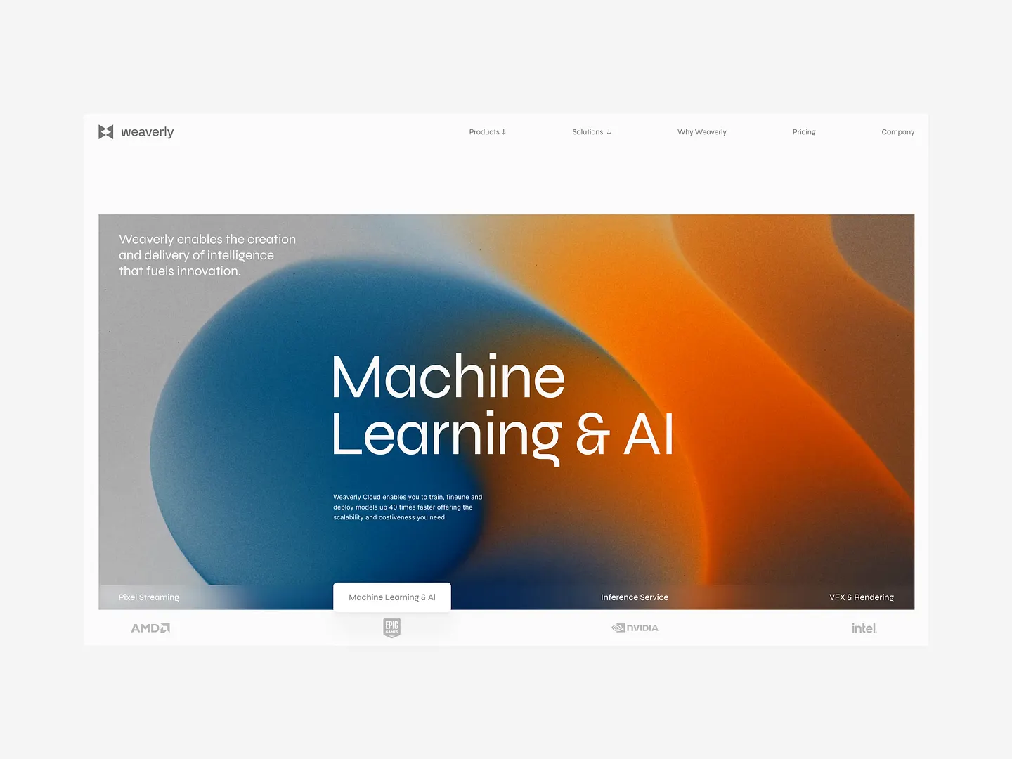
This callout section showcases a modern design with a vibrant gradient background blending blue and orange hues. Bold typography emphasizes 'Machine Learning & AI,' creating a visually striking contrast while maintaining a clean, professional layout that enhances user engagement.
Check out this example on Dribbble.
This callout section features a modern design with a vibrant color palette, using smooth gradients of blue and orange for dynamic visual impact. Bold typography highlights 'Machine Learning & AI,' drawing attention while maintaining a clean, professional layout.
Check out this example on Dribbble.
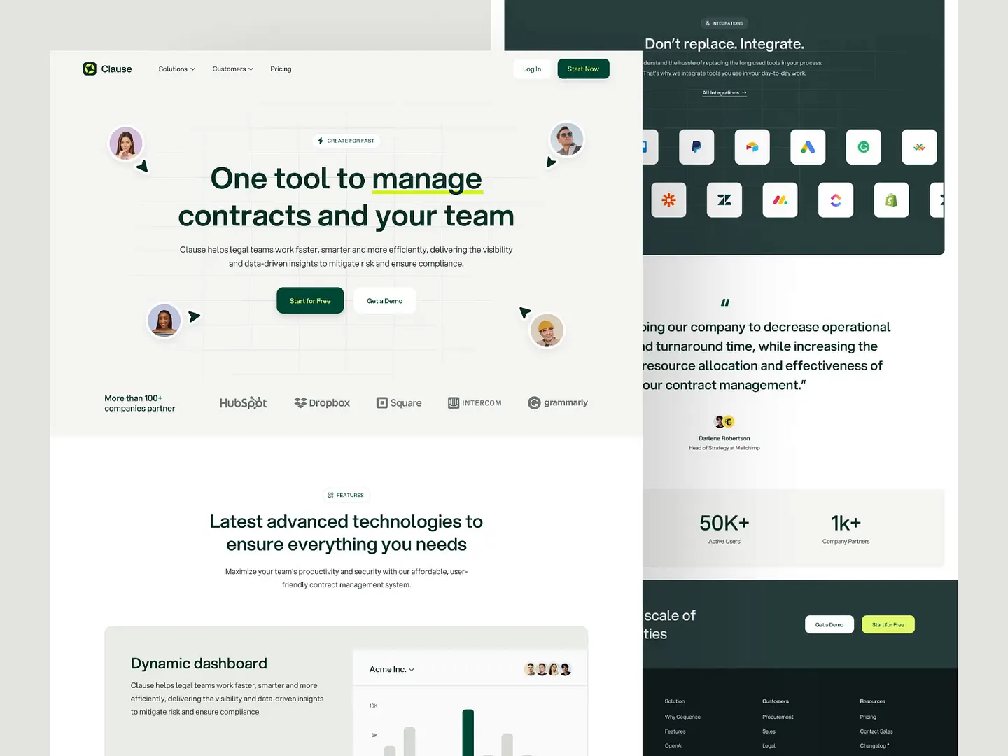
The Clause contract management landing page features a clean layout, engaging visuals, and strategic color contrasts to highlight key features and benefits. Unique elements like intuitive navigation and clear call-to-action buttons enhance the user experience.
Check out this example on Dribbble.
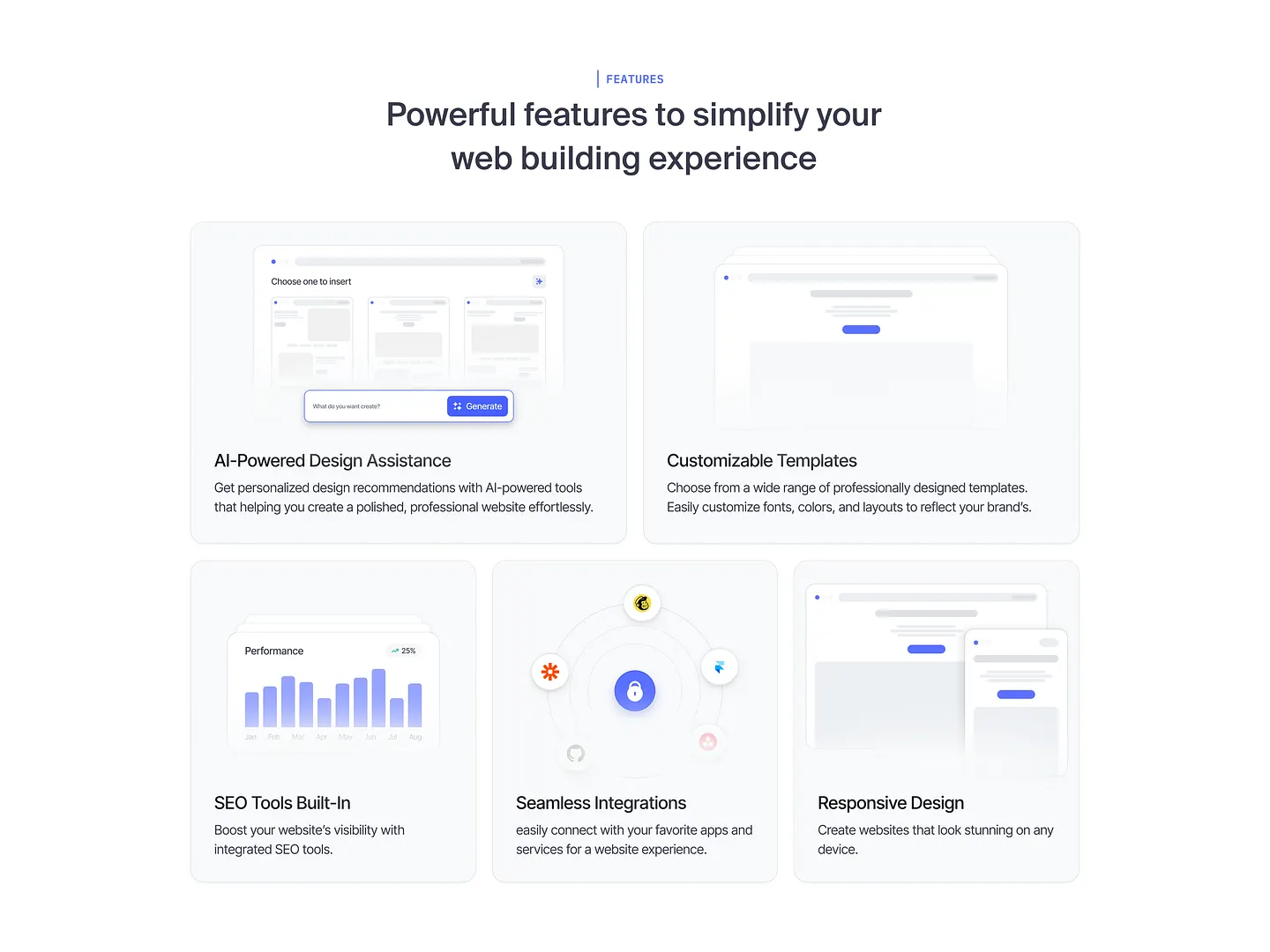
SiteCraft's callout section features AI-powered design assistance, customizable templates, integrated SEO tools, and responsive design. These elements streamline web building, ensuring a polished, professional look across all devices.
Check out this example on Dribbble.
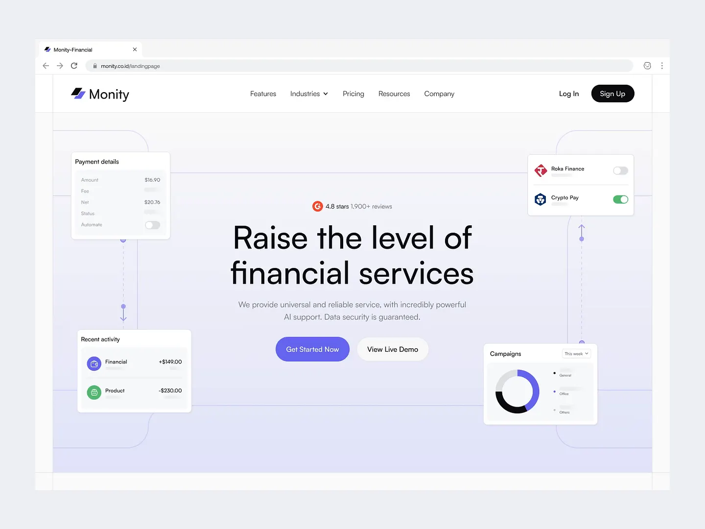
Monity's financial services landing page features a sleek callout section with a clean layout and engaging visuals. Key features and payment details are highlighted using a soft color palette and intuitive icons, enhancing user experience.
Check out this example on Dribbble.
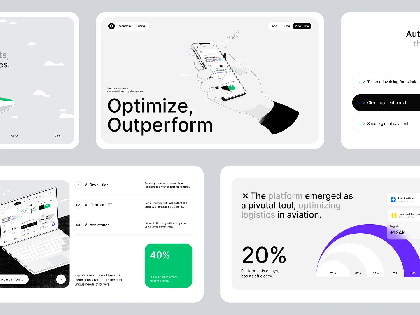
This callout section design for aviation procurement websites features bold typography and a clean layout, effectively highlighting key features and statistics. Unique elements like intuitive icons and strategic color contrasts ensure clarity and visual appeal for users seeking optimized logistics solutions.
Check out this example on Dribbble.
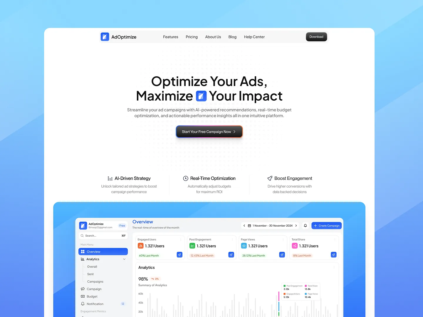
This callout section highlights key features of AdOptimize with a clean layout and engaging visuals. Contrasting colors and clear typography draw attention to essential actions, enhancing user engagement and guiding visitors towards optimizing their ad campaigns.
Check out this example on Dribbble.
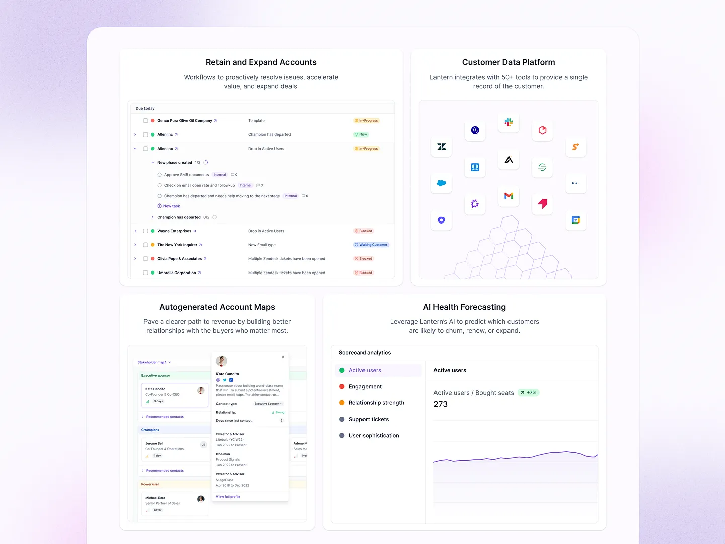
This callout section showcases a sleek design that highlights key features and functionalities, enhancing user engagement. With a clean layout and vibrant icons, it effectively communicates essential information about customer data integration, account management, and AI forecasting, making it visually appealing and easy to navigate.
Check out this example on Dribbble.
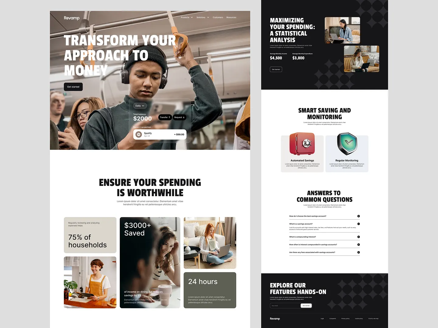
This landing page features a striking callout section that emphasizes key financial insights and user benefits. Bold typography and engaging visuals capture attention, guiding users to explore savings strategies and features. Unique elements like intuitive icons and strategic color contrasts enhance the user experience.
Check out this example on Dribbble.
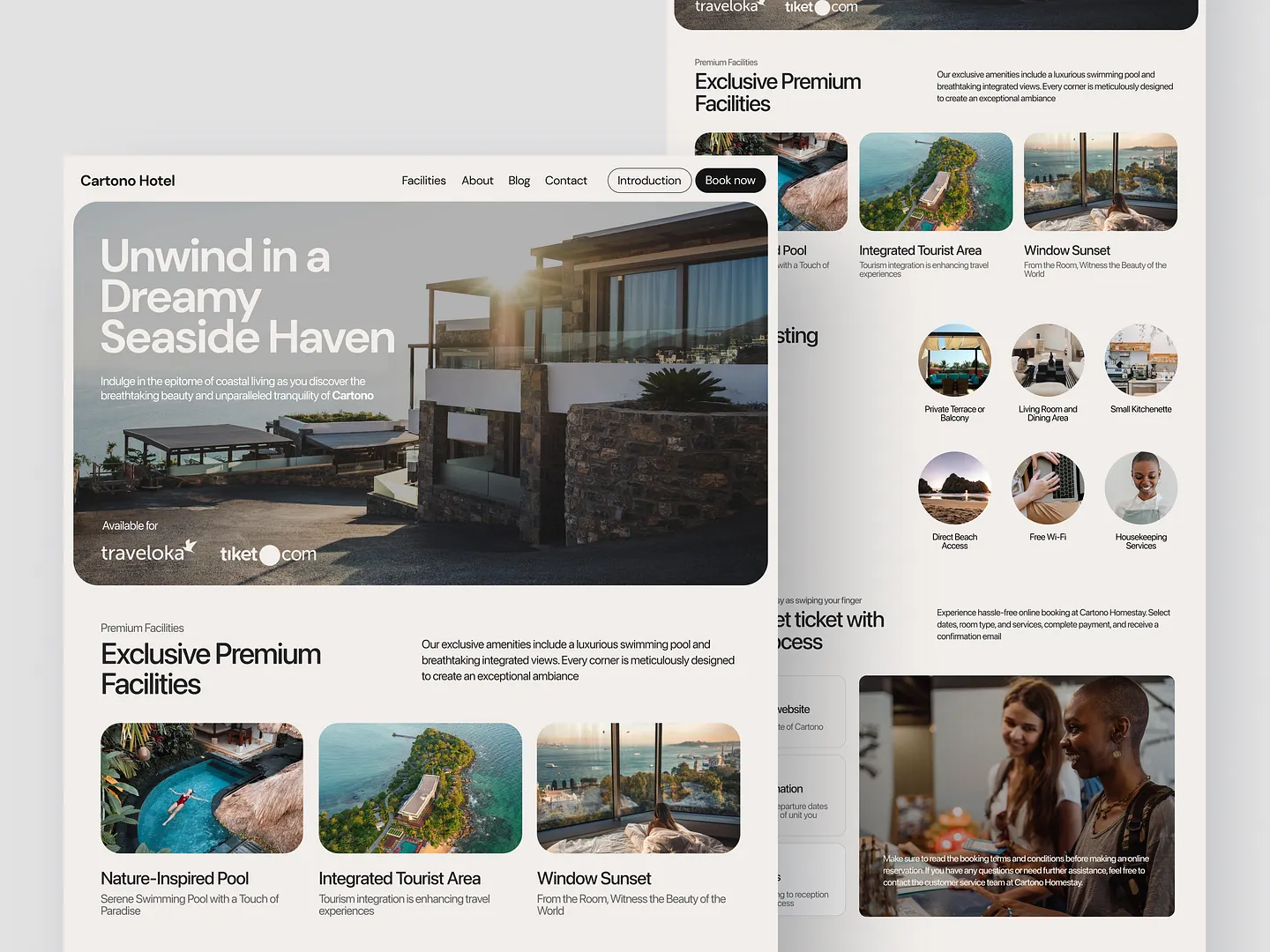
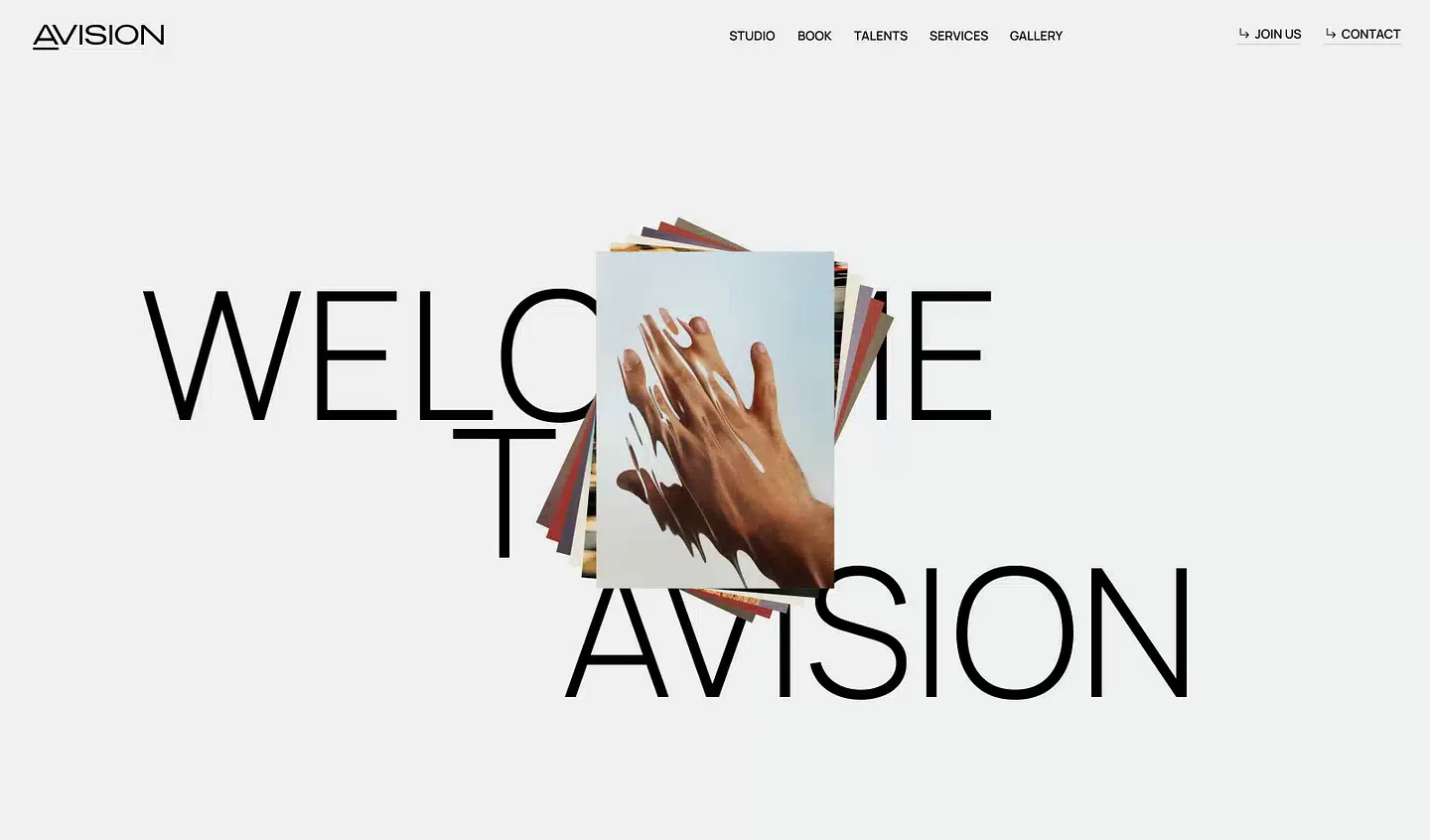
The Cartono Hotel landing page features a captivating callout section with bold typography and serene coastal imagery. It highlights the hotel's unique offerings, creating an inviting atmosphere that encourages visitors to unwind and discover premium facilities.
Check out this example on Dribbble.
Ready to design your own callout section? Subframe streamlines the process with its intuitive interface and responsive canvas, making it easy to achieve professional, pixel-perfect results quickly.
Join the community of designers and developers who love Subframe. Start for free today!
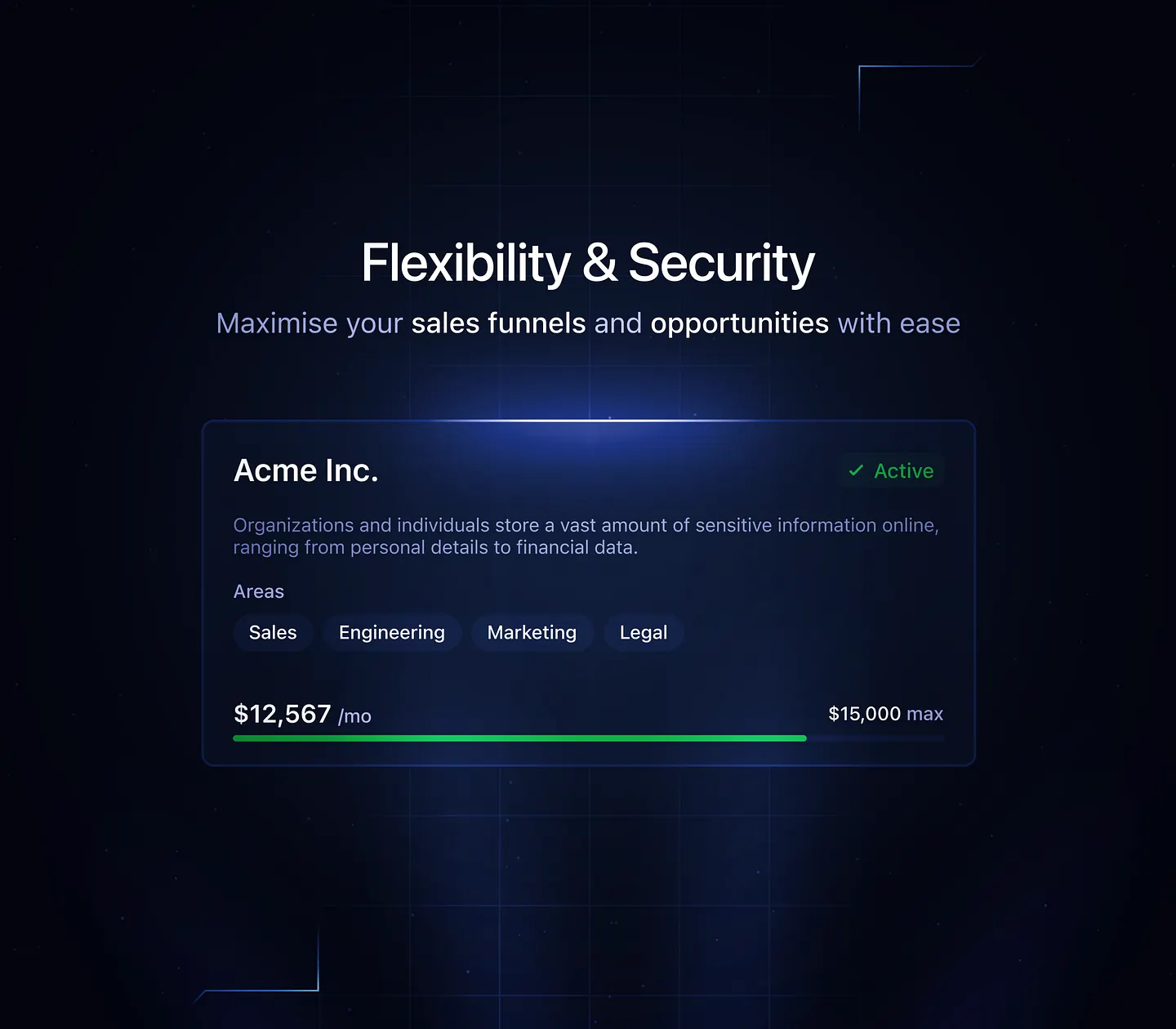
This callout section showcases a sleek dark UI design, emphasizing flexibility and security in managing sales funnels. Contrasting colors and clear typography enhance readability, while the layout effectively highlights key information, making it essential for modern web applications.
Check out this example on Dribbble.
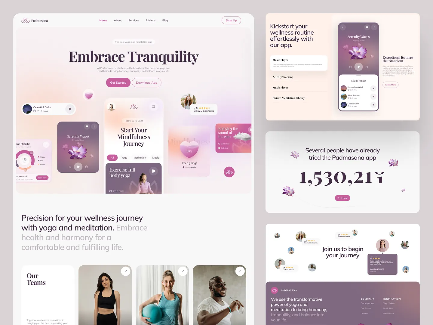
The Padmasana app's callout section highlights key features and user engagement with a soft color palette and elegant typography. This serene design invites users to embrace their wellness journey through yoga and meditation.
Check out this example on Dribbble.
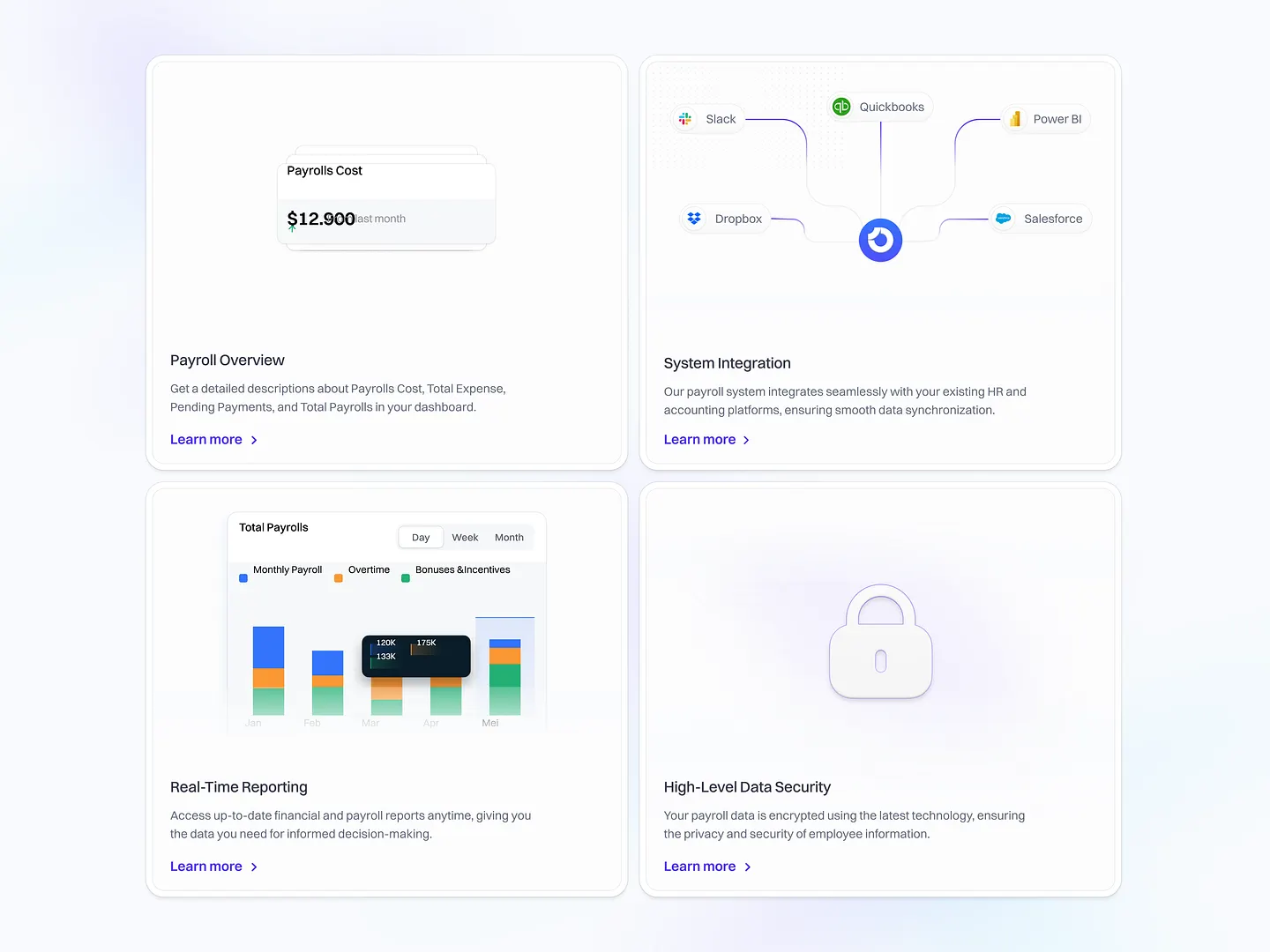
This callout section highlights key features of an HR management SaaS platform, including payroll cost, system integration, real-time reporting, and data security. The clean layout and intuitive design enhance user engagement, making the platform's value clear at a glance.
Check out this example on Dribbble.
This callout section captivates users with bold typography and striking visuals, effectively highlighting key content. The clean and modern aesthetic draws attention to essential information, making it perfect for creative professionals.
Check out this example on Dribbble.
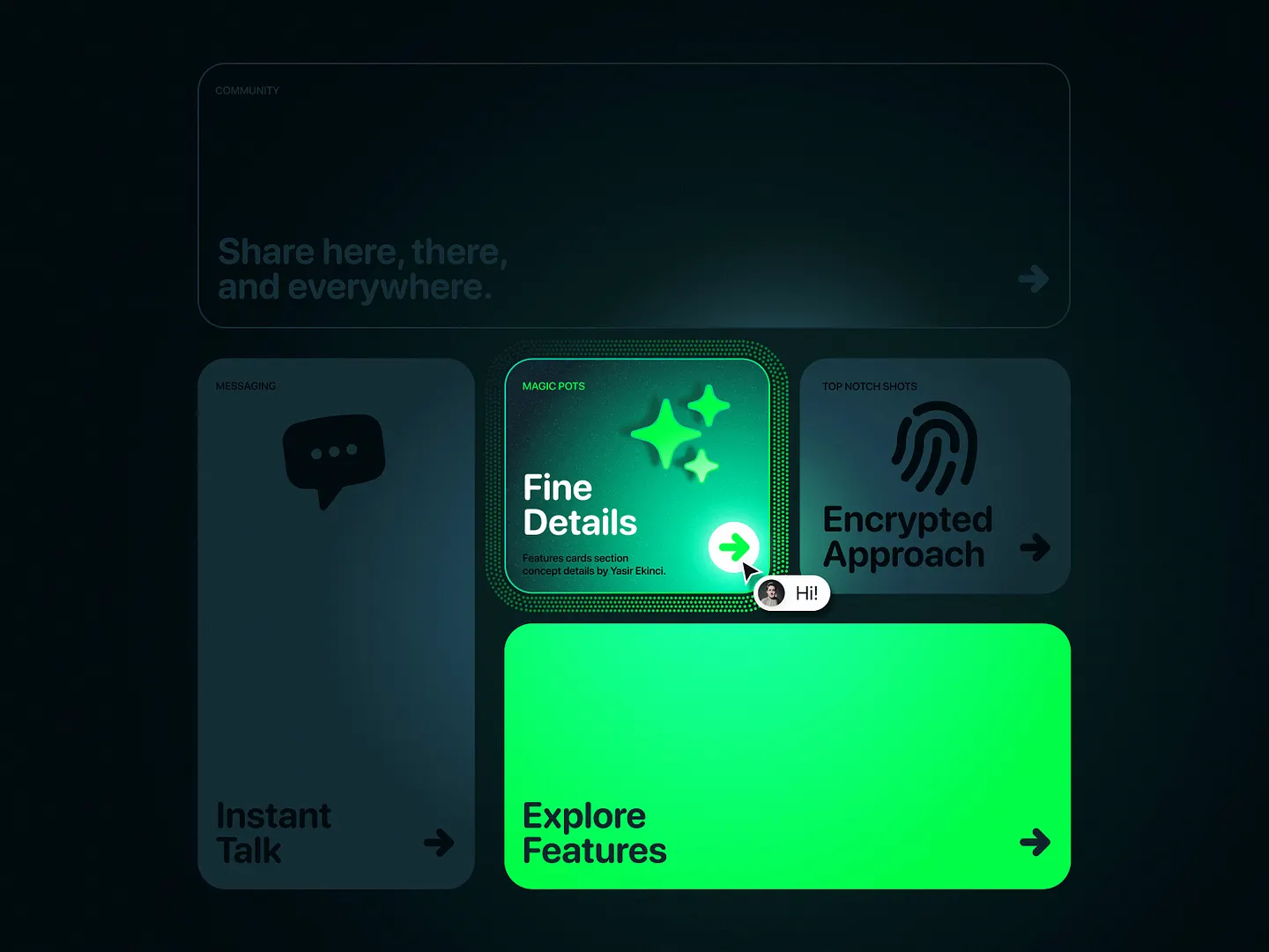
This callout section features vibrant colors and engaging layouts, with a glowing green accent highlighting key elements. The sleek, dark background enhances readability and visual appeal, making it ideal for modern UI design.
Check out this example on Dribbble.
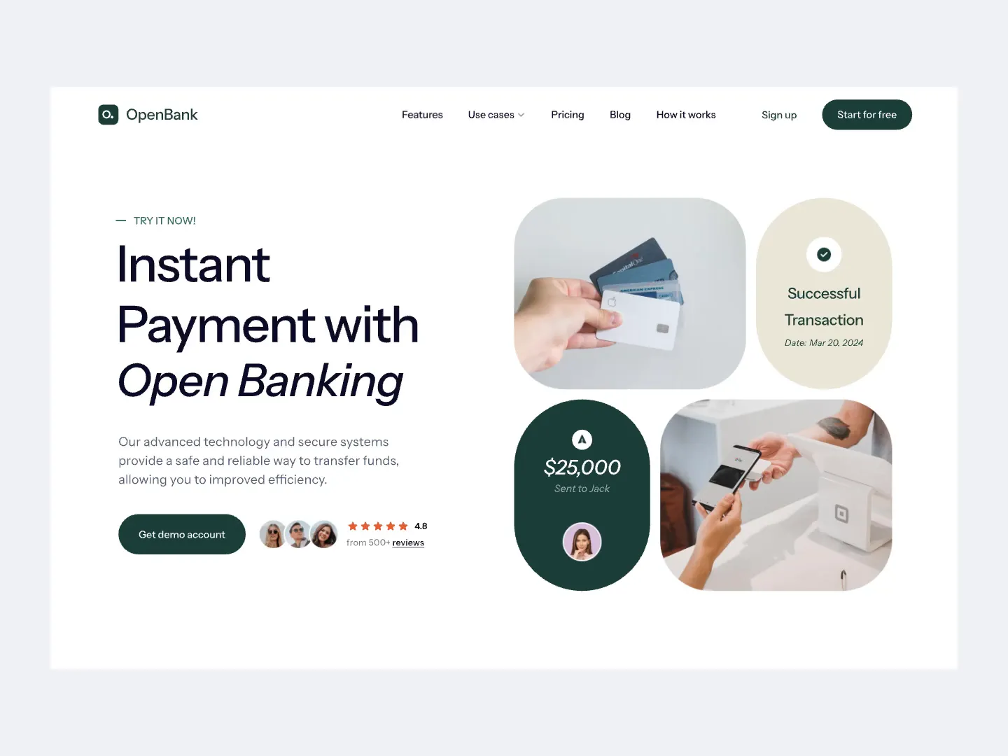
This finance landing page features a well-structured callout section that highlights instant payment capabilities with Open Banking. Contrasting colors and clear typography draw attention to key information, such as successful transactions and demo account options, enhancing user engagement and trust.
Check out this example on Dribbble.
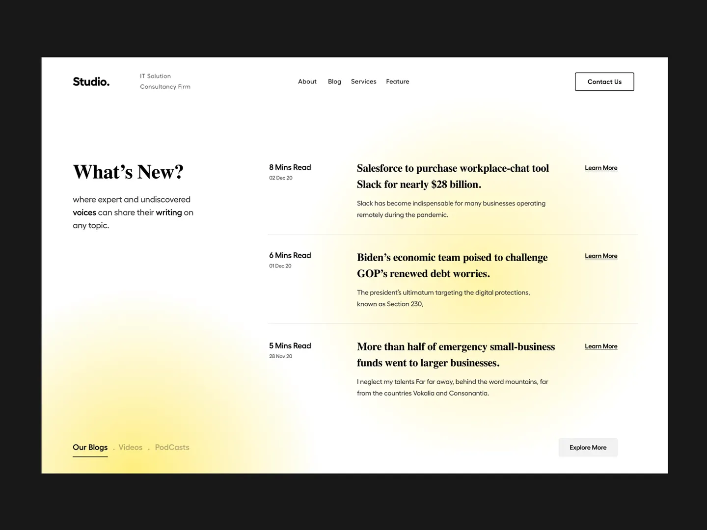
This callout section features a clean, modern layout that highlights recent blog posts with a focus on readability and user engagement. Soft gradients and ample white space enhance visual appeal, while clear headings and concise summaries invite readers to explore topics from technology to economic insights.
Check out this example on Dribbble.
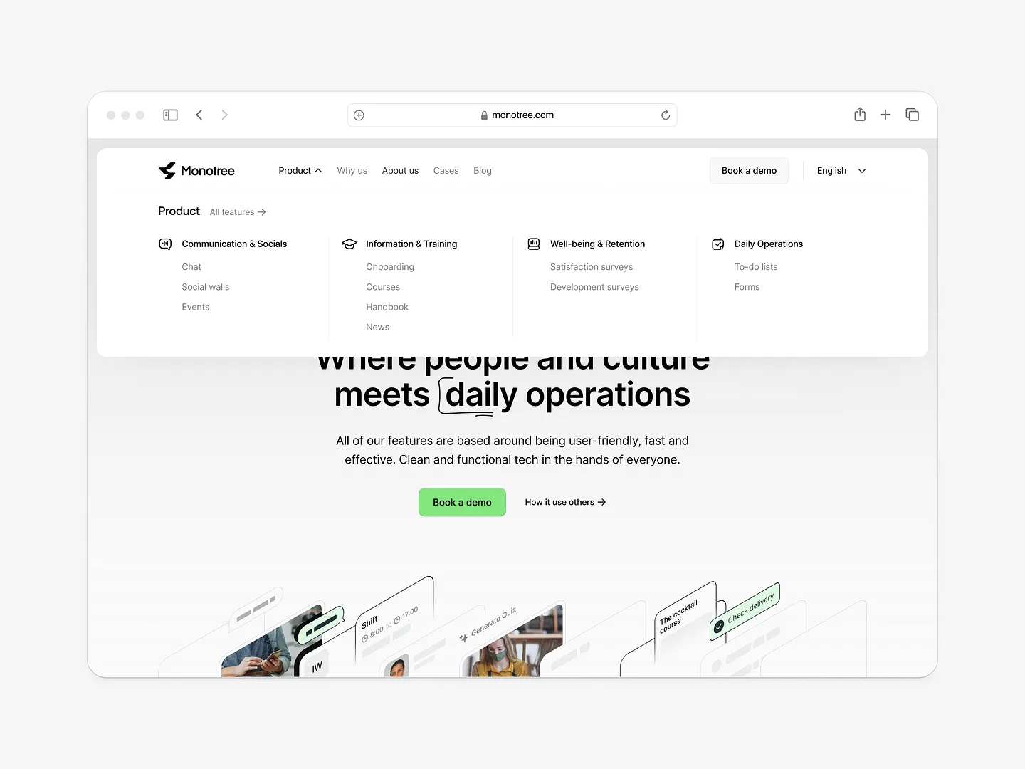
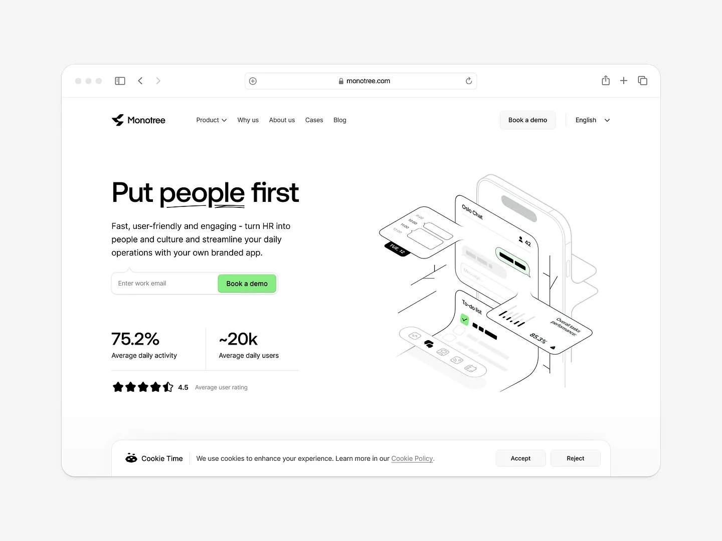
Monotree's callout section features vibrant visuals and clear typography, enhancing user engagement. The design highlights key features and encourages interaction, making it a standout element in the overall layout. Unique elements like dynamic buttons and a streamlined layout enhance user engagement and retention.
Check out this example on Dribbble.
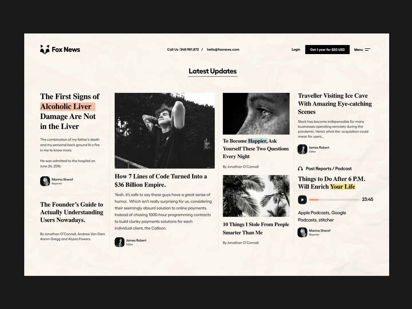
This callout section design for news websites uses bold typography and striking visuals to highlight key articles and updates. The clean, modern aesthetic draws readers' attention to important topics, enhancing user engagement and readability.
Check out this example on Dribbble.
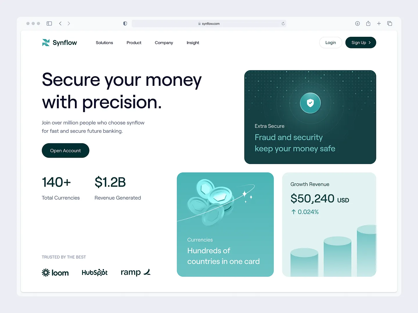
This callout section exemplifies a modern design with a clean layout and a soothing teal and white color palette. Concise messaging and engaging visuals highlight key features like security and revenue, enhancing user engagement on financial platforms.
Check out this example on Dribbble.
Designing effective callout sections has never been easier with Subframe. Its intuitive interface and responsive canvas allow you to create pixel-perfect UI efficiently, enhancing your website's user experience.
Ready to elevate your designs? Start for free and begin creating stunning callout sections immediately!


