Looking for Blueprint alternatives? Compare top react component libraries with unique features, pricing, and benefits to find your ideal match.
Irvin Zhan
•
2025-01-13
In the ever-evolving landscape of project management tools, finding the right fit for your team's needs can be a challenge. While Blueprint has been a popular choice, there are numerous other options available that might better suit your specific requirements.
This article explores ten alternatives to Blueprint, each offering unique features and capabilities. Whether you're looking for enhanced collaboration, better integration, or more customization, these alternatives provide a range of solutions to consider.
What is Blueprint?
Blueprint is a UI toolkit designed for web development, specifically built using React. Developed as an open-source project by Palantir Technologies, it aims to provide a comprehensive set of tools for building complex web interfaces.
Some of the features offered by Blueprint include extensive documentation and a GitHub repository for developers to explore. It is licensed under the Apache-2.0 license, ensuring it remains free and open for community contributions.
What to Consider When Selecting a Blueprint Alternative?
Ease of Use: Look for tools that offer a drag-and-drop editor and real-time collaboration to simplify the design process for both designers and developers.
Customization: Ensure the alternative allows extensive customization through props, styles overriding, and theming to fit your brand and design requirements.
Performance: Choose a solution optimized for performance, with features like fast rendering and minimal bundle size to ensure a smooth user experience.
Accessibility: Verify that the components are WCAG compliant and tested for accessibility to ensure your application is usable by everyone.
Community and Support: Consider the availability of community support, comprehensive documentation, and additional resources like forums and GitHub discussions for troubleshooting and feedback.
Best Alternatives to Blueprint in 2025
1) Subframe
Subframe is a code-first design tool that revolutionizes the way you build user interfaces. With its intuitive drag-and-drop visual editor, real-time collaboration, and AI-powered design features, Subframe allows you to create pixel-perfect React and Tailwind code effortlessly. It supports modern front-end technologies like NextJS and Vite, making it an ideal choice for developers and designers alike.
Pros of Using Subframe
Subframe offers a range of features that make it a standout choice for UI design and development.
Design with real components: Subframe allows you to drag-and-drop on an intuitive, responsive canvas, ensuring pixel-perfect UI every time.
Stunning UI templates: With templates inspired by world-class products and built with reusable components, you never have to start from scratch.
Skip handoff, get high-quality code: Easily copy and paste front-end code, then add business logic in your codebase, saving you time on pixel-pushing CSS.
Start building UI visually for free: Subframe offers a free tier to get you started without requiring a credit card.
Real-time collaboration: Work seamlessly with your team in real-time, enhancing productivity and ensuring everyone is on the same page.
These are just a few of Subframe's many features. Check them out here to learn more.
Who Should Use Subframe?
Subframe targets a diverse range of users, including founders, designers, developers, freelancers, and non-technical team members. It is particularly beneficial for growing teams, agencies, and large companies that need quick and high-quality UI development solutions.
Subframe Pricing
Subframe offers three pricing options:
Free Plan: $0 per user/month
Pro Plan: $29 per user/month
Custom Plan: Pricing is not public; please contact support for a quote
Subframe Reviews
Subframe has received glowing reviews from users, earning a perfect score of 5 out of 5. Users consistently praise its ease of use, high-quality code generation, and time-saving features. Dakota loves how easy it is to get started, especially with templates, while Dominic Whyte highlights its speed and superior quality for product UI. Germán Merlo finds it super useful and user-friendly, and Aris Nakos appreciates that it's more than just a mockup, wishing he could give it more upvotes.
2) Fluent UI
Fluent UI is a set of customizable, performant, and accessible React components designed to align with the Fluent Design Language. It offers lightweight components optimized for bundle size and render performance, making it ideal for building consistent and accessible web applications.
Pros of Using Fluent UI
Lightweight components: Fluent UI offers refactored and slimmed-down components that allow you to include only the necessary packages and dependencies, reducing the overall bundle size for faster performance.
New tokens system: This system ensures frictionless cohesion across OS themes, making it easier to maintain a consistent design language across different platforms and applications.
Enhanced assets: Fluent UI provides new assets specifically designed to enhance Teams add-ins and M365 experiences, ensuring a seamless and integrated user experience.
Cons of Using Fluent UI
Performance Issues: Users have reported that the Fluent UI homepage lags on various devices, including high-end ones. Features like acrylic and mica are particularly problematic for performance, especially over Remote Desktop.
Inconsistencies Across Products: There is a notable lack of a unified vision and leadership in design at Microsoft, leading to fragmentation and inconsistency across different Microsoft products. This inconsistency can make it challenging to maintain a cohesive user experience.
Fluent UI Pricing
Fluent UI's pricing is not public. Contact their support for more info.
Fluent UI Reviews
Fluent UI has received mixed reviews, with users generally giving it a score of 2.5 out of 5. Common criticisms include performance issues and a lack of design consistency across Microsoft's products.
3) Mantine
Mantine is a free and open-source React components library that supports TypeScript and is compatible with modern frameworks like Next.js and Remix. It offers a wide range of customizable components and hooks to facilitate rapid development of web applications.
Pros of Using Mantine
Extensive Component Library: Mantine offers over 100 customizable components and 50 hooks, providing a comprehensive toolkit for building web applications.
Dark Color Scheme Support: Mantine includes built-in support for dark themes, allowing developers to easily implement a dark color scheme with global styles.
Flexible Theming and Customization: Mantine allows extensive customization through props, styles overriding, and theming, enabling developers to tailor components to fit their specific design requirements.
Cons of Using Mantine
Performance Issues: Users have reported that Mantine can be slow when handling large forms, which may affect the overall user experience in complex applications.
Initial Learning Curve: Despite its extensive documentation, some users find the initial setup and customization of Mantine components to be challenging, especially for those new to React or TypeScript.
Mantine Pricing
Free Plan: $0 per user/month
Pro Plan: $29 per user/month
Custom Plan: Pricing is not public; please contact support for a quote
Mantine Reviews
Mantine has a rating of 5 out of 5 based on a single review. Users generally find it favorable, as indicated by the review from Srujan Gurram, who builds apps.
4) shadcn
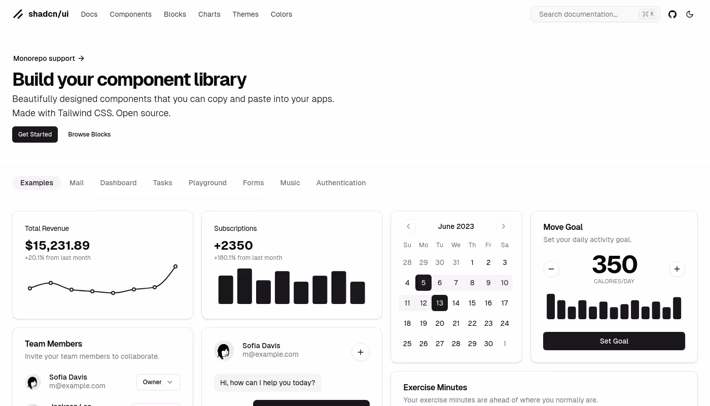
shadcn offers a collection of beautifully designed, open-source components made with Tailwind CSS. These components can be easily integrated into applications by copying and pasting, providing developers with resources like documentation, blocks, charts, themes, and colors to build their component libraries.
Pros of Using shadcn
Beautifully Designed Components: shadcn offers a collection of aesthetically pleasing components that enhance the visual appeal of any web application.
Built with Tailwind CSS: The components are crafted using Tailwind CSS, ensuring modern, responsive, and easily customizable designs.
Comprehensive Documentation and Examples: shadcn provides extensive documentation and a variety of examples, making it easy for developers to integrate and utilize the components effectively.
Cons of Using shadcn
Initial Learning Curve: Despite its extensive documentation, some users find the initial setup and customization of shadcn components to be challenging, especially for those new to Tailwind CSS.
Compatibility Issues: The use of Tailwind CSS and specific components might require users to have a compatible setup for seamless integration, which can be a hurdle for those not already using Tailwind in their projects.
shadcn Pricing
shadcn's pricing is not public. Contact their support for more info.
shadcn Reviews
shadcn has an overall rating of 4.8 out of 5 based on 9 reviews. Users generally mention its minimalist design and ease of use.
5) AntBlocks UI
AntBlocks UI is a library of high-quality, responsive, customizable, and ready-to-use React and Figma components built on Ant Design, designed to streamline web development workflows and help create stunning web applications with ease.
Pros of Using AntBlocks UI
Copy & paste functionality: Quickly integrate components into your projects with simple copy-paste actions, streamlining your development process.
Built with design tokens: Easily customize components with design tokens, allowing for flexible adjustments to color schemes, fonts, and other design elements.
Dedicated Figma UI kit: Enjoy a seamless experience between design and development with a comprehensive Figma UI kit that supports the latest Figma features.
Cons of Using AntBlocks UI
Initial Learning Curve: Despite its extensive documentation, some users find the initial setup and customization of AntBlocks UI components to be challenging, especially for those new to React or Figma.
Ongoing UI Inconsistencies: The need for regular updates and fixes to address various UI inconsistencies suggests that there might be ongoing usability improvements required, which can be a hassle for users.
AntBlocks UI Pricing
Basic Plan for Teams (subscription): $349 billed annually + local taxes
Pro Plan for Teams (subscription): $449 billed annually + local taxes
Ultimate Package for Teams (one-time payment): $1199 billed once + local taxes
AntBlocks UI Reviews
AntBlocks UI has a rating of 0 out of 5 based on zero reviews. There are no user opinions or specific comments available as the review section is currently empty.
6) Tetrisly
Tetrisly is a design system that offers user-friendly components for seamless integration, fully compatible with Figma and React. It features comprehensive TypeScript support, ready-to-use components, customization variables, and extensive documentation with interactive Storybook.
Pros of Using Tetrisly
TypeScript Support: Enhanced type safety, autocompletion, and IDE support improve development, minimize errors, and scale React projects efficiently.
Ready-to-use Components: Refined UI elements that can be used without prior design team support, offering built-in elegance, functionality, and ease.
Export Design Tokens: Figma plugin to convert Figma Variables into React-ready code, ensuring seamless transitions from design to development.
Cons of Using Tetrisly
Initial Learning Curve: Despite its extensive documentation, some users find the initial setup and customization of Tetrisly components to be challenging, especially for those new to React or TypeScript.
Compatibility Issues: The use of Tailwind CSS and specific components might require users to have a compatible setup for seamless integration, which can be a hurdle for those not already using Tailwind in their projects.
Tetrisly Pricing
Basic Plan for Teams (subscription): $349 billed annually + local taxes
Pro Plan for Teams (subscription): $449 billed annually + local taxes
Ultimate Package for Teams (one-time payment): $1199 billed once + local taxes
Tetrisly Reviews
Tetrisly has an overall rating of 4.98 out of 5. Users generally mention that the product is well-organized and integrates effectively with Figma, but some find the initial setup challenging.
7) DaisyUI
DaisyUI is a component library for Tailwind CSS that simplifies the development process by providing pre-defined component class names, enabling faster and cleaner styling of web elements. It supports various themes, is highly customizable, and works seamlessly across all JavaScript frameworks.
Pros of Using DaisyUI
Component Class Names: Adds component class names to Tailwind CSS for faster and easier styling, reducing the number of class names needed.
Unlimited Themes: Offers a variety of themes that can be applied without adding new class names, allowing for effortless theme switching and customization.
Pure CSS: No JavaScript dependency, making it lightweight and framework-agnostic, ensuring compatibility with all JavaScript frameworks.
Cons of Using DaisyUI
Initial Learning Curve: Despite its extensive documentation, some users find the initial setup and customization of DaisyUI components to be challenging, especially for those new to Tailwind CSS.
Compatibility Issues: The use of Tailwind CSS and specific components might require users to have a compatible setup for seamless integration, which can be a hurdle for those not already using Tailwind in their projects.
DaisyUI Pricing
DaisyUI's pricing is not public. Contact their support for more info.
DaisyUI Reviews
DaisyUI has an overall rating of 4.9 out of 5 based on 20 reviews. Users generally mention its ease of use and comprehensive documentation.
8) React Bootstrap
React Bootstrap is a front-end framework that replaces the Bootstrap JavaScript with React components, built from scratch without dependencies like jQuery. It offers a set of accessible-by-default components that are compatible with the Bootstrap stylesheet and themes.
Pros of Using React Bootstrap
Rebuilt with React: Offers true React components without unneeded dependencies.
Bootstrap at its core: Ensures compatibility with the extensive Bootstrap ecosystem.
Accessible by default: Components are designed to be accessible out-of-the-box.
Cons of Using React Bootstrap
Limited Customization: While React Bootstrap offers a range of components, it can be challenging to customize them beyond the provided options. This limitation can be a hurdle for developers looking to create highly unique and tailored user interfaces.
Dependency on Bootstrap Styles: React Bootstrap relies heavily on Bootstrap's stylesheet, which can lead to conflicts or inconsistencies if you are using other CSS frameworks or custom styles. This dependency can make it difficult to integrate React Bootstrap into projects with existing, non-Bootstrap styling.
React Bootstrap Pricing
React Bootstrap's pricing is not public. Contact their support for more info.
React Bootstrap Reviews
React Bootstrap has an overall rating of 3.5 out of 5. Users generally mention that while it offers true React components and ensures compatibility with the Bootstrap ecosystem, it can be challenging to customize beyond the provided options and may lead to conflicts with other CSS frameworks or custom styles.
9) NextUI
NextUI is a React UI library that provides a range of components designed to help developers create beautiful, fast, and modern web applications. It emphasizes accessibility, customization, and performance.
Pros of Using NextUI
Themeable: HeroUI provides a plugin to customize default themes, allowing users to change semantic tokens or create entirely new themes. This feature is built on TailwindCSS, making it highly flexible and easy to use.
Fast: The library is built on top of Tailwind CSS, which means it does not include runtime styles or unnecessary classes in the bundle, resulting in faster load times and better performance.
Unique Developer Experience (DX): The library is fully-typed, which helps minimize the learning curve for developers and ensures a smooth development process.
Cons of Using NextUI
Limited Customization: While NextUI offers a range of components, it can be challenging to customize them beyond the provided options. This limitation can be a hurdle for developers looking to create highly unique and tailored user interfaces.
Dependency on Tailwind CSS: NextUI relies heavily on Tailwind CSS, which can lead to conflicts or inconsistencies if you are using other CSS frameworks or custom styles. This dependency can make it difficult to integrate NextUI into projects with existing, non-Tailwind styling.
NextUI Pricing
Solo Plan: $249 (one-time payment plus local taxes)
Startup Plan: $399 (one-time payment plus local taxes)
Organization Plan: $799 (one-time payment plus local taxes)
NextUI Reviews
NextUI has an overall rating of 4.8 out of 5 based on 15 reviews. Users generally mention its speed, efficiency, and compatibility with other tools like TailwindCSS and React server components.
10) Ark UI
Ark UI is a headless UI library offering over 45 customizable and accessible components, designed to build reusable and scalable design systems compatible with various JavaScript frameworks.
Pros of Using Ark UI
Zero-Styling Freedom: Every component starts as a blank canvas, allowing developers to apply their own design rules and styles.
State Machine Powered: Utilizes state machines to ensure predictable behavior and reduce bugs in component interactions.
Accessibility-First: All components are WCAG compliant and thoroughly tested to ensure accessibility.
Cons of Using Ark UI
Initial Learning Curve: Despite its extensive documentation, some users find the initial setup and customization of Ark UI components to be challenging, especially for those new to headless UI libraries or state machines.
Compatibility Issues: While Ark UI supports multiple frameworks like React, Solid, and Vue, the lack of immediate Svelte support can be a hurdle for developers who need to integrate with Svelte right away.
Ark UI Pricing
Personal Plan: $249 (discounted to $199)
Team Plan: $649 (discounted to $599)
Ark UI Reviews
Ark UI has an overall rating of 4.5 out of 5 based on 20 reviews. Users generally mention that while the product is functional, it has a steep learning curve and lacks immediate Svelte support.
Which One Should You Go With?
Each of the alternatives to Blueprint offers unique features and capabilities, making them all worthy contenders for your next project. Whether you prioritize customization, performance, or accessibility, there's a tool on this list that can meet your needs.
If you're looking for a standout option, we recommend Subframe. Its intuitive drag-and-drop visual editor, real-time collaboration, and AI-powered design features make it an excellent choice for both designers and developers. With Subframe, you can create pixel-perfect React and Tailwind code effortlessly, ensuring a seamless and efficient workflow.
Join thousands of happy builders.
Subframe lets you build stunning UI with beautifully crafted components and a drag-and-drop visual editor.


